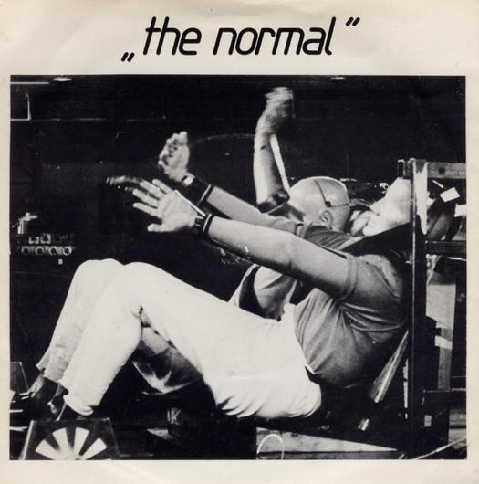
"T.V.O.D. / Warm Leatherette" by The Normal, Mute Records, 1978
In the last few years, there has been a revival of interest in the music that came after mid-1970s punk. Bands from the Red Hot Chili Peppers to Franz Ferdinand acknowledge their debt to post-punk originals such as Gang of Four. The latest issue of The Wire magazine has an ad for a compilation of underground Brazilian groups citing the British post-punk bands Joy Division, The Slits and The Pop Group as influences. There have been collections of post-punk music and now, finally, there is British music critic Simon Reynolds' 500-page history of the genre from 1978 to 1984, with the invigorating title Rip it Up and Start Again. It's a brilliant book. Reynolds, who lives in Manhattan, started researching it in 2001 and it has arrived at exactly the right moment to benefit from, and propel, the growing wave of interest. He argues that post-punk music's explosion of creativity equals the golden age of popular music in the mid-1960s, but that it has never received its full due. I think he's right.
Design has always been a key part of the record-savouring experience for many music fans and it remains so today, as Momus noted in a recent post. There is a continuing fascination with record covers of the post-punk period. Dot Dot Dot has published pieces about the sleeve designs of XTC, John Foxx, Scritti Politti and Wire — its editors were kids when they came out. Most notable of all was the rapturous reception accorded to Peter Saville's exhibition at the Design Museum in 2003. British journalists seemed almost as besotted as Saville himself with what he had achieved at Factory Records in the early 1980s and even the London Review of Books sent along their man (novelist Andrew O'Hagan) to check it out.
The latest compendium of post-punk music graphics is This Ain't No Disco: New Wave Album Covers by New York designer and author Jennifer McKnight-Trontz. I wish I could recommend it, but it's a lamentable piece of work as cloth-eared when it comes to the music as it is blind to the visual qualities and impervious to the cultural significance (or lack of it) of the artefacts it both includes and arbitrarily leaves out. First published by Chronicle and taken up in the UK by Thames & Hudson, it shows little sign of having passed through the hands of anyone who knows or cares much about the subject. Its interpretation of "new wave" is so loose that it lacks any credibility and many of the covers display no design originality while the bands they represent have rightly been forgotten — Katrina and the Waves, anyone? Kajagoogoo?
Meanwhile, memorable covers that clothed some of the most original post-punk releases, music that still exerts an influence, fail to make the grade. Here are just a few: Pink Flag, Chairs Missing and 154 by Wire; Cut by The Slits; Public Image and Metal Box by Public Image Ltd; Y by The Pop Group: 20 Jazz Funk Greats by Throbbing Gristle; Unknown Pleasures by Joy Division; The Correct Use of Soap by Magazine; Hex Enduction Hour by The Fall. There is nothing by Neville Brody for Cabaret Voltaire or Fetish Records and, with just one cover shown, Vaughan Oliver's ravishing body of work for 4AD, so prominent in the 1980s, barely gets a look-in. If Roxy Music and Kraftwerk qualify as new wavers, then why not former Roxy band member Brian Eno and the German avant-gardists Can? They were both a big influence on post-punk bands and they had good covers. (Eno produced the Talking Heads album, Fear of Music, which indirectly gives the book its title.) McKnight-Trontz includes Iggy Pop's Party (1981), presumably because it looks like "fun" with its cleaned-up, presentable Iggy and colourful blobs and splatters, but excludes The Idiot (1977) with its bleak, unsettling, black and white portrait of the singer: what did he mean by those peculiar hand gestures? Someone who understood the music's impact would be unlikely to make a misjudgement like that.
This may seem inconsequential — they are only record sleeves, after all — but what makes post-punk so interesting and inspiring, even now, as Reynolds shows so well, is the exceptional range of cultural influences that shaped the music, its refusal to stand still, its disinclination to cede any ground, especially to commercial priorities, and its intellectual energy and artistic ambition. All of this was reflected in the most inventive, audacious cover art of the time. "Those seven post-punk years from the beginning of 1978 to the end of 1984 saw the systematic ransacking of twentieth-century modernist art and literature," he writes. "The entire period looks like an attempt to replay virtually every major modernist theme and technique via the medium of pop music."
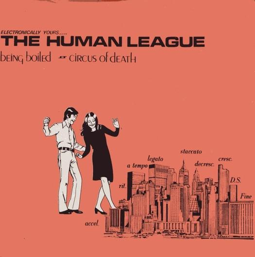
"Being Boiled" by The Human League, Fast Product, 1978
The bands' sources included Futurism, Dada, Marcel Duchamp, Alfred Jarry, John Heartfield, Constructivism, De Stijl, the Bauhaus, Die Neue Typographie, Bertolt Brecht, the Situationists, Jean-Luc Godard, Anthony Burgess' A Clockwork Orange, and the extreme science fiction of William Burroughs, J. G. Ballard and Philip K. Dick. Many of the musicians had studied art or design. Talking Heads' David Byrne put in time at RISD, members of Wire attended Hornsey Art College, Gang of Four were in Leeds University's fine art department, where the head, art historian T. J. Clark, had belonged to the Situationist International. (It's a long list. For the best account of art school influences on British rock, see Simon Frith and Howard Horne's Art into Pop — Reynolds acknowledges his debt to the book.) The sleeve designers — Bob Last at Fast Product, Saville at Factory, Malcolm Garrett in his collaboration with the Buzzcocks, Brody at Fetish — shared many of these influences.
Any visual survey of post-punk graphics that concentrates solely on album covers overlooks a crucial part of the story. The discovery that it was possible to record, manufacture and distribute records relatively cheaply spurred the development of a thriving independent scene. The 7-inch and then 12-inch single with picture sleeve went through a great flowering. 1978 saw the arrival of an advance guard of lo-fi synthesiser singles that heralded a new direction for electronic pop in the 1980s: "T.V.O.D. / Warm Leatherette" by The Normal; "Being Boiled" by The Human League; "United" by Throbbing Gristle; Cabaret Voltaire's four-track Extended Play; "Paralysis" by Robert Rental; "Private Plane" by Thomas Leer.
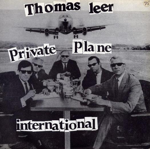
"Private Plane" by Thomas Leer, Company/Oblique, 1978
It's hard to convey the excitement that records like these generated among music fans at the time. A large part of it was the feeling that the usual channels had been bypassed. Only committed readers of the music press were in on it. No one else had a clue. The audience had taken control of the means of production and anything seemed possible. It was a new kind of do-it-yourself electronic folk culture and the kitchen-table designs that gave this sensibility an image were raw but thrilling. The photo of crash test dummies, borrowed from the Motor Industry Research Association, and use of the Din typeface to represent Daniel Miller's "Warm Leatherette" underscores the cold, sociopathic lyrics about the eroticism of a car crash ("Hear the crushing steel, feel the steering wheel"). Listeners instantly registered the song as a homage to Ballard's cult novel Crash. This Ain't No Disco breaks its own remit by featuring a few singles, none of them shown here, but it largely misses this side of post-punk music. One of the pleasures of Reynolds' book is its excellent picture research with the assistance of British music writer Jon Savage.
With thanks to Hilary Young
See also:
The Art of Punk and the Punk Aesthetic
It's Smart to Use a Crash Test Dummy


Comments [61]
http://www.wired.com/wired/archive/6.09/saved.html
(5 pages)
01.17.05
01:01
01.17.05
01:22
Design on display is actually quite satisfying. I saw last week MoMA's design and architecture rooms, filled with design from this and the last century, and it was quite entertaining. Design is material culture, everyday applied art, and in the context of a museum, seems to fit right in as a marker of human culture and creativity.
This exhibit on the Whitney's website does a pretty good job of archiving works of a "computational" nature. By placing the code which defines the work before the work itself, it emphasizes the link between computational and conceptual art. Many works of a "digital" or "computational" nature are basically lines of code, a set of instructions, and the manifestations viewed in museums are but one of many possible manifestations.
A weblog, such as this one, is a database of entries and logs. If some time and money were invested in it, it could be completely searchable and accesible by subject, poster, links, and words within the post. Data is usually backed up, and erasure of the information on this blog would require a lot more destruction than a set of paper files would.
01.17.05
04:17
01.17.05
06:20
Perhaps it's a bit off-topic to get into the MoMA design rooms? But I guess I'd agree that they're "entertaining."
01.17.05
11:41
First, thank you for a refreshing post that embraces the contradictions of design. Perhaps this acknowledgement stems from a Californian influence, LA being city of contradictions, simultaneous productions and consumptions.
But the notion that design is out of synch or displaced in a museum context is a contradiction I have difficulty resolving. A few years ago the MoMA's display of The Russian Avant-Garde Book was very popularly received and included a lavish catalog (designed by Tsang+Seymour, NYC). Of course this is not the first time that a museum has held an exhibit of book design. But my interest is linked to the fact that the artifacts of the exhibit--designed books--are re-produced in a monograph form. Does this mean that graphic design has "arrived"? I am not sure, but it does signify (in my mind) that design does have contain some cultural significance worthy of institutional display.
01.18.05
11:54
I recently began work on a show entitled, "Exhibit Archive" and a section of it is comprised of framed compact discs, each containing various files of my graphic art - some for clients, some "self-assigned" - and each labeled with whatever sharpie was lying around at the time I burned it. My point is that the data has an alternative form of its expression, rather than having been put through one particular printing mechanism (a 'necessary' variation on the data). Of course, the particular G4 burning mechanism is also itself a variation. Another section is a slide show of posters (made in Illustrator) displayed on the monitor which I was looking at when I created them in the first place. Hand in hand with this question of archiving and re-presenting our form of art goes the issue of what their true expression is...
Titillating post Ms. Wild; look forward to more comments on the thread.
01.18.05
12:34
While I wouldn't want to discourage design being displayed in a museum context, I don't agree that it sits in this environment as comfortably as the modern art that usually graces gallery walls. And that's exactly my point, and maybe why Lorraine and myself find design hanging in a museum, well, a little weird.
Most of the artwork we see in galleries (at least since the concept of "art for art's sake") was intended to hang there from the beginning. Design (graphic especially), though, is much more dependent on context and use, and when it is "frozen" on the white walls of these cool moratoriums, it's original effect is neutered. It's maybe the reason shows about, say, the dinnerware of the Victorian era seems so uninteresting when exhibited in a museum. They pieces have been stripped of their context and packed on pedestals behind plexiglass. We're left to simply admire their beauty and craft in a vacuum—which is fine—but it has the feel of some sort of historical accounting at best.
SFMOMA has recently staged a good show on mostly contemporary (Saul Bass and Jack Stauffacher are the lone pre-1980's designers) expressive typography, Belles Lettres, and while the work is beautiful and inspiring, seeing Martin Venezky's Speak magazine—its first issue not even a decade old—under plexiglass where I can't touch it is, well, weird. Seeing all these works together in one space, almost in competition with one another, is also weird, as we'd NEVER see them like this in their original intended context and use (outside of design annuals). I'm sure because the work isn't that far removed, hisorically, from today adds to this strangeness. When placed in this precious "historical survey" bubble, the exhibit seems to be saying less this is the zeitgeist, and more "it's over", and from a bygone era.
Maybe it's not design in a museum, but more the manner in which it is exhibited that adds to this strangeness. Then again, this strangeness might only extend to we, the makers of the work. The rest of the world could maybe care less.
01.18.05
01:31
And yet... I recently jettisoned 18 years of my work (I am no Saul Bass, so no great loss you say. Perhaps).
I still have boxes of removable media that I hung onto because I don't know how to dispose of things like Syquest cartridges in an ecologically sound manner. It's a rare day indeed that I have call to rummage through that pile. I am not worried about ceasing to exist, or concerned with leaving my mark on the world.
We're living in a time when there is more archiving and preservation than any other period in history (not to mention the availability of collectibilia via the internet). The question might not be, should we attempt to archive everything, but more to the point, what do we do with all the information we've collected, and is it really necessary?
I suppose we could all smoke a collective joint and sit back and discuss the philisophical properties of time, history and future, and our position in the universe. It might be more productive to realize the relevance of our own work in context, and to pass along some of our knowledge to a young designer.
I believe it is more important to be a good mentor than it is to preserve my personal body of work. If I do a good job, some of the information I pass along to my protegé will, in turn, be passed along to her charge.
01.19.05
11:44
but non-literate cultures (many cultures have been that way until european colonization), or 'oral cultures' preserved knowledge through 'word of mouth', by passing knowledge from generation to generation through talking and storytelling. i don't mean to sound like a multi-culti hippie, but i do come from an ethnic background that is very orally based and never had a script of its own language developed.
perhaps this quote from blade runner is apt:
"i've seen things you people wouldn't believe. Attack ships on fire off the shoulder of orion. i watched c-beams glitter in the dark near the tannhauser gate. all those moments will be lost in time, like tears in rain. time to die."
batty the replicant is fighting his own anonymity and for the recognition of some record of his life. but maybe we should check outselves with the fact that not everything stays, that much of life and cultural experience remains anonymous, that everything has a determined shelf life that ultimately detoriates.
ill toke on that joint now.
01.19.05
02:20
On the other hand, I've had past clients call asking to either revise or reprint old projects. That's when I say a silent prayer of thanks for the triple-redundant tape backups and burnt CDs of printed files that clutter our storage closet.
Unless you've felt the pang of data dropout on a three-year-old tape or a scratched CD, you probably don't have a real sense of how transient our current records are. Also keep in mind that our digital files are our wares.
01.19.05
03:33
So, what is a right way of archiving arts and designs? Should we save them in DVD as data? or, should we put them in the Internet server to make easy to access? Is this kind of questions are what we have to think about? I don't think so. It is true that there are huge amount of art and design produced. However, it is not necessary to keep all of them. Actually, we shouldn't do. It is nothing but a making confusions. I'm not talking about the personal archive, but the public archive for the historical record. Like I wrote in the beginning, the reason why we need to make archive is not to make an art encyclopedia, but, to look back what art made a high value in given situation. There are so many of shoddy goods in this world. On the other hand, there are just a few of 'best quality master pieces'. And if someone -not one person- can figure out select which is good one in terms of both showing new direction and achieving aesthetic value, making archive of them is not a big problem.
I think what we have to worry is not how to save them, but how to distinguish a stone from a diamond.
02.27.05
08:14
05.20.05
11:26
05.20.05
11:55
YES!
05.20.05
12:06
Before the arrival of Reynolds' book, one of the best surveys of the field was The Trouser Press Guide to New Wave Records edited by Ira A. Robbins, which came out as long ago as 1983, while the new wave was under way. (Trouser Press, for younger readers, was a rather fine, cerebrally inclined US rock mag.) The book offers an encyclopaedic listing of all the key artists and their record releases up to 1983 with some sharp critical assessments. The introduction begins with the statement that "'New Wave' is, admittedly, a pretty meaningless term ... at this stage new wave connotes essentially nothing." But they do a good job of making sense of the territory regardless. McKnight-Trontz evidently consulted the book because she quotes from it, but she doesn't seem to have learned much. I have often used the term "new wave" myself but after reading her book I plan to drop it. It is meaningless.
"Post-punk" is narrower and better as a description of the most interesting rock music of this period. In Britain, punk's great year was 1976. Most participants regard it as more or less over as a vital movement by 1977. Obviously, the situation is different in other countries, including perhaps the US. Although UK punk had been inspired by American rock of the early to mid-1970s such as the Iggy and the Stooges, New York Dolls and Patti Smith, which it pushed to a more extreme position, becoming a national scandal, punk scenes in cities such as Seattle and LA thrived later, in the late 1970s and early 1980s. For a graphic take on this, see Art Chantry's great collection, Instant Litter: Concert Posters from Seattle Punk Culture (1985). Also, Turcotte and Miller's Fucked Up + Photocopied: Instant Art of the Punk Rock Movement (1999).
So post-punk is music which is reacting against punk, consciously trying to move beyond it. Music writers such as Reynolds take the view that punk's return to rock and roll basics, while invigorating and cleansing, could ultimately lead nowhere musically very interesting. The dilemma plays out most vividly in Johnny Rotten's move from The Sex Pistols to become John Lydon in the far more experimental Public Image Ltd. In Britain, 1978 is the key year for this -- hence the dating of Rip it Up and my visual emphasis in the post -- but this date works well for the US scene, too. Devo from Akron and Pere Ubu from Cleveland are post-punk groups and their first albums arrived in 1978. Same goes for Talking Heads, perhaps the definitive American post-punk group, really hitting their stride in 1978/1979. Then there is the whole late 1970s New York "No Wave" scene ...
05.20.05
12:38
Your comments are all well-taken. After I posted, I drove home listening to the Rhino No Thanks! compilation and realized my calendar wasn't too rational ('77 is mid not end). Metal Box (1979) in sensibility is way post. My formulation was looking at a new "generation" of bands, like R.E.M., that had no "punk" time whatsoever, coming on the scene when the 76-78 crowd were into their fourth releases. (I have nothing logical to support it but I often regard the 4th LP as a career point. But with this crowd, maybe it should be three.) Please carry on!
05.20.05
01:17
05.20.05
01:54
Although, as a teen, I just liked the music.
For a couple summers+ as a teen I worked at a giant Tower Records in Los Altos, California. I ended up buying a number of the albums mentioned here. Probably 50% just because I liked the design! (although I did not know what design was at the time). I also bought classical and many rock oldies.
Despite the measly discount I got, in later years, I thought, what a waste of money! I could have retired early if I sunk that money into savings. But now, I wonder if these designs made me partly into the designer I became. I think so.
I know the music and attitude had an impact.
05.20.05
02:05
I can write a dissertation on this subject, because I lived it. And have seen most of the Punk Rock Bands, from A-Z
I'd like to clarify your quote and some things.
Same goes for Talking Heads, perhaps the definitive American post-punk group, really hitting their stride in 1978/1979.
Actually the biggest band in America was DEVO The De Evolution Band. From Akron Ohio. Along with Talking Heads. Devo went on to do some fantastic things in the Film Industry with Scoring Movies.
The amazing thing about many of the Punk Rock Bands or New Wave Bands. They were Art and Design
Students revolting against the establishment.
Roxy Music, Brian Ferry Designed just about all his album covers. The members Devo were Art Students. As well, as David Byrne and the Talking Heads.
A Group name Pere' Ubu was quite big. Remain underground.
Post Punk Era it was a Band from D.C. name Dead Presidents. Who received a lot of notoriety.
Punk Started with IGGY POP and the Stooges. IGGY acknowledged by all the GRAND-DADDY of PUNK.
Will have to say, LOU REED played a very important and prominent role in the emergence of PUNK and NEW WAVE in England and The United States. If IGGY is the GRAND-DADDY of PUNK and NEW WAVE. LOU REED is the GOD FATHER.
PUNK BANDS, were more influenced by BLUES Musicians such as BO DIDDLEY, MUDDY WATERS, BB KING, and BIG MABEL.
I have the Sex Pistols first album. Seen them play. IGGY gave birth to a whole new generation of artist. Such as the NEW YORK DOLLS, Davey Jo Hanson, or bka, Buster Poindexter.
Wayne County was a personality from this era.
I literally cried when Joe Strummer Died two years ago. The Clash one of my Favorites. I keep their cassette tapes on my night stand.
My all time favorite PUNK BAND is The Stranglers. For my money hands down. The Greatest Punk Band ever. With the most distinctive sound. Yeah, they got into a lot of fights. Favorite song, Toiler on the Sea. I'd be remiss if I didn't mention THE DAMN. Captain Sensible and I became friends. Met him in D.C. Didn't know whom I was talking to at the time. Didn't have any money to see his concert. He was so impressed with my knowledge of music. He got me and my friends in to see his concert. By telling the manager of the club we were his roadies. The were no strings attached.
There were some great talent during this era. Some were not as proficient as playing their instruments as others.
Elvis Costello was a Giant and has stood the TEST OF TIME.
Remember, IAN DURY, Sex and Drugs and Rock and Roll.
Rick, I have some issues of Trouser Press, Believe it or not. Will try to scan and send you the cover.
I also have the Warm Letherette 45 by the Normal. I will also scan the 45 rpm lable and send to you.
For the last twenty years. I have been looking a a single by Little Roger and the Goose Bumps. Gilligans Island, played to the tune of Led Zeppelin's Stairway to Heaven. A Classic and Collector's item. If any-one has it in their collection.
Yes, the birth of what we know as PUNK was given birth to by British Bands. Namely, The Sex Pistols, The Clash, The Stranglers, Elvis Costello.
In America the Post IGGY genre started by The New York Dolls.
I will try to find my issue or issues of Trouser Press. I remember them being a Free Publication. You just went into Record Stores to pick them up.
Off Topic, gAmazing, BASELINE used to be the same owned by Letraset. I have all ten issues of BASELINE Magazine. They are worth more than GOLD or PLATINUM. I suspect I'm the only collector that haven them. BASELINE doesn't even have them.
One of the Greast BANDS I've seen BAR NONE is a European Band name ULTAVOX. Please tell me you know them and have heard of them.
They had a Guitar Player name Stevie Shears, that was a great as Jimmy Page, Phil Manzanera,Keith Richard, and Robert Fripp.
Cant forget the Psychodelic Furs.
Art Chantry, was in the forefront of this era with his album covers for groups in D.C. such as the CRAMPS.
Not sure if Chantry Designed Album Covers for other Great Punk Groups out of D.C. such as THE SLICKEY BOYS, THE URBAN VERBS, and BAD BRAINS.
Taking Tiger Mountain by Strategy. ENO, The Greatest Producer in music History Bar None.
DM
THE ALPHA MALE
05.20.05
03:18
Groups like the B 52's with their Distinctive Sound were given birth to by none other than DICK DALE and the DEL-TONES.
KING, MASTER and Inventor of the SURF GUITAR.
Along with LINK WRAY and The Tornados.
05.20.05
03:46
In the United States. The "A" side to The Normal Warm Leatherette was a song titled TV O.D. Something I'm doing more of now with this new computer with built-in DVR. Actually, Warm Leatherette was the "B" side single in the U.S. didn't get as much air-play from our undergound station.
TV O.D. put The Normal on the map in the United States.
We had an underground station in D.C. at Georgetown University, WGTB They were the only station in the United States to play PUNK ROCK and NEW WAVE during the 1970s and/or PUNK NEW WAVE era. WGTB, now defunct it lasted approximately twenty three (23) before it was sold. Then the format changed.
05.20.05
04:48
05.20.05
06:40
05.20.05
06:43
The Ramones who didn't get any mainstream record play. Until Rock and Roll High School is in the forefront of the movement with DEVO, Talking Heads, B-52's, and Britsh Bands, Siouxsie and the Banshees, Rich Kids, Sham 69, Slits, Wire, Boomtown Rats, UK Subs, Desmond Dekker, Cabaret Voltaire, and Simple Minds.
Another reason I don't like list. Even when I make them. Always someone left out.
The Ramones are a PUNK ROCK Institution and should never be forgotten.
They stayed TRUE to the Game.
Apologies for Band names spelled wrong, THE DAMNED and ULTRAVOX.
Just think this all started Jamin at CBGB's.
05.20.05
07:23
Anyone interested can view all issues of Trouser Press by clicking on the link below.
http://www.trouserpress.com/magazine/index.php?p=1
05.21.05
12:24
and while we are talking about flipper, imho, one of the best covers ever, here.
05.21.05
06:17
Thanks for the Trouser Press link.
There is a superb archive of rock writing, including articles from Trouser Press, at rocksbackpages.com. You have to pay, though. I did this for a while and it more than delivers the goods.
Rip it Up and Start Again won't be published in the US by Viking Penguin until February 2006. Simon Reynolds emailed to say that three chapters will be cut and there has been some tightening up. It's not clear yet whether the US edition will have the pictures.
05.21.05
06:25
I know the group well and the Cover Design.
I will send you a contact in D.C. that sell
PUNK and NEW WAVE records. He was very prominent in the 70's, & 80's managed some prominent Punk and New Wave Bands. As well owned some Record Stores. Now he buys record collections from collectors or estates.
Funny story, he had Little Roger and the Goose Bumps in the 70's. Unfortunately at the time D.C. didn't have a Metro System. (Communtor Trains) I didn't drive. So I lost out
because his store was in Rockville Maryland.
Better Debbie, I've got FLIPPER on Radar, and I'll make this a gift. If I can find it.
Rick:
Many thanks. I love this stuff, because I actually lived it. Saw all the concerts. Collected the records and albums. There has been a resurgence of PUNK of late.
I often wonder why PUNK and NEW WAVE didn't became mainstream CULTURE like HIP HOP.
Meaning, Hip Hop has lasted almost thirty (30) years. For the last fifteen (15) years received major, major air-play. PUNK and NEW WAVE lasted about ten (10) years. Received very little or no air-play at all. I guess PUNK and NEW WAVE were too Anti Establishment.
If we search Deep beneath the surfice Hip Hop owe a debt to PUNK and New Wave. Being the predecessor (ancestor) to the youth Anti Establishment movement.
Beautiful and Heartfelt Appreciation for your Editorial. Brought back a lot of fond memories. Thank GOD I'm alive to tell the story.
GOD SAVE THE QUEEN.
P.S. Trouser Press was not FREE as I earlier stated. I got them FREE because I new the owner of the Record Store.
The publication that was FREE was the Unicorn Times.
I was referencing the first ten (10) issues of BASELINE Magazine. When Letraset was the publisher.
One last thing. You're correct in the sense Talking Heads with David Byrne have always remained in the forefront of the Music Scene.
The biggest names to emerge from PUNK and NEW WAVE Culture have been, ENO, David Byrne, and Elvis Costello.
The best BASS PLAYER I ever saw was from Europe, a guy named John Gustafson. Not even Stanley Clarke can touch him.
I can TESTIFY to that. I've seen them both play.
05.21.05
11:27
The tricky thing about it is that bands like Talking heads, Devo, Television, etc...are really proto-punk. Television, New York Dolls, Johnny Thunders, Voidoids, etc. influenced the Sex Pistols. For more info, check out the seminal, Please Kill Me...probably the best book on the era. Lipstick Traces and England's Dreaming offer some good insights as well. The Trouser Press Record Guide is also an invaluable resource, but the older version is out-of-print. Look for it in a used bookstore...I found mine about 10 years ago for $1.
Several punk bands became post punk...I'd say Siouxsie and the Banshees, Wire, and the Fall would be examples...so to delineate where punk stops and post-punk begins is a little fuzzy. I think it's more about a willingness to experiment and to push the limits of popular music. throbbing gristle, yes, but also Ultravox??? is there any genre so diverse as post punk?
Can you tell I'm a little post-punk obsessed? Have been for almost 20 years.
And design was DEFINITELY a big reason. I had to own every copy of New Order's Ceremony single...the design was so striking to me in high school. When everything else was so over-the-top, it was so clean, simple...beautiful. OMD's Architecture and Morality with the die cut, the coveted Public Image Ltd. Metal Box, Joy Division's cloth-covered Still release...and all of the lesser known releases...this whole era has always stood out to me as a time of incredible creativity, and I could never figure out why it was so overlooked.
Even a few years ago, when I said I loved post-punk, people didn't know what I meant.
It's good to know my record collection is finally worth something.
05.22.05
12:10
By the far the most thorough examination of this subject I have come across is the essay "Post Punk Graphics: The Displaced Present, Perfectly Placed", written in 1990 by Australian academic Philip Brophy -- it's an exceptional piece of design criticism. Thanks to Simon Reynolds for reminding me about it.
05.22.05
07:31
Ramones weren't mainstream? For the longest time the Ramones were definitely more accepted than Talking Heads and Devo.
Devo didn't have a hit at all until "Whip It" (or possibly their cover of "Working in a Coal Mine," I forget which) and Talking Heads didn't get off the ground until "Burning down the House" got onto the radio waves via payola in the mid-eighties. And then for the casual listener they both fell into obscurity soon after.
When the Ramones and Talking Heads toured together (the only relation being that they both played at CBGBs), people were not going to the shows to see Talking Heads.
Also, don't forget Brian Eno also produced most of these acts. God bless he did, or we probably wouldn't be talking about most of them!
Speaking of Eno, I love his cover for "Another Green World."
05.23.05
03:36
One of the things that I always found interesting was how many artists of the time integrated performance, print and music. For example, Throbbing Gristle, who started out as performance artists, combined harsh sounds, controversial imagery, and almost punishing live shows into an all-encompassing experience that tested the limits of art, music, and for lack of a better word, reality. Their album art just one part of a much larger integrated design.
With regard to today's post punk revival, I think it's interesting that bands like Interpol and Franz Ferdinand are creating album covers that echo the art of that time. However, it seems to be missing the mark, and I'd argue it is because of the way we purchase music currently. Whether it be the CD or the iTunes download, packaging is small or non-existent, leaving much less opportunity to push the boundaries in this area. The 12" or 7" square offered many more opportunities for the adventurous (on a side note, it should be pointed out that many of the great post punk designs were never available in the US domestically...only via import. That could be an entire discussion in itself).
One last thought, though. One area where design has become interesting for the current crop of post-punkers is the web. Though perhaps not directly post-punk, Fischerspooner definitely is influenced by the era. Their Odyssey puzzle offers interesting imagery for their album, hinting back to this integrated package idea.
05.23.05
10:34
While McKnight-Trontz is simply hopelessly oblivious to popular cultural and music history - some of her "New Wave" examples date from 1974-75, and the inclusion of Kajagoogoo and Wham! is simply a crime - Reynolds, and Poynor, suffer from a highly selective and elitist attitude to the UK punk explosion, citing in Reynolds' case those groups who are seen to be somehow 'seminal' or hip in retrospect, and in Poynor's those who worked with (what were to become) the contemporary 'greats' of graphic design.
While the First Wave of punk in London was morphing into post-punk fragments after 1978, in smaller towns and cities across the country, young people were taking up the call to create their own version of punk culture, which in many cases owed far less to the Kings Road and McLaren's and Westwood's (and even Reid's) ideals than many would like to think. Not only did this lead to the inventive post-punk icons from the Art School crowds (Cabaret Voltaire, Mekons, GO4, The Normal, Wire etc etc), it also led to the (largely non Art School) Anarcho Punk scene, Oi!, Hardcore, Thrash, and the 1980s New Punk movement - much of which was to be hugely influential worldwide, in terms of both music and graphic design - though not within the mainstream of either area.
Many of the assumed clichés associated with punk graphics, such as the widespread use of dayglo colours and ransom note typography, are not actually played out when the range of punk output is studied in detail - in fact, although Jamie Reid, Malcolm Garrett and Peter Saville (the supposed holy trinity of punk/post-punk graphic designers) had a huge influence within the graphic design world, the real legacy of punk design in terms of record covers owes more to the likes of Gee Vaucher/Crass, Discharge, Dick Lucas/The Subhumans, and the Riot City, Secret and No Future labels... but then, none of those are hip enough for either Reynolds or Poynor to consider even worthy of a mention.
By the way, this point is unapologetically Anglo-centric - I'm not getting into the debate about Eno, Talking Heads, Devo, REM etc, as that is another story altogether... though it should definitely include the Dead Kennedys.
05.23.05
11:09
In fairness to Reynolds, one review of his book estimated that he had covered 200 bands. I haven't counted, but that seems pretty wide-ranging to me. Cities such as Manchester and Sheffield in the UK and Akron and Cleveland in the US made a huge contribution and he makes that clear. And yes, of course, punk itself continued to evolve into the 1980s all over the world. You are welcome to Oi. I'll pass.
Is the Dead Kennedys' Fresh Fruit for Rotting Vegetables (1980) punk or post-punk? Either way it's a sublime cover: yellow gothic lettering above a motorcade that looks like it's emerging through the luminescent smoke from some hellish underworld. McKnight-Trontz omits it. On a more positive note, she does include Fear of Music (1979) by Talking Heads, Three Imaginary Boys (1979) by The Cure and Tin Drum (1981) by Japan. On a recent trip to China, a Chinese colleague told me how much he loved Tin Drum's fusion of east and west, in particular "Canton" with its sinuous fretless bass, and the cover photo of David Sylvian eating rice with chopsticks under a photo of Chairman Mao. I know, I know: more artiness. McKnight-Trontz's most surprising inclusion, given everything she has overlooked, is Vibing Up the Senile Man (1979) by Alternative TV. Now that is obscure.
Last I heard, Russ, you were working on a doctorate about this area of design. Is it finished yet? Some early fruits of this emerged in your article with Ian Noble, "Punk Uncovered" in Eye no. 33, autumn/fall 1999 (not available on Internet). This also features some of the material I reference above -- Gang of Four, The Human League, The Normal, Fast Product -- and obsessives and completists will want to track it down.
05.23.05
12:31
Many people 'pass' on Oi!, and I can understand why, but it does need to be pointed out that it was a significant part of the development of punk/post-punk, is highly influential (recent US punk supergroups Rancid and Green Day owe more to the New Punk/Oi! scene than any artier post-punk experiments)... Also, it can't be discounted (however much people might like it to be!) when The Exploited got in the charts, Vice Squad sold 22,000 copies of their first single on their own label (equivalent to the first Buzzcocks e.p. and many more than the Desperate Bicycles), and Oi! sales throughout 1981-82 are purported to be in excess of a million records...
Yes, I'm still working on the doctorate, aiming to complete early next year and hoping to develop a book and exhibition which is a little more extensive and inclusive... just back from a punk weekender in Morecambe, so the diversity of the scene is fresh in my mind!
05.23.05
04:41
The band felt a strong affiliation with punk, although not strong enough to accept Richard Branson's apparently serious proposal for them to have Johnny Rotten/Lydon, freshly ousted from the Sex Pistols, join the band. According to Jade Dellinger and Dave Giffels' excellent book "Are We Not Men? We Are Devo!", this offer was made by flying two of Devo out to Jamaica where they met with Branson in his mansion, with Rotten/Lydon in the next room, and the entire UK music press corps gathered on the beach to hear the news. The book is a goldmine of stories like this, including the fascinating and hilarious saga of the US sleeve art for the debut album. Record sleeve design really was where art and commerce met up, and often ended up fighting to a futile and wasteful death.
One final point. I have to take Rick Poynor to task over the claim that punk was over as a vital movement by 1977. Anarchy In The UK came out in November of 1976 and in December the Pistols gave the Bill Grundy interview. In 1977 Matlock was booted out the band, Sid joined, they were kicked off EMI and A&M, they released Pretty Vacant and God Save The Queen which was at Number One during the Queen's Silver Jubilee week. Perhaps all this meant it was over for a couple of dozen insiders who were at the 100 Club in 1976, but for the rest of us, 1977 felt pretty vital.
05.23.05
06:55
Alpha Male -
Ramones weren't mainstream? For the longest time the Ramones were definitely more accepted than Talking Heads and Devo.
Devo didn't have a hit at all until "Whip It" (or possibly their cover of "Working in a Coal Mine," I forget which) and Talking Heads didn't get off the ground until "Burning down the House" got onto the radio waves via payola in the mid-eighties.
The Ramones are PUNK. Devo and Talking Heads are New Wave. Not because of a time-line. Difference in Style of Music. As previously stated, The Ramones are an institution. More accepted than Devo or Talking Heads. That's a matter of conjecture and personal taste. It's an apple and orange debate.
The Ramones did receive mainstream air-play after Rock & Roll High School. Call it PAYOLA if you must. They were in heavy rotation in D.C.
Again, the best groups I've seen were THE CLASH, THE STRANGLERS, ULTRAVOX, THE DAMNED and DEVO. Later the B-52's My experience with seeing IGGY. That's a ten year conversation.
David Byrne has amassed the most LONGEVITY. With ENO and ELVIS COSTELLO.
Echoing, Mark Wernham's comment. Devo was performing in the 1970s. As well as The Ramones.
Both performed via Georgetown University WGTB
Radio Station Promotion in the 1970s before achieving commercial success and receiving air-play.
WGTB played both groups DEMO TAPES in the 1970s. Before a Record Deal. Albeit being the only radio station in America devoted to PUNK and NEW WAVE.
Commercially, in the U.S. there was not a group as successful as DEVO or Talking Heads. During the infancy of New Wave. Bar None.
From this 1970s era emerged the only AFRICAN AMERICAN PUNK group, BAD BRAINS who were essentially a Reggae Group and switched to PUNK.
Of all the groups BRIAN ENO managed, one group fired ENO. It was the URBAN VERBS in D.C. It was their shortcoming, not ENO's.
05.24.05
01:43
Talking Heads' first mainstream hit was; TAKE ME TO THE RIVER.
I disseminate this 411 without looking at their song discography and searching for the records in my storage facility.
05.24.05
03:05
Suggest you take a look at:-
http://www.roctober.com/roctober/blackpunk1.html
A pretty good overview of African-American punk, going well beyond Bad Brains (and pre-dating them in many respects - Pure Hell being a good case in point). As I said earlier, it's good to check the facts beyond the regular 'histories'...
As regards punk as a vital movement... when the public 'philosphy' of the movement is that "anyone can do it", it seems pretty churlish to me to restrict a critical appraisal to some early scene-makers, rather than to view what happens when those "anybodies" actually DO "do it"... by which I mean punk's diaspora (Savage's words) from 1977 onwards.
05.24.05
07:17
The issue here, though, is not the music, it's the graphics and their relationship to the music. If and when Russ Bestley's research is made public, it will be interesting to see whether the new visual material changes our picture of graphic design in these years in any fundamental way. The theme of this thread, however, is not punk but post-punk, unless the distinction is being challenged. But, here again, the issue that concerns us would be how this relates to graphic design.
05.24.05
09:47
I think the trend is towards a distinction made on aesthetic grounds - visual, musical and stylistic - rather than chronological. This seems fine in theory, but as I said earlier, some later developments are missing from the picture... Post-punk, as a genre aesthetically distinct from punk, could easily embrace Anarcho or Hardcore - each of which have their own codes and practices. I just want to make the case that when it comes to post-punk visual (and musical) practice, the scene is far more diverse than the story often allows.
Post-punk graphics then tend to sit within a set of parameters defined largely by what Malcolm Garrett, Peter Saville, Barney Bubbles, Chris Morton, and later Vaughan Oliver were doing in the 1980s. I think this is one area where people like McKnight-Trontz get the wrong end of the stick, as the visual graphic style of the likes of Duran Duran, Wham, Spandau Ballet etc is actually quite similar to the later Buzzcocks, Magazine, New Order etc output (for obvious reasons), and stylistically they can be confused and seen as one and the same thing.
I take your point about the DIY nature of the sleeves you show, and I agree that they are (actually very good) examples of the genre. I wasn't actually criticising that aspect of the piece - just making the point that "anyone can do it" does lead to a great deal of variable - both brilliant and awful - music and design, and the untrained aspects of punk and post-punk design led to some great innovations as well as some stylistic nightmares... the point for me is not to make a distinction between the validity or authenticity of either.
05.24.05
10:25
Don't get your point. I've lived in D.C. for the last fifty years. I know all the members of Bad Brains. I sold them tapes from WGTB in the 1970s.
If you read my earlier statements. I mentioned the Cramps and Art Chantry designing for them. As well as other D.C. Legends.
The information you're sharing. I'm already Privy.
As stated before. I LIVED THE LIFE.
Not only as a collector. As a D.J.
However, BAD BRAINS were performing in the 1970s.
You provide no relevant time line of African American PUNK Groups that predate BAD BRAINS in the U.S.
Perhaps there were PUNK Groups in the U.K. that predate BAD BRAINS. Until that information is provided. Your argument is not BULLET PROOF. BAD BRAINS is the eminent AFRICAN AMERICAN PUNK GROUP to emerge in the U.S. from the 1970s.
Thanks for the link. Any further comment. Please contact me offline.
Apologies for going OFF TOPIC Rick.
05.24.05
10:49
Certainly, like myself, they were in the forefront of the PUNK and NEW WAVE Movement.
1. Skip Groff, benefactor to many of the early punk and new wave acts in the Washington Metropolitan Area. Collector of one of the largest PUNK and NEW WAVE music archives in the world. Owner of Yesterday and Today Records.
2. Steve Lawber,(sp?) one of the most celebrated DJ icons of punk and new wave music at WGTB. The only station in America that embraced and played PUNK and NEW WAVE 24/7. Steve hosted a radio program titled Mystic Eyes. Which tied in blues, and rock-a-billy (sp?) with PUNK as a major, major influence of PUNK.
Both Skip and Steve, will provide timelines and dates and their favorite graphic designed album covers, singles, and EP package designs.
For whatever reason, Washington D.C. was left out of this editorial as a seedbed of PUNK and NEW WAVE. Every group mentioned in this editorial was played first by WGTB, Georgetown University in Washington D.C.
WHERE IS THE LOVE ???
DesignMaven
THE ALPHA MALE
STAY TUNED
05.24.05
06:03
Isn't the notion of discussing who is punk and who isn't contrary to the very notion of punk? What's the point here?
What has always struck me as important about the music, the design, and the culture has been the way a certain group of talented individuals formed a community around art that took a conversation to a new place, or that boldly rejected the accepted mores of the day. The best bands, those that are well-known (or not-known) as "punk" were important because they brought something new and urgent to the table: the Pistols music, for one. This core message also informed the design, much of the time. Some of the bands whose impact was in my opinion the most enduring happened to have also created notable, meaningful, and lasting visual language that complemented their music--Joy Division and Gang of Four (if only for Entertainment!...and by the way, I saw GO4 but a week ago here in Boston and they were unbelievable) and Talking Heads, to name a few. But of course the entire 2-Tone label: let's not bother to argue whether the Specials and Beat were punk or not; they also produced great, timely, music which was complemented by art that fit.
By the way, who remembers first seeing the LP cover to Fear of Music? I remember when that came out. Brilliant. And the music--the same.
But again, I fundamentally reject this parlor game of trying to name who's in and who's out; we sound a bit like the journalist on the bus in Syd and Nancy....
It is a shame that online music swapping and the CD case have shrunk or done away with meaningful design for bands. R.I.P the record sleeve. Are any bands today producing anything more than catchy images to complement their songs?
05.24.05
10:43
oh dude. don't even open that door.
this is totally, completely, utterly tangential to the topic at hand, but great info. i must share.
if, like me, you were but a wee child when all this was happening, you probably veered off into british pop quite heavily.
i personally started with duran duran, then went back to visage and ultravox and then worked my way back into the normal and shriekback's early stuff (yeah, i know, australian, so what).
i found great book called "the look" which covers how post-punk electronics developed through the 80's in britain. it's very well written—by a guy who was there. my suspicion was that he was the quiet weird one nobody paid attention to, but hey. it paid off. good reading for us boys who like the eyeliner.
05.24.05
11:13
05.25.05
01:19
Skip at Y&T
05.25.05
07:36
05.25.05
06:34
As I stated earlier, they are indeed very good examples of UK post-punk single sleeves, though one thing in particular about their design has been troubling me. Whilst I can see certain links between the visual codes employed in both the Normal and Human League covers (actually, they are quite explicit in their shared use of the extended Letraset catalogue), and I can see a connection with the graphic design of other sleeves cited (but not pictured) - e.g. Throbbing Gristle's use of white space and clean lines and even Cabaret Voltaire's (rather more amateur) geometric shapes, I do think the Thomas Leer example shown is rather at odds with the developing generic visual styles of electronic post-punk.
It's certainly DIY, but I would make the case that it has more in keeping with the visual style of earlier punk fanzines and the visual sleeve aesthetic of, say, the Angelic Upstarts, Newtown Neurotics, Leyton Buzzards, and a host of other second generation guitar based 'punk' groups than with the new electronic age. It's actually a great record, and it does fit very closely alongside the other examples musically - I just can't help thinking that if we were to consider the graphic design alone, it's out of step, and somewhat confusing for the would-be post-punk record buyer.
The point here, I think, is to consider the function and purpose of the record sleeve design itself. It packages a fragile piece of plastic, and it markets the contents to an audience. Of course, it carries cultural references far beyond this limited definition, but these are its primary functions, in my view.
As such, if we are to consider successful sleeve design as that which, in fitness for purpose terms, reaches a specific subcultural audience through the use of certain shared visual codes and devices, then some sleeves, such as the early Hardcore and Anarcho Punk sleeves I mentioned earlier, are actually very successful. They employ visual codes which have continued to be utilised across the last 20 odd years, but have remained underground and within the specific subculture that they are intended to communicate with. They don't cross over into the mainstream, in the way that the work of Peter Saville, Malcolm Garrett et al. actually did in the mid 1980s - but then, in terms of functional graphic design, they don't need to do they?
05.26.05
06:17
Thomas Leer's lettering is clearly more punk-like in its use of found characters cut out and stuck in position "ransom note" style. (The "75" visible in the corner is incidentally a price sticker -- for 75p -- and not part of the design.) But this, too, is surely just the result of expediency at a time when the designer (presumably Leer; there's no credit) probably wasn't very conscious of this typographic approach as definitely signifying "punk". His plangent melody could certainly never be described in that way. The nice thing about this cover is that its visual coding still feels unsettled and unbound by imperatives to "market the contents" by speaking in the established visual language of an audience. In 1978, these visual conventions were still being established for "post-punk" and the "new wave". Actually, in place of Leer's cover, I nearly showed the cover of Robert Rental's "Paralysis", a black and white photograph of a homemade electronic noise-making device -- many of these groups built their own equipment -- with some relatively accomplished Letrasetting in the corner. You might just as well conclude from this that black and white signifies "experimental electronics". What it much more likely signifies is "simple artwork, cheap repro".
It would be possible to trace the use of elementary devices such as cutting up found lettering through any number of countercultural movements -- the Situationists, the hippies, and every kind of grass-roots organisation obliged to communicate by the most basic means to hand.
05.26.05
01:26
However, I'm not so sure about the way that visual conventions within punk/post-punk were yet to become firmly established by mid/late 1978. Firstly, some punk graphic clichés, such as the safety pin or the swastika, were pretty much redundant by this stage when it comes to artwork on record sleeves and fanzines. I would also go as far as to say that the ransom note typographic style, so firmly associated with the Sex Pistols and the first wave of UK punk, was also becoming a little passé by the end of 1977. It was, in fact, picked up again in May 1978 for the first Angelic Upstarts single (and their group logo) - but I would assert that this was as much an homage to the earlier movement (i.e. a conscious aesthetic decision) as the result of expedient design. Conversely, the Television Personalities had adopted the style as a witty or ironic parody of "punk" visual language, particularly on the Where's Bill Grundy Now?/Part Time Punks e.p. released in November 1978 - the same month as the Thomas Leer release.
I think that Leer MUST have been aware of the other records pictured above prior to the release of his single: The Normal record had been released around 10 months earlier, with the Human League debut following mid year. Both were very successful within the emerging post-punk/electronic milieu, alongside other post-punk releases which followed similar graphic trends - Throbbing Gristle's 'United' in June '78, the Mekons' debut in February (alongside label Fast Product's other visual output) etc. Both Ultravox and Wire had released a number of albums and singles by this time, each moving more into the electronic field and becoming a strong influence on the 'artier' side of post-punk, both musically and graphically.
My point here is not to over-analyse the sleeve graphics (I recognise the pitfalls you point out with the black and white = meaning statement), but to look at the way that certain visual codes were maintained and interpreted. If the Television Personalities were using ransom note type to take the mickey out of punk fashions a month before the Thomas Leer single, then surely some kind of "established visual language" had already been formed. It is interesting to note that pretty much all the other sleeves of the emerging post-punk and electronic artists during 1978 were beginning to adopt certain common visual codes and patterns by this time: there is certainly a comparison to be made between the early Cabaret Voltaire sleeves, Fast Product records, even ATV and Spizzoil... I just find it a little surprising that Leer didn't follow suit.
05.27.05
09:33
The record, "Martians" by Martin and the Martians, received a couple of reviews in the weekly music press and the highpoint for me was seeing it on the wall of the Rough Trade shop in Notting Hill, the nerve centre of the London post-punk scene, in a patchwork of singles sleeves among all the other new releases. There ended my career as a music graphics designer.
05.29.05
06:40
I've never seen the Martians sleeve I'm afraid - that one escaped me! You might be interested to know that a copy is going at Vinyl Tap mail order for 50 quid... maybe it's the Poynor connection?
05.29.05
05:23
one big reason for this opinion is the simple fact that britain re-designes a large number of american record covers (and book covers and posters, etc.) that make the trip across. while american coprorate mentality also reserves the right to re-design the same before releasing stateside. so, the influences survive - but sometimes barely - to affect young designers in either arena.
then you have the more direct influences of undergound channels of communication. for instance, importing records directly (the only way to actually see barney bubbles' original design ideas, as an example) and the huge influence of 'zines and actual touring bands and their associated machines. these regions of overlap and direct contact may have had a far far more einfluential impact on the developing styles and 'movements' than any marketing contacts possible. the ramones were virtually invisible in america and then toured england and changed the course of british music just by their performance and clothing and attuitude. without copies of 'sniffin' glue' reaching the shores of america, it's doubtful that the d.i.y. stylistic influences of people like jamie reid would ever have reached san francisco and inspire the look and style and attitude of 'search and destroy'and west coast punk. yet, they had seperate genesis from each other.
ther weird thing i've noticed over the years is that , even though this revolution of style and art had it's major influences and practioners and heroes, etc., were unknown for a loooooong time. yet this whole tidal wave of change happened virtually simultaneously in every city in the united staes and britain (and maybe the world). exactly HOW did that happen?
the point is that this is an extremely popular, influential and exceedingly complex history being discussed here. and the reality of how it happened is still being written. i hope that someday there is an honest overview presented. however, up until now, all histories of this stuff MUST be read with a rather large grain of salt.
06.01.05
12:06
i know that this thread is focussed on record sleeve designs from that time, but what about music videos as well? growing up in the suburbs of seattle, my main sources for this music as well as posters (i had a hard time calling it new wave because i didnt want to be defined as a 'waver') was cellophane square, tower, fallout records, and time travellers. writing came from local monthly the rocket. but also, local shows like bombshelter videos as well as MTV's 120 minutes (this is like 86-88) provided a lot of access for me to visual imagery of bands such as the smiths, new order, cabaret voltaire, pil, wire, the cure, nitzer ebb, and many others. the visual language of these videos were completely new to me at the time.
i remember something about peter saville's record covers at the time seeming inaccesible to me (i was in like 9th grade). they represented a world that seemed mysterious and enigmatic, that didnt belong to me but i wanted it to. they seemed to come from far off places (and usually they were special editions or imports that i bought). i remember first listening to the music as well, music by new order and joy division. new order was more accesible to me, but, like the graphics, it was about some world about which i had no idea at all. the beauty of new order's 'ceremony' matched the poetry of the leaves of the sleeve design of 'substance'. i had the purple cloth bound 'still' by joy division. the cover and the cassettes seemed so mysterious to me. such an odd shape for a dual cassette album, completely not in line with how dual cassettes were usually packaged (and this was before box sets became popular). the black cassettes were blank, without a track listing, something else i wasnt used to, and the music seemed to come from a dark, angry, and desperate place that i had some intuitive connection to but couldnt really access or understand.
06.02.05
03:06
it's so funny to see you list all of those old seattle scene places and things. did i know you?
i think it's valuable to point out manuel's point of view. it's that of the typical early design student - before their heads are filled with the various doctrines of design culture. he is exposed to all the input of poular culture in an almost random way,a combination of local and national and international visuals, and his own mind attempts to organize it in some fashion. he sees associations and then begins to build a sort of hypothesis, a theory, as to what this design language is saying. this is the stuff of real graphic design. language.
the power of those records covers is that it grabbed the imagination of young folks (old folks, too) like manuel and actually led him into design. others were led into music. others were led into film. others were led into publishing or history or politics or culture. but they were all lead by the work and it's power on the imagination.
i've always considered that very phenomenon the real purpose of graphic design. i'll always consider that the REAL design world.
06.02.05
11:39
thanks for the post. yes, that hits it right on the head and im glad to hear you say it.
"he is exposed to all the input of poular culture in an almost random way,a combination of local and national and international visuals, and his own mind attempts to organize it in some fashion. he sees associations and then begins to build a sort of hypothesis, a theory, as to what this design language is saying. this is the stuff of real graphic design. language."
i bought a 36" x 54" poster of joy division ("here are the young men") at time travellers in 1987. i took it home on the 150 to kent and walked it up east hill in the rain and tried to hide it from my parents when i sneaked it into my bedroom. its one of the most enigmatic objects ive ever owned in my life, second only to the LP of joy division's "unknown pleasures". those things were like doorways to some unknown world i wanted to get to when i was a kid.
being an immigrant kid, you are in many ways an empty container, not truly belonging to the world your parents come from, not truly belonging to the culture you find yourself in. the visuals of international pop and youth culture are an accesible language that fill the void of your not-belonging self. the 'language' takes on a special meaning. those with the luxury of a clear sense of belonging might view that language as superficial (the more comfortable i become with myself, the more i view that language as superficial); for others, films, movies, commercials, skateboards, album covers, posters, websites, t shirts, brands all become essential elements of self-definition.
id been a fanboi otaku dork wannabe for most of my life. somehow i got a job that put me in control of the tools of production, and i realized that if i tried harder, i could get behind the language myself.
you know, i still have never been to england, but having grown up in a rainy city (seattle) and always having been drawn to british music i imagine id feel pretty at home there.
anyways, thanks again for the great post and thread.
06.03.05
01:06
i think the truth is that we are ALL "immigrant kids" when it comes to discovering the language of graphic design. it's a totally learned and not genetic or instictive. to a certain degree we ALL end learning the language through exposure. we assimilate it.
when we decide try our hand at speaking the language, we don't even realize that we are speaking in a new langauge. we just start talking. and what comes out is sometimes so new and individual and unique that we have to call it a style - like say "post punk" - others pick it up and 25 years later the academics "discover" it and label it and talk about it on websites like this and universities and write books about it.
it's the real history of graphic design in a nutshell.
06.03.05
09:28
06.04.05
01:50
The key 'influences' that Reynolds cites for post-punk are dub reggae, krautrock, and (more dubiously) funk -- with the whole weight of post-Velvets, post-Roxy art-rock taken as given. John Cale and Brian Eno are the godfathers of post-punk as defined by Reynolds. (The 'Please Kill Me' book, an 'oral history' of punk, starts with the VU.)
How does this relate to design? First off, to my knowledge it's hard to see any concomitant design influence from krautrock, reggae or funk sleeves in the design of post-punk sleeves (except maybe on Two-Tone sleeves -- which Reynolds disdains!), and it is in the sleeves above all that the 'recapitulation of modernism' idea shines through. Similarly the original mid-Sixties art-school rockers, eg The Who, put their pop-arts on their sleeves while their music was r'n'b pastiche.
The difference is that the majority of post-punk bands have a kind of 'deconstructing/subverting' schtick, I think. They saw pop music as a con, hence the Gang of Four's weird decision to make their records dry and un-rocking. I think the decision to go with constructivism is rooted in this puritanism: the radical chic factor was also high.
06.24.05
05:11