"Reed College at that time offered perhaps the best calligraphy instruction in the country. Throughout the campus every poster, every label on every drawer, was beautifully hand calligraphed. Because I had dropped out and didn't have to take the normal classes, I decided to take a calligraphy class to learn how to do this. I learned about serif and sans serif typefaces, about varying the amount of space between different letter combinations, about what makes great typography great. It was beautiful, historical, artistically subtle in a way that science can't capture, and I found it fascinating.
None of this had even a hope of any practical application in my life. But 10 years later, when we were designing the first Macintosh computer, it all came back to me. And we designed it all into the Mac. It was the first computer with beautiful typography. If I had never dropped in on that single course in college, the Mac would have never had multiple typefaces or proportionally spaced fonts. And since Windows just copied the Mac, it's likely that no personal computer would have them.”
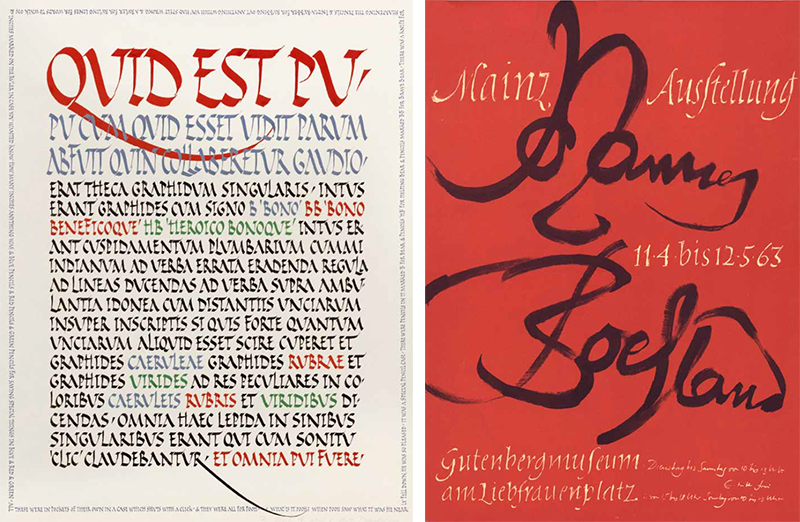
LEFT: Alice Koeth. Pen, ink, and gouache on handmade paper. 17 x 233⁄4. 1983. RIGHT: Johannes Boehland. Poster printed by offset lithography, 161⁄2 x 113⁄4 inches. 1963.
Rick Paulus. Pen and gouache with raised gold on black moldmade paper, 133⁄4 x 133⁄4 inches. 2014.
Surely the alphabet is one of the major accomplishments of mankind; one might even argue it is humanity’s most important achievement. The artistic expression of this utilitarian creation can rise to the level of fine art, just as architecture, photography, and other expressions of the human mind can, in their highest form, be appreciated as an art. it is an unfortunate distinction of beautiful writing that, while these other arts have been exhibited at major museums throughout the world, calligraphy remains underappreciated by the art community. —Jerry Kelly, exhibition curator
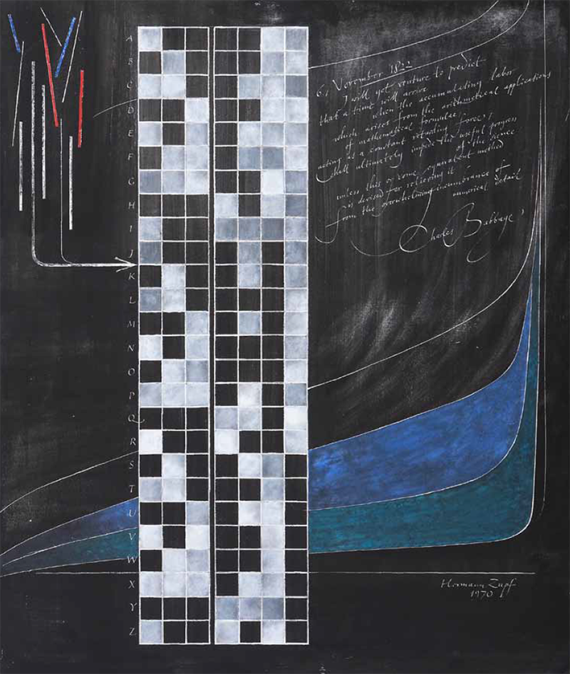
Hermann Zapf. Sgraf to technique using specially prepared oil and tempera panel, 275/8 x 231⁄2 inches. 1970.
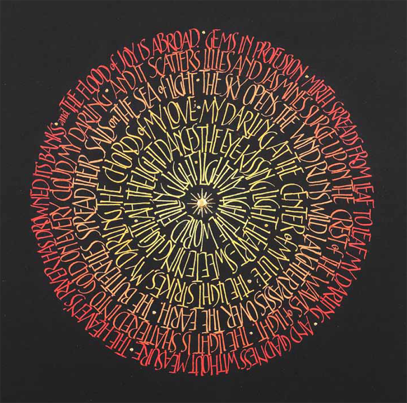
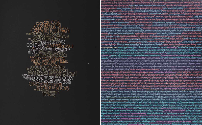
Thomas Ingmire. Paint and burnished gold on moldmade paper, 9 x 71⁄2 inches. 1998.
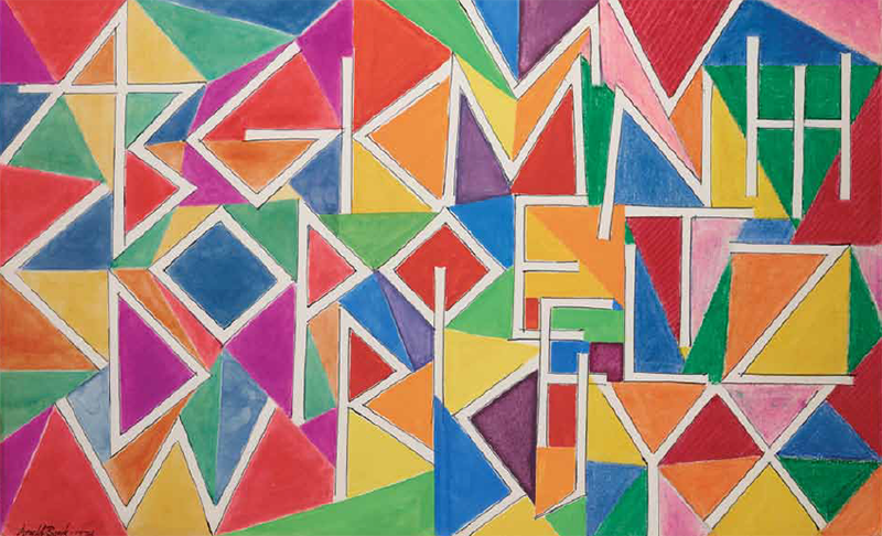
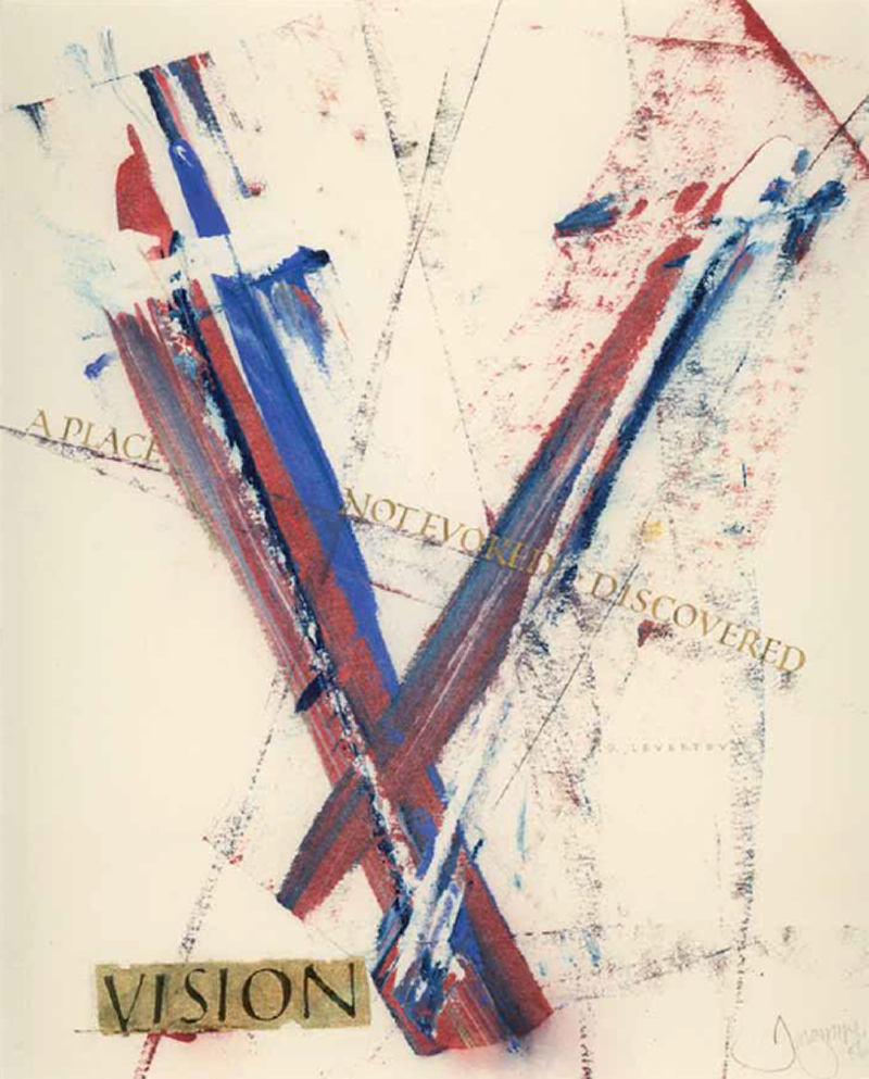
Arnold Bank. Crayon and pen on board. 177/8 x 271⁄2 inches. 1974.
In the last one hundred and ten years calligraphers working with the Roman alphabet have inhabited many different fields. Some have thought of themselves as engaged in craft; others have labored in graphic design; others think of themselves as book artists, or artists full stop. At the same time, people conversant with the calligraphic tradition have engaged in stone carving and typographic design.
What unites all of these very different works is their demonstration of skill. Mastering the use of an expressive tool to make formal writing—writing in which the form matters—demands that we educate both the hand and the eye. The calligrapher must develop a feel for the tool in the hand and a sensitivity to how ink or paint is flowing from the nib. Regular practice develops muscle memory, until the basic mo- tions have become internalized. in addition, a knowledge of historic letterforms in all their variety gives calligraphers a vast repertoire with which to work.
All of these skills are put to the purpose of making writing that is distinctly of the present, even if it is grounded in practices of the past. Edward Johnston famously said, “Regarding the copying of early work, it is contended that to revive an art one must begin at the beginning, and that, in an honest attempt to achieve a simple end, one may lawfully follow a method without imitating a style.” Most calligraphers would agree that our aim is not to engage in an antiquarian exercise, but rather, using our knowledge of the past, we seek to make objects that are relevant to our own time. —Christopher Calderhead
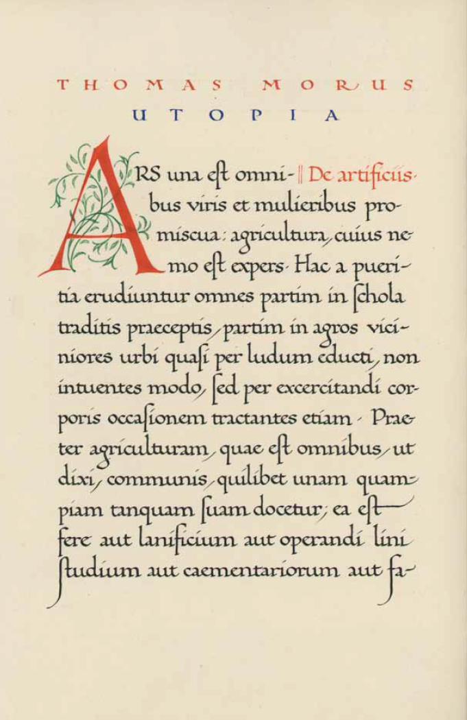
Jan Tschichold. Utopia by Thomas More. Manuscript book on handmade paper, 10 x 7 inches. 1920.
LEFT: Marsha Brady. Limited edition multi-color silkscreen print on black moldmade paper, 22 x 16 inches. 1990. RIGHT: Julio Vega. Pen and gouache on moldmade paper, 17 x 14 inches. c. 1990.
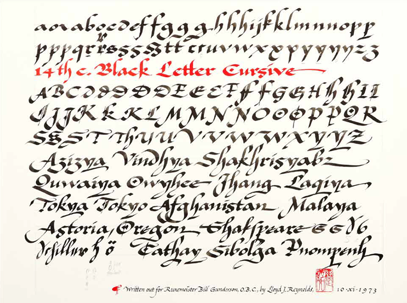
Lloyd Reynolds (founder of the Calligraphy program at Reed College). Limited edition offset print in two colors, 600 copies, 17 x 22 inches. 1973.


