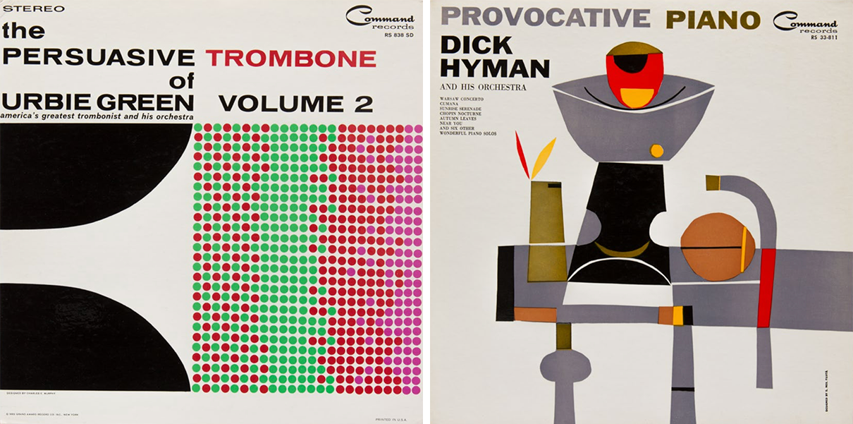
Charles E. Murphy, Designer
In 1939, the year that graphic designer, art director, and record cover pioneer Alex Steinweiss created the first original record album cover design for Columbia Records, Newsweek reported an increase in the sales of shellac 78 rpm discs to the tune of 800 percent. Before this, records limited to six or seven minute durations per side were fitted into craft paper sleeves, bound into an actual “album” with the title embossed on the spine. They were displayed spine-out in music stores in a manner called “tombstones”. Why it took so long to discover that using artwork was a better marketing strategy is anybody’s guess. There were precedents, of course: illustrated film posters induced audiences to buy tickets; illustrated sheet music covers were more seductive; and illustrated dust jackets teased potential readers into acquiring books, although the custom was to discard them once they were shelved at home. Records were, in fact, advertised through pictorial cardboard, easel-back countertop displays.
Yet self-contained advertising was more impactful. Album cover design hinted at the feelings, moods, and styles imparted by the recorded music. It added visual allure to the overall listening (and seeing) experience and because it also protected records from damage, album covers had indefinite shelf-lives.
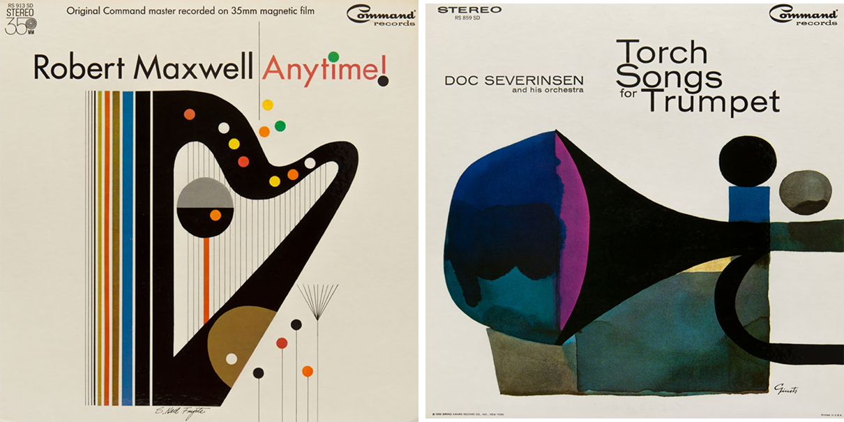
LEFT: S. Neil Fujita, RIGHT: George Guisti
Album covers had pride of place in the commercial design world too. Initially they were a tabula rasa, empty canvases that were less proscribed by constricting marketing rules and industry taboos than were other kinds of consumer packaging. There were myriad styles of illustration and typography as varied as the sounds emanating from the discs themselves. Also specific visual cues were created through graphic tropes to help the consumer distinguish classical from pop from avant garde from spoken word, etcetera. While the quality of art and design did not always directly drive record purchases, if a particular piece of music hit the right chord, its illustrated album cover would invariably become iconic too.
By 1948 with the advent of the music industry’s standard microgroove plastic 12” 33-1/3rd vinyl LPs cover art was perhaps more essential than before. One reason was that record stores large and small began to open all over the United States leading to a growing industry. As new labels entered this competitive marketplace, musical genres demanded more aggressive marketing. Record containers were art directed to reflect the range of music and the popularity of musicians. Even before the 1950s, jazz and other experimental genres were starting to hit high notes and topped the charts with such labels as Blue Note, Paramount, Westminster, Verve, Prestige, and Riverside Records, among others. Many of these labels were as hip for their art and design as for their sonic grooves.
LEFT: Charles E. Murphy, RIGHT: S. Neil Fujita
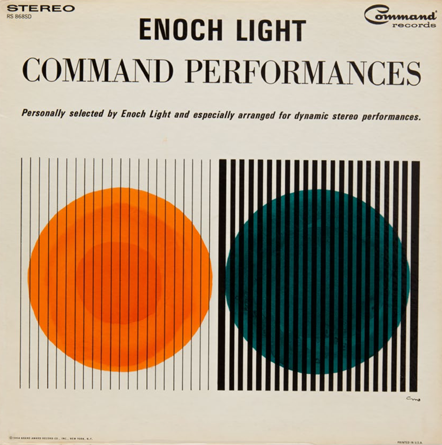
One of the era’s most prodigious labels, Command Records, founded in 1959 by band leader and recording engineer extraordinaire, Enoch Light (1905-1978) and George Schwager, made innovative sounds come alive through the tireless development of stereophonic exactitude. Producing their brand of progressive percussive, rhythmic string, and big band jazz music, Command aimed at “discriminating people who desire the finest in sound.” They recorded such talents as Tony Mottola, Count Basie, Dick Hyman, Buddy DeFranco, The Ray Charles Singers, and Light’s own Light Brigade. But Command’s most significant contribution was its “painstaking research into all phases of the recording field,” states the standard liner note on most of Command’s albums, along with the “pledge that they will produce only recordings which will contribute to your musical enjoyment and successfully meet your high quality standards.” Command accomplished their goals through sound fidelity that could only be achieved with multiple microphone pick-up: “From the origin of the sound in a large acoustically perfect studio to the editing and re-recording to the final pressing of the record only the finest equipment is used.” This was, after all, the hi-fi age.
Command was originally called Command Performance Records and later became Command ABC-Paramount with offices in the Paramount building on Times Square. It was produced largely with the devout audiophile in mind. Although it is not as famous today as, say, Blue Note, it is nonetheless as significant for its graphic design, a stunning mixture of Midcentury Modern typography and abstract graphic art.
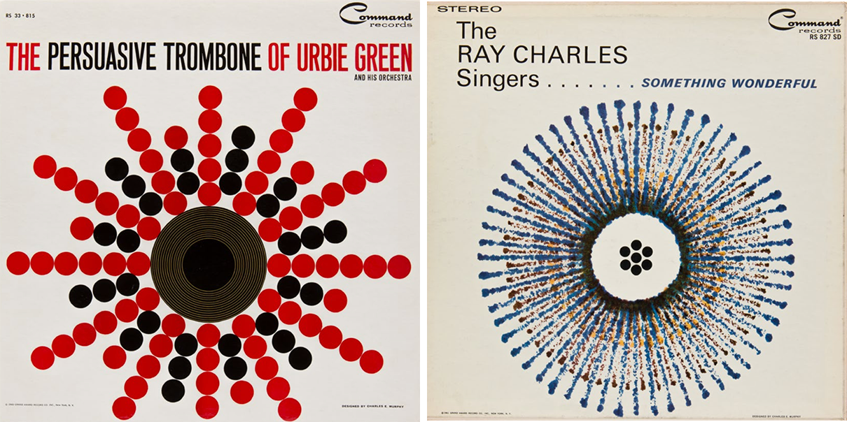
Both by Charles E. Murphy
Pictorial abstraction was a visual corollary to the improvisational music that was emerging from Command Records’ studios. How deeply involved Light or Schwager were in the selection of cover artists is unclear, but they obviously preferred an abstract approach and trusted the designer and painter Charles E. Murphy (1933-2005) to design many of them on his own and be art director for a host of other well-known designers on a variety of jazz, easy listening, classical and pop releases. Murphy, with a penchant for modern art, color theory, and jazz, studied at Yale School of Art and Architecture and was taught by the Bauhausian painter and color theorist Josef Albers. Murphy maintained his old-school-ties when he later commissioned Albers for the covers of the Persuasive Percussion and Provocative Percussion series, on which he employed purely non-representational yet extremely provocative geometric forms. These were arguably Albers only commercial assignments in the United States.
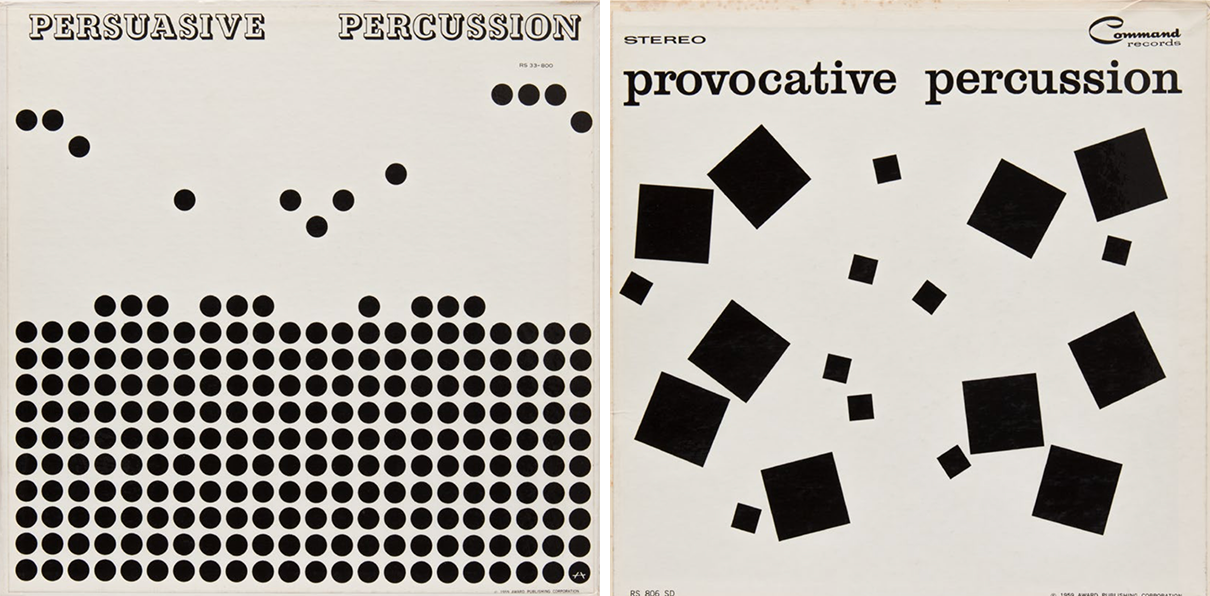
Both by Josef Albers
Murphy was more versatile than his former teacher. While also fond of abstraction, his collages and drawings were more representational (see The Persuasive Trombone of Urbie Green Vol 2) and he often played with typefaces in a demonstratively illustrative manner (see Bongos Bongos Bongos and The Urbie Green 6-Tet). He further injected some witty elements seemingly influenced by the likes of Paul Klee (see Fabulous). His approach to pure and symbolic geometry and playful linearity became the basis for Command’s visual identity, which also included the abstract expression of George Giusti, one of Murphy’s close friends, and S. Neil Fujita, who were also known as Midcentury Modernists and for designing dozens of book jackets and covers. Guisti also took this opportunity to experiment with drawing and collage.
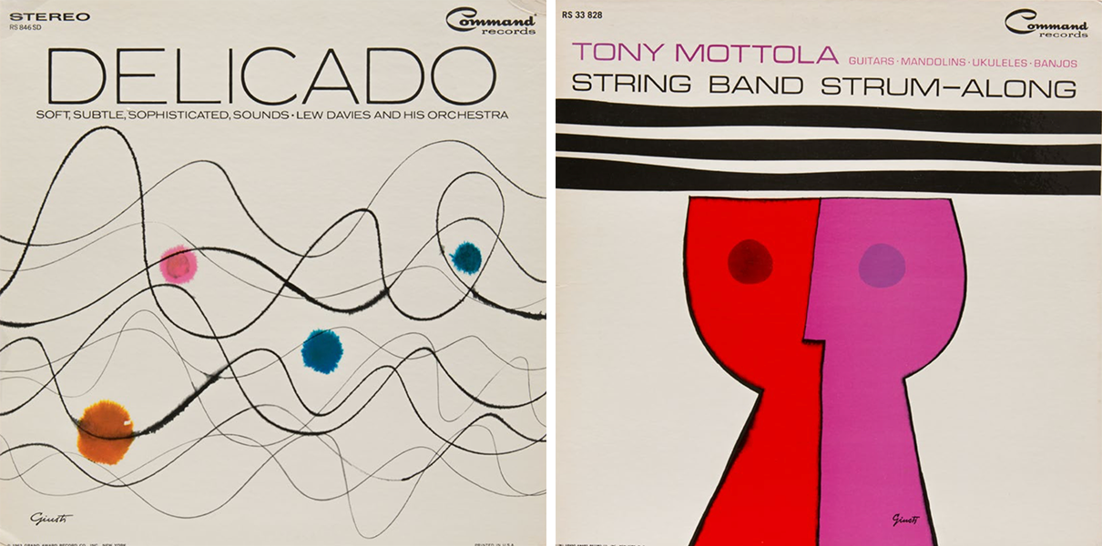
Both by George Guisti
Today the Command covers exude a contemporary sensibility yet also underscore a curiously bygone design aesthetic. Indeed, not everyone at the time was as smitten by the graphic direction as I am. The veteran Modernist designer and teacher of graphic design history, Lou Danziger told me: “Of course I saw the work which I generally did not care for [because] many look like design school exercises.” Yet as a company vision they, at least, hold together.
Whether or not they were perceived as more style over substance at the time of their creation, today Command Records covers are striking for the graphic and branding power of the abstract format. They are also vividly identifiable not only because of Command’s mnemonic script logo that sits usually in the right hand corner, but for another key characteristic: All images were printed against a white background. Now that’s good art direction.


