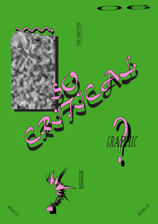
Poster by Darius Ou Dahao from the self-initiated Autotypography series, 2012-13
Critical graphic design is a vague and subjective term. The meaning of the word “critical” in relation to graphic design remains unclear, resulting in an overuse and misuse in design magazines, books and websites. The term was popularized by the much-cited traveling exhibition Forms of Inquiry: The Architecture of Critical Graphic Design first shown in 2007, and by the Dutch design studio Metahaven, among others. Yet, the ambiguous criteria used by the Forms of Inquiry curators to support the term, and designers’ struggle to match the ambitions of their political, social and cultural research with its visual output, indicate a continuing need for critical discussion of critical graphic design.
In recent years, however, there has been disenchantment and even skepticism toward graphic design work that is labeled as critical. If we look for critical graphic design online, the first search result is an open-submission Critical Graphic Design tumblr predominantly filled with humorous responses to design work, designers, publications and institutions generally associated with the term. Here, we can listen to the designer Michael Oswell’s satirical electro track, “The Critical Graphic Design Song,” absurdly repeating the names of designer Zak Kyes (co-curator of Forms of Inquiry) and Radim Peško, whose typefaces Kyes often uses in his work. Also mentioned is the popular blog Manystuff, which disseminates many works commonly described as critical, though its press-release style of presentation is inherently celebratory and uncritical. The tendency to gather and repeat familiar names shapes an echoing, self-referential canon that is automatically self-validated.
An updated post-financial crisis cover created for Adrian Shaughnessy’s book How To Be a Graphic Designer Without Losing Your Soul suggests that criticality is a luxury in the current conditions under which graphic design is produced. Other works include parody photos of Metahaven’s three-dimensional representation of Sealand, and images that imitate the visual styles of some of the most celebrated critical designers and academic institutions — Yale is often mentioned. These references seem to have three different goals: (1) to provoke the “critical graphic design” clique exemplified by the participants in Forms of Inquiry and the recent exhibition All Possible Futures; (2) to express disappointment toward traditional forums for public debate and legitimation: essays, lecture series, publications and academia; and (3) to challenge the shallow and predictable stylistic approaches used by designers to address critical issues. As the nonsensical critiques, literal illustrations and animated GIFs appear on the screen, they raise some pertinent questions about critical graphic design: What does this poster or image add to the issues at stake? Where is the critique? How does it contribute to written modes of research? What are the criteria and who makes these decisions?
This is not revealed on the Critical Graphic Design tumblr, nor does there seem to be any intention with most of these responses to construct a coherent argument. Despite their popularity online, these critiques of criticality also remain largely unquestioned. Are these hacks really contributing to a better understanding and questioning of these undebated trends? Or are they merely tickling the clique they intend to provoke? Are LOLz enough? Can jokes bring down (supposedly) critical design projects? Most of the submissions online reveal an ironic suspicion toward critical design and this attitude will presumably be reflected in the critics’ own practice, as they try to avoid doing what they criticize. A clarification of what is meant by “critical” may provide some answers.
In the book The Reader (2009), the design researcher Ramia Mazé suggests three possible forms of criticality in design. The first has to do with a critical attitude toward a designer’s own practice. The designer makes an effort to be self-aware or reflexive about what he or she does and why. Mazé argues that this can be understood as a kind of internal questioning and a way of designers positioning themselves within their practice. The second form is the “building of a meta-level or disciplinary discourse.” This involves what Mazé calls, “criticality within a community of practice or discipline,” and trying to challenge or change traditions and paradigms. Designers are critical of their discipline while actively and consciously working toward its expansion and evolution. In the third kind of criticality, designers address pressing issues in society. The critique is not targeted at a designer’s own discipline, practice or even at design in general, but at social and political phenomena. In practice, the three modes of criticality often overlap, intersect and influence each other.
Mazé’s categorization is not new. A direct connection can be made with the Dutch designer Jan van Toorn’s view on design pedagogy. As a design educator, Van Toorn tried to raise awareness of the tension between private and public interests. In User-centred Graphic Design (1997), he argues that the “student must learn to make choices and to act without attempting to avoid the tensions between individual freedom, disciplinary discourse and public interest.” This assertion of the personal, disciplinary and public levels that a designer should always consider anticipates Mazé’s three forms of criticality.
Two influential European design schools focus on the development of critical design practice. The Werkplaats Typographie (WT), founded in 1998 by the Dutch designers Karel Martens and Wigger Bierma, bases its educational model on a modernist form of reflexive practice, following the idea of the “workshop” developed by the English typographer Anthony Froshaug and designer Norman Potter. The WT normally concentrates on typography as a point of departure in assignments set either by the school, external clients, or the students; these usually take the form of publications. The WT’s type of criticality falls between the first and second definitions put forward by Mazé.
The other Dutch design school with a strong critical orientation is the Sandberg Institute, which emphasizes the third type of criticality. Its design department presents itself as a “Think Tank for Visual Strategies,” with students seeking critical reflection and engagement through work that explores design’s role and potential in relation to public and political issues and public discourse. Some examples of this are Femke Herregraven’s Taxodus, Ruben Pater’s Drone Survival Guide, Noortje van Eekelen’s The Spectacle of the Tragedy, Belle Phromchanya’s The Rise of the Moon and Simone C. Niquille’s Realface Glamouflage.
Despite the rejection of the label “critical graphic design,” most notably by the designers Stuart Bailey (in Dot Dot Dot no. 20, 2010) and James Goggin (in Most Beautiful Swiss Books, 2008), the term is still relevant. It emerged at a time when the discipline was in a generally uncritical state, providing a necessary distinction from routine practice and awarding a kind of merit badge to designers or studios who deviated from the norm. For designers who scorn the label, criticality in its many forms is intrinsic to graphic design and therefore a special term is unnecessary and redundant.
The term also highlights an important transition in graphic design practice and education: from the designer as author to the designer as researcher. This is not only a consequence of the maturation of the discipline, seeking legitimacy to be used as an investigative tool, but also the result of an increased importance of the social sciences, humanities and their multiple research methods being applied, changed and appropriated by design education and designers. On the one hand, graphic design aims to use its own processes and production methods to contribute new knowledge to the areas it works in. On the other, the absorption of ethnography and data collection methods shows an increasing reliance on other disciplines’ methodologies. The widespread presence of “design research” in design’s lexicon is a sign of these developments, despite recurrent confusion as to what constitutes research in graphic design.
In the age of Behance, of earning badges and appreciations, when one of the most used words in the site’s feedback circle is “awesome” and likes and followers are easily bought, graphic design has another opportunity to reexamine its apparently incurable allergy to criticism. Within interaction design, speculative and critical design is now being openly questioned and the critical design projects’ political accountability and relevance to society debated.
As a term, critical graphic design will probably be replaced in the permanent rush to coin the next soundbite. Criticality in graphic design will surely continue to be a topic for discussion, but a design work is not instantly critical just because of the intentions of the designer, or the pressing issue being researched. A talk, song, scarf, flag, web meme, website, installation or publication may all be valid ways to pose a critique. However, it’s time to publicly discuss the means, effects and especially the quality of the critical design projects, not just to celebrate and retweet them. If that doesn’t happen, critical graphic design runs the risk of not being as substantial and meaningful as it could be. Or worse, it will become irrelevant to society. For a discipline that aims to contribute to public debate — let alone social and political change — that would be a disastrously wasted opportunity.