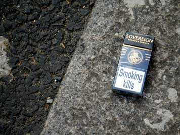
London gutter, 2005.
It is early winter, 1894, and a young woman, a servant to a prosperous New York family, finds herself in need of immediate medical attention. Poor and illiterate, she takes it upon herself to seek a remedy for her discomfort by scanning the shelves of her employers' pantry, where she spies a bottle whose label features a skull and crossbones. Unknowingly, she downs a swig or two, whereupon she collapses in agony and is rushed to the hospital. Miraculously, she survives, later telling the police that she selected this particular bottle because of the picture on the label — a picture of bones. "I thought it would heal my aching limbs," she confesses. "I had no idea it was poison."
A true story. And blessedly, we've come a long way since then. But the notion of truth-telling on a label remains a tricky enterprise. In the United States, regulatory commissions like the Food and Drug Administration require warnings and printed counterindications to alert consumers not only to potential sources of poison, but to other possible dangers related to food, medicine and cosmetics, among other things. There's a no-nonsense specificity to such literature, leaving no wiggle room, no space for interpretation.
In this context, the role for design — and by this I mean the introduction of what might well be more persuasive visual and verbal solutions for critical warning information — remains fundamentally restricted by what is, in the end, legally permissable.
Take cigarettes, for instance. As early as 1492, Christopher Columbus wrote about smoking as a social activity in his journal. By the sixteenth century, tobacco had successfully migrated to Britain. Even then, smoking was not without its detractors: early in the seventeenth century, King James I of England described it as "[a] custome lothsome to the eye, hatefull to the Nose, harmefull to the braine [and] dangerous to the Lungs." Spring forward some 350 years later, when at long last, the Surgeon General of the United States issues a report on smoking and health; within a year, the Federal Cigarette Labeling and Advertising Act of 1965 mandates that cigarette packages come with warning labels that read: "Caution: Cigarette Smoking May Be Hazardous to Your Health." (Five years later, the label is dramatically amended to read: "Warning: The Surgeon General Has Determined that Cigarette Smoking Is Dangerous to Your Health.") Over the next few years, subsequent laws would come to prohibit things like smoking on airplanes, in offices and restaurants. By 1991, 77 countries required health warnings on their tobacco products.
In spite of such warnings, every year, nearly 350,000 Americans still die of lung disease. In 2003, the World Health Organization predicted that without government intervention, smoking-related diseases could claim the lives of as many as 10 million people per year by 2020. But government intervention can't be the only strategy for change. (For starters, nicotine, the main ingredient in cigarettes, is a highly addictive drug, and treating addiction is a personal — not in principle a judicial — matter.) Part of the problem with smoking is perceptual, and indeed, visual: what do people see when they look at a pack of cigarettes — and what don't they see? Despite efforts by government agencies and public health organizations, smoking has, over time, accumulated a set of visual references that have done more to boost the tobacco industry than to thwart sales. Yet this, too, may change: A U.S. district judge ruled last month that, by suppressing documents and manipulating language, the tobacco industry engaged in a decades-long racketeering enterprise that conspired to hide the dangers of smoking from the American public. (Hard to imagine that the Racketeer Influenced and Corrupt Organizations Act [RICO] will make a dent in cigarette packaging design, but who knows?)
In the meantime, though, cigarettes remain devilishly alluring on the screen. Smoky and sultry, they're the stuff of romance, of drama and nuance and beauty and sex. From Marlon Brando to Marlene Dietrich to the Marlboro Man, cigarettes are the ultimate gender-neutral prop, making men more masculine, women more feminine, wartime more tension-filled, parties more fun. (The number one cause of preventable death, more fun? ) We all know that cigarettes are bad news, yet we continue to buy into the fantasy that somehow, the damage they inflict is inversely proportionate to the way they make us feel. We all know that the statistics don't lie, but kids still get the message that it's hip to smoke. We abide by government regulations stipulating best practices for labeling, but the words fall flat. At the end of the day, the label that reads: "Warning: The Surgeon General Has Determined that Cigarette Smoking Is Dangerous to Your Health" — or the shorter, more menacing British version "Smoking Kills" ("Fumer Tue," if you're French) — has the same relatively insignificant impact that a certain skull and crossbones once had for a poor servant girl. What's the label's responsibility, if not to remind the individual of same? Not to put too fine a point on it, but to ignore a label that says, in effect, you are hastening your own premature death by deliberately choosing to fill your lungs with chemicals is a kind of willful illiteracy, is it not?
It turns out that language may be precisely the problem, and while I'm not one, in principle, to applaud the effects of scare tactics, this may be one instance in which pictures speak much louder than words. This past summer, the European Commission developed 42 picture health warnings for countries in the European Union to use on tobacco packs. They hosted an online web survey to poll the public and thereby help determine which images will be most effective in the UK. Not surprisingly, studies have shown that images have a greater impact than written health warnings alone. "We now need to refresh our approach," notes British Health Secretary Patricia Hewitt, " by introducing new hard-hitting images." Back in 1980, the French issued a postage stamp that gently put the burden of responsibility on the individual: "Your choice — tobacco or health." A quarter-century later, it's still a bit of a leap to hard-hitting, and it remains uncertain whether Hewitt's agency will follow Canada's or Australia's lead — whether they'll embrace other, even more graphic images that if nothing else, serve to effectively highlight the less glamorous side of an addiction that remains, quite simply, a global epidemic.
And how do you brand an epidemic, anyway — with carefully worded warning language? With color-coded stripes? With a skull and crossbones? Bear in mind that beyond Jolly Roger and The Queen's Royal Lancers lies an entire society at Yale. Once the allegedly chilling skull and crossbones is marketed as a decorative pattern on a silk bowtie, its credibility as a mark of peril seems, well, somewhat questionable, begging the question: have we become so bored by life that we've inadvertently become inured to death?
Years ago, at the height of what was, in retrospect, a pronounced surge in new commercial real estate on Manhattan's Upper West Side, it seemed for a time as if new retailers were cropping up on an almost weekly basis. An editor friend of mine joked that our local funeral home was going to renovate and reopen as "Death 'N' Stuff" — a friendlier, more accesssible funerary destination for the newly-bereaved. But death isn't warm and fuzzy: it's cold and hard and scary, inescapable and yes — for each of us, inevitable. Which is precisely what makes the design and creative writing on the cigarette package a curious case study. True, the skull and crossbones have long expired as spooky harbingers of doom. Yet so, too, has the expectation that people are actually alert to portent. (When was the last time you paid attention to the airline safety film before take-off?) Where cigarettes are concerned, the very notion of warning — whether visual or verbal — is clearly not enough. The question is one of social responsibility, of moral comprehension and of a deep and abiding concern for public health. To dismiss this problem — long-standing and epic in scope — as one of the government versus the individual, or the tobacco companies versus the health organizations, or the health organizations versus the insurers — is simply irresponsible. We're all at risk. We're all affected. We're all mortal. Consider yourself warned.


Comments [25]
09.21.06
07:21
09.21.06
09:23
09.21.06
10:22
I don't think we've become "inured to death." I think most people are so afraid of death that we try not to think about what it really is. When we do have to address death, we treat it more as an abstract concept than anything else.
Good post.
09.21.06
11:01
I've written about this before, quite possibly in commentary on this very site somewhere, but I really don't think the warning labels are a deterrent. Some survey may prove me wrong, but to the people I know who smoke (not me, I don't smoke Canadian cigarettes), the ads are rather a source of amusement, although some men go out of their way not to get a pack that warns about impotence. And to be completely honest, the first time I saw the hideous blackened brain on a pack I laughed out loud.
Regulators seem to fail to appreciate the allure of the dark side. The skull and crossbones, while effectively neutered by now, is still a symbol of "bad," and incredibly, still serves as a "cool" icon across the teen market.
Your mention of movie screen idols who smoke is a bit out of date. In current movies all the cool people smoke: it is an ingrained link with the hard case; the dark, isolated one; the man or woman with that self-destructive edge that so many people are drawn to.
That's the image that the pictures of mouth cancer are up against. Graphic design is a puny little peanut compared to the swaggering giant of the movie industry.
09.21.06
11:17
09.21.06
11:22
09.21.06
11:37
09.21.06
02:09
I notice the UK report refers to polls where people say what they think of the campaign...not actual, measured behavior changes. So it's all pretty suspect. Want to reduce smoking? Do what we here in New York do: tax the heck out of them. At $8 a pack, price is a darn good motivator.
09.21.06
04:56
09.22.06
08:21
And it's no surprise that images are more effective than text. Imagine entire societies taking up smoking because "The Surgeon General had determined that smoking is beneficial to your health." No, it took photos of sufferagettes smoking in the papers to do get everyone smoking.
09.22.06
01:30
1. Don't be illiterate like the woman in the story. 2. Don't just put something in your body because you feel bad... like the woman in the story.
Not to mention some awesome new aspiring fine artists are doing the package design for Camel, like Martha Rich... (Here's a direct link to a pack)
And I'm not even a smoker.
09.22.06
02:15
Here in NYC,what really gets ones attention more than any graphic design statement is the price tag of $8.50 per pack. I remember as a kid buying cigarettes from vending machines for 35 cents: I was able to develop a taste for tobacco at a very young age that my children thankfully will never be able to emulate, simply because of the expense.
09.22.06
11:06
2."They" can set policy of control requiring a standard graphics at the larger side of cigarette packs. I am sure there would be many brilliant ideas of how the graphics could be. But then again, what's the design brief?
3. I have warned you. Don't you see the little note on the cigarette pack? Duty done.
look fr studio LDA
09.23.06
05:05
Sorry to quibble but no; it is not. I don't quite understand the urge to transpose categories. (Why should everything we're against be terrorism or fascism or rape or genocide?) Illiteracy is the inability to read, not the choice to ignore something that can be read.
09.23.06
01:42
09.23.06
10:20
H. Michael Karshis
09.24.06
11:49
good post!
09.24.06
08:48
09.25.06
03:26
09.25.06
04:25
09.25.06
11:51
Respectfully,
09.26.06
01:49
10.05.06
12:57
Their Burger King Big Fat Fucking Cholesterol King Costume Sandwich campaign is effective as well. They saw that McShit had to start pumping out Asian Salads after Super Size Me and figured that there was the demand and why not market to that audience. I am not knocking them at all. I love Burger King. I ate a Sausage Egg & Cheese Crossiant today for breakfast. I just wanted to point out the obvious detachment that most people in advertising/marketing have for what their product does to the consumer.
I bet you a million dollars that someone who has done work for truth.com sneaks a fag in when no ones looking.
11.03.06
02:48
03.21.07
11:31