
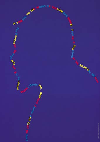
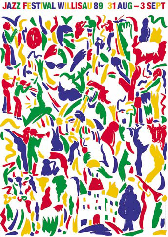
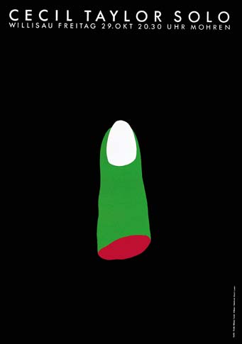
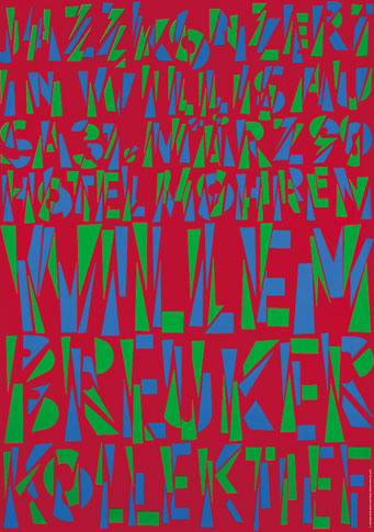
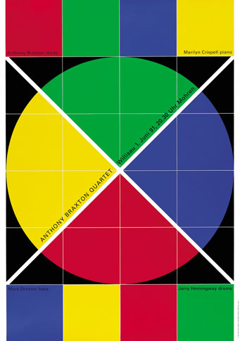
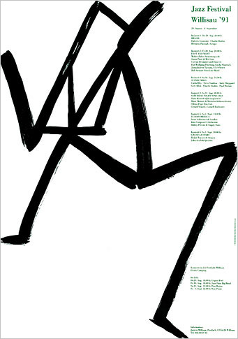
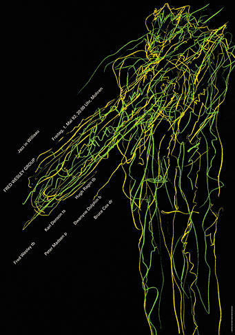
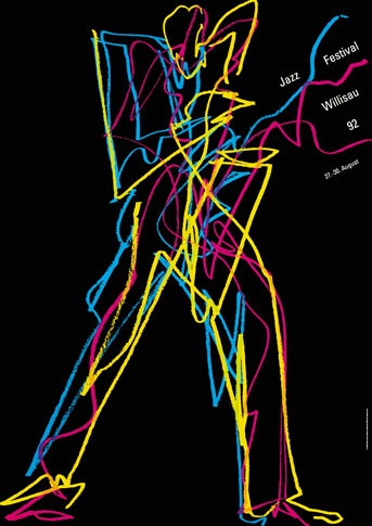
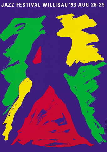
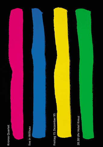
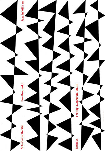
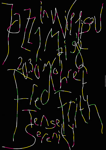
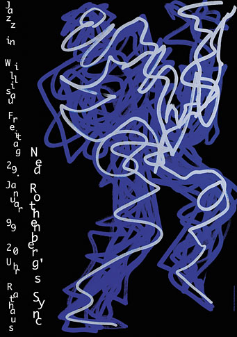
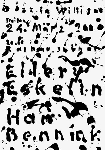
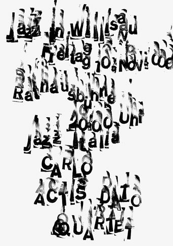
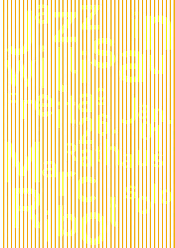
Niklaus Troxler is a graphic designer. Niklaus Troxler is a jazz fanatic. Nearly forty years ago, Troxler invited a jazz group to play in Willisau, the small Swiss farming town he calls home, and thus it began: Willisau became established as an unlikely destination for jazz musicians and their fans, and Troxler began to acquire a reputation as a designer to watch. Today, his work is exhibited, published, and collected all over the world, and Jazz Festival Willisau — which has hosted Keith Jarrett, Lester Bowie, Dewey Redman, McCoy Tyner, and the Kronos Quartet, among many others — is about to celebrate its 37th year.
The posters that Niklaus Troxler has designed to promote jazz in his home town can be viewed as a single, self-initiated project that has developed over five decades, a body of work that has few, if any, precedents. Spanning an astonishing range of styles, the posters are united by a single thing: the passion of a single man who serves at once as designer and client.
Many young designers dream of a world where they can set their own agenda and create without boundries. For most of us, this remains a fantasy. Niklaus Troxler proves that it can be done.

This essay was originally published January 30, 2007.


Comments [28]
VR/
01.30.07
07:47
Frank
01.30.07
11:51
Designing without boundaries-- to jazz... how beautiful.
01.30.07
04:49
01.30.07
06:17
01.30.07
06:35
01.30.07
08:31
I admire designers who can stick single-mindedly to a restricted visual palette for years. Troxler is not one of them. His imagination is restless, and when I view the breadth of his work (particularly in Jazz Blvd., his monograph from Lars Muller Editions), I can see the reiteration of 40 years of graphic design history in real time: Pushpin, Tissi, Fukuda, even Muller-Brockmann. What impresses me is that rather than settling into a groove, he keeps jumping genres, pushing himself to find something new.
If you decide you're going to do nothing but use Akzidenz Grotesk for the rest of your career, you can devote yourself to a lifetime of refinement. If, on the other hand, you decide to never repeat yourself, you dance with disaster every time. Troxler has guts, and I applaud him.
01.30.07
11:16
01.31.07
12:33
01.31.07
02:40
01.31.07
02:15
So What?
VR/
01.31.07
07:08
01.31.07
11:31
I've been told in the past that Troxler's work has been so widely imitated that he's arguably set something of a standard for jazz festival/concert graphics worldwide. Though I can't say so authoritatively, perhaps that's why his style may seem common from your standpoint. Many of his posters, I believe, are still popular and in demand.
...Troxler is sort of all over the place...
I always find this to be a rather irritating criticism. To me, a wide diversity of approaches -- some of which, obviously, will be pulled off better than others -- should be one of a designer's greatest strengths.
To paraphrase Dylan (among others): an artist should be in a constant state of becoming. I applaud anyone who constantly experiments and pushes themselves beyond existing boundaries into new territory, even when some of the output will invariably be duds (a.k.a., noble failures).
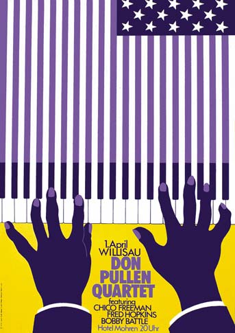
And while a trademark underlying "feel" is perhaps every auteur designer's aspiration, I just don't understand why being bottled into one unchanging style would be considered laudable. In Troxler's case, I love that the last poster (McPhee) looks so absolutely different from the first (Pullen).
I do, however, like your point about bridging the connection between poster designers and their subjects. I know Victore has said some interesting things on that subject.
... despite the fact that he is faced with the same problem over and over again...
Well, sometimes graphic design should be more than just solving a problem, right? It can also be expressing ideas, messages and feelings with exuberance, vitality, humanity and heart, visually conveying the magic or wonder or energy of a particular facet of life -- right?
And I don't think anyone would ever say that, whether seemingly "Kenny G-ish" (to use tarpitizen's words) or not, Troxler's designs lack heart.
Now, having mentioned all that, some of Troxler's posters aren't so much my cup of tea stylistically either, while others I'd consider practically sublime.
Regardless, to be so dismissive of the guy, and accuse him of being "oversold" in this instance, seems kinda narrow.
...Many young designers dream of a world where they can set their own agenda and create without boundries...
In some ways, Michael, that's one of the most inspiring aspect of Troxler's work, given the backstory.
Lastly: thanks Joe Moran -- that movie is amazing!
(Uh, Mr. Pez, I think Mr. Moran was just being playful/tongue-in-cheek: obviously "So What" is the name of one of Miles Davis' most famous songs, as played in that linked YouTube movie, which contains among the most well-known opening refrains in jazz. Common knowledge, right?)
02.01.07
07:09
02.01.07
07:40
As Jon Resh points out, "So What?" is the first track on Miles Davis's Kind of Blue, the greatest jazz album ever released. (Discuss.)
I met Troxler for the first time about 15 years ago, and I began to follow his work then. He was in New York for an Alliance Graphique Internationale conference. He is one of the most warm-hearted, big-spirited, fun, and funny graphic designers — or make that people — in the world.
02.01.07
08:50
I think this brings up an interesting point when looking at a persons body of work (in general - of course this is an incomplete section of Troxler's work). Within graphic design education, I see two schools of thought on the subject of diversity and style. While one insists that we must diversify our portfolio (whether that be in style, or medium), another school of thought condones creating and developing a style and/or specialization - to direct ourselves with a particular goal in mind. Right now, I'm sitting on the fence on this one. And while Troxler's work clearly shows influences from the styles of 'other people,' what designer isn't affected by the visual aesthetic of others? I think to be uninfluenced (to not interact with) culture and style in some way is to be removed from culture, and that is a shame. Besides, experimentation is fun even if that means you risk 'danc(ing) with disaster'.
I enjoyed Troxler's posters, but I think I would have appreciated them more had I been at the event to experience these wonderful musicians perform.
02.01.07
10:52
02.01.07
02:16
I was relieved to read that Mr. Troxler still has a fighting chance to be accepted by some of the D.O. readers' "A" list, that he survived the meticulous critique and deconstruction of his exuberant posters, his lifelong passion. As for the apparent unevenness of his design efforts -- I can only applaud Troxler's willingness to take chances and the risk of "failing" at times. That's the beauty of his efforts: a freedom of singing new songs from an old soul...
As for Tarpitizen's comment on "... any one of those Polish guys whose names I can't spell..." maybe as a Polish émigré in New York I can help a bit here: certainly R. Szaybo, J. Lenica, H. Tomaszewski, among others, did great jazz posters, including the brilliant ones by Waldemar Swierzy.
Lastly, as a graphic designer whose own last name has been misspelled hundreds of times over the last 25 years by my fellow Americans (somewhere in our office is an "Alterations" folder with the more creative interpretations), I couldn't help notice that by now, one would think, it should be clear to D.O. visitors: it is Michael Bierut who writes the insightful posts here and not Beirut.
Please, if you can, support the March 10 AIGA/NY event -- I, with thanks, am.
Jurek Wajdowicz
www.DesignEWS.com
02.01.07
03:47
"Having a non-style is more slippery, amusing, and surprising than sticking to one nice recognizable look. It's a way of staying half-awake, or noticing things, enjoying things and learning to love things— especially the vernacular and banal things that have been relegated to the garbage heap of design."
02.01.07
06:40
02.01.07
07:10
Two very different versions of one great song.
Hope nobody missed the second movie, like I've missed these posters for so long. Great stuff!!!
VR/
02.01.07
07:31
I was relieved to read that Mr. Troxler still has a fighting chance to be accepted by some of the D.O. readers A list, that he survived the meticulous critique and deconstruction of his exuberant posters, his lifelong passion. As for apparent unevenness of his design efforts -- I can only applaud Troxler's willingness to take chances and the risk of "failing" at times. That's the beauty of his efforts: a freedom of singing new songs from an old soul...
As for Tarpitizen's comment on "... any one of those Polish guys whose names I can't spell..." ¬¬-- maybe as a Polish émigré in New York I can help a bit here: certainly R. Szaybo, J. Lenica, H. Tomaszewski among others did great jazz posters, including the brilliant ones by Waldemar Swierzy .
Lastly, as a graphic designer whose own last name was misspelled hundreds of times over the last 25 years by my fellow Americans (somewhere in our office is an "Alterations" folder with the more creative interpretations) I couldn't help notice that by now, one would think, it should be clear to the D.O. visitors: it is Michael Bierut who writes the insightful posts here and not Beirut.
Please, if you can, support the March 10 AIGA/NY event - I, with thanks, am.
02.01.07
07:36
Many have already derided tarpitizen's response, so I hate to pile on, but if the repeating "problem" is JAZZ, isn't the fact that the work is continually evolving, always different, and a confluence of styles a perfect way to design jazz posters. I would think that you would try to illuminate the audience on the musician's style, not the designer's style. A series of posters on jazz that were always in the same style seems like a ridiculous notion.
Sorry to seem so cranky, but these posters are at least a refreshing change from the contemporary, flatsstock style rock posters of today. Most of these use the same printing techniques, the same hand hewn type and imagery and borrow extensively from the past. You can't pick up a design annual without being deluged by these. They are no different in Seattle or Austin, or Chicago. So what exactly are they saying about a band, or a place?
One more thing . . . JAZZ HANDS!
02.01.07
07:52
at The International Poster Gallery in Boston
Worth a click through...
02.01.07
11:22
Please forgive my boorish comment, Mr. Wajdowicz, it was written in the heat of my obviously cranky position on the mini-oeuvre (in the slideshow, anyway) of Mr. Troxler. But thank you for your list, because all four of the designers you mention make more interesting work than Troxler. I'm the last person to demand stylistic unity, though my statement about him being "all over the place" would seem to endorse that position. But my stand - and I'd detail it more here, but that would be too boring - is that Troxler is an interpreter of contemporary styles that he applies to his subject (jazz) and the fact that they are big and colorful about something that people love is why people are swayed by them. It's the opposite of "killing the messenger for the bad news;" here you have the messenger being elevated to the status of his subject when the actual work is just not as free, experimental, moving or "out there." I'm not saying he isnt' a nice guy. In fact, these posters have "nice guy" written all over them, in a way his subject does not. If he had spent his career designing posters utilizing the same stylistic gestures in the service of selling cold remedies or breakfast cereal, I don't think that would have gotten him into AGI.
02.02.07
12:00
My guess is that Tarpitizen is saying something more than "So What". Indeed she seems to be suggesting that Troxler is a "Freddie Freeloader". I give up. I admit that most everyone loves a clown. Why is this so? This is a serious question about popular culture and its nexus with graphic design and the communication arts. Troxler, judging by our discussion here, seems to be squarely within the center ring of the circus.
02.02.07
02:23
Kudos to Michael Bierut for bringing this man and his work before us.
Kudos to Niklaus Troxler for bringing the music of Jazz in Willisau both visually and aurally to those who won't be in Willisau anytime soon
...and kudos to Tarpitizen for inciting such lively and intelligent commentary from all who have written in this forum.
All too often graphic works are placed before us by an eminent designer or design authority and none dare question its validity. We just assume it must be something Important, even if we don't "get" it and feel we have much to learn. Or perhaps we have arrived at a stage where we are more trusting of our own instincts. Just as one should speak truth to power, those who do should not be excoriated for doing so.
Richard Salcer
02.04.07
09:18
02.07.07
05:19