“I hate it when graphic design is too graphic,” said Etienne Hervy.
It was a surprising remark coming from the art director of the International Graphic Design Festival, in Chaumont, France.
“Some designers are like fashion victims,“ he explained. “They just try too hard. The result is often pretentious.”
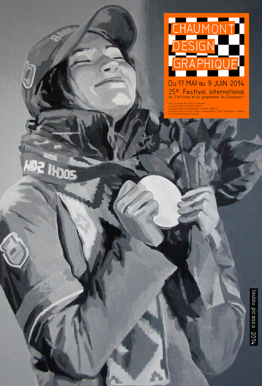
To avoid making too pretentious a statement, Hervy asked a painter, not a graphic designer, to create a pair of posters for this year’s event. Wasn’t Toulouse Lautrec a painter as well as an affichiste? So the assignment for the 25th anniversary of the Festival went to Jean-Louis Dupré, a.k.a Loulou Picasso, formerly from Bazooka, the legendary French Punk art collective from the 1970s.
Like Shepard Fairey, Dupré is a radical artist who works from photographs. Like him, he is famous for his casual appropriations of copyrighted pictures, which he translates, with broad brushstrokes, into frozen monochromatic tableaux. However, unlike the “Obey” hipster, Dupré doesn’t engage in ironic guerrilla marketing. The photographs he copies are not embedded with politically or socially relevant imagery.
Any resemblance to conceptual images, past or present, is purely coincidental. There is no correlation between the subject of the posters — a winner and a loser — and the fact that the Festival’s most salient feature is a prestigious international poster competition.
You don’t ask someone who calls himself Loulou Picasso to illustrate a mere concept.
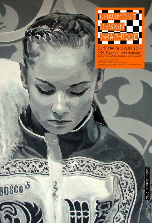
Dupré never explained to Hervy why he chose to portray two Sochi Olympians. Hervy never asked. The winner was Darya Domracheva, 27, an accomplished athlete who got three gold medals for her performance in the biathlon competitions; the loser was the lovely Russian figure skating prodigy Yulia Lipnitskaya, 15, who fell down twice during two programs, a victim of exhaustion.
Dupré had dimmed down the made-for-television, high-definition digital images and given the women’s faces an introspective glow. Darya’s and Yulia’s emotional responses, as they hear the verdict from the judges, are dramatized by a palette of grey tones, pure whites, and deep charcoals. No longer upstaged by their candy-colored Olympic uniforms, the young athletes seem to have reclaimed, for a brief moment, their private personae.
The girls are suddenly alone on the stage. The roar of the audience has died down. On the posters, the only graphic noise is a fluorescent orange label. It’s an indication that the warning light on the media machine is on.
“Graphic designers are into typography these days,” says Hervy. “They’ve left image making to advertising agencies. They’ve deserted the pictorial domain. Maybe this pair of posters will jolt them out of their complacency.”


Comments [2]
Really? So there's no correlation between 2 images of winners and losers and a poster advertising a competition where there will be winners and losers…
Hmmm…
05.23.14
03:37
Perhaps he means to state that graphic designers have renounced an interest in image-making for a vogue of _typo-graphic_ solutions? Given that my local magazine rack is now saturated with clones of Fantastic Man and The Gentlewoman, perhaps the pendulum will swing the other way?
06.01.14
05:33