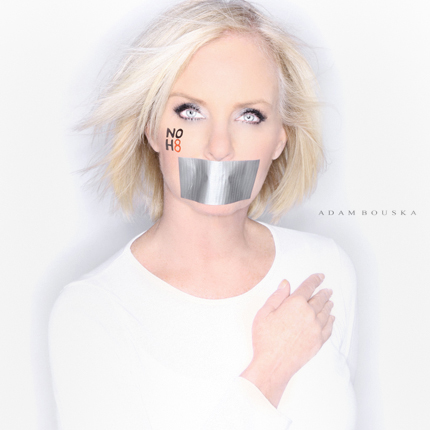
Cindy McCain posing for NO H8, photo: Adam Bouska
I don't know what to make of this image. Clearly, it's an over-Photoshopped portrait of Cindy McCain that looks like something straight out of the X-Files. Then again, the notion that Mrs. Maverick is openly championing gay rights is a bit alien after all.
Jokes aside, I can't help but admire her courage. How many Republicans do you know who are actively campaigning to repeal California's Proposition 8? How many conservative parents do you know who would publicly and unashamedly share the silence experienced by their children?
The photo is not merely a form of political dissent: it is the portrait of a mother's grief. Despite its formal shortcomings, the design manages to make the debate on gay marriage personal. Mrs. McCain is claiming that Proposition 8 isn't just about political disenfranchisement. It hurts families. It silences mothers.
For the design community, the image raises important questions on how we countenance the experience of social exclusion in our work. The McCain photo departs from most “No on 8” images by moving away from the language of “equal rights” and “justice for all,” and leaning sharply towards an expression of the personal and psychological effects of legislation like Prop 8 on the LGBT community and its supporters.
The image transforms the marginalized individual from what Anne Cheng, a Professor and Associate Chair of English at Princeton, would call a “subject of grievance” to a “subject of grief.” Grievance is the process of redressing social exclusion through legal or political means: basically, it's the right to your day in court. Grief is the traumatic, interior experience of denigration that accompanies marginality — the sense of shame you live with every day on account of your social class, race, or sexual orientation, for instance.
As an example, Cheng cites the Supreme Court's decision in Brown vs. Board of Education, which famously desegregated public schools. In the majority opinion by Chief Justice Earl Warren, the Fourteenth Amendment right to equal protection under the law was interpreted as an inadequate basis from which to rule. Instead, the opinion argued that segregating schoolchildren “solely because of race generates a feeling of inferiority...that may affect their hearts and minds in a way unlikely to ever be undone.”
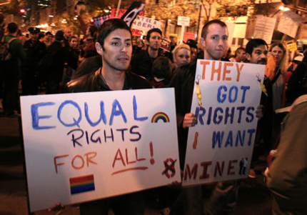
Grievance: Prop 8 Protestors Demanding Equality, photo: Ariel Soto/San Francisco Bay Guardian
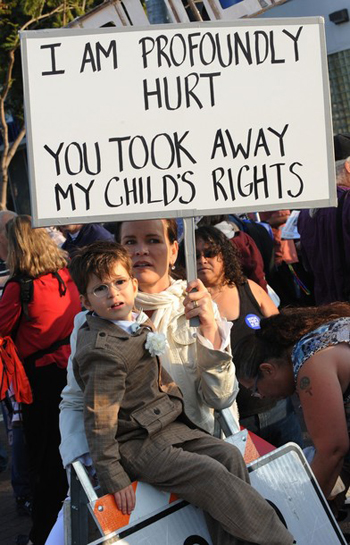
Cheng posits that we are “comfortable with the language of grievance, but not with the language of grief.” I think we often fail to distinguish between the two. A recent New York Times article on the children of same-sex couples was accompanied by a photo of Los Angeles mother Dawn Berg and her 5-year old son, AJ. In the photo, Berg's picket sign reads, “I am profoundly hurt. You took away my child's rights.” By addressing her personal pain in the language of her son's rights, she invites the criticism that her “selfish” insistence on a fatherless household harms her child in ways that Proposition 8 prevents.
Imagine if the sign read: “He is profoundly hurt. You took away my child's mother.” Empathy relies on an understanding of somebody else's grief, whether or not you agree with their particular grievance. This is not to say that we should sensationalize the experience of trauma or instrumentally inject children into the conversation whenever convenient. But if we're serious about social change, it is necessary to create design that examines the consequences of marginalization on a wider human scale. Our work should not merely address the political injustices wrought by discriminatory laws: it should register the sense of loss inflicted on those who suffer them.
Dawn Berg and her son AJ, photo: Mark Ralson/Agence France-Presse - Getty Images
It is naive to overestimate the effect of graphic design on the shaping of social perceptions. Most people don't look at a poster and suddenly decide that they're going to support gay marriage after a lifetime of steadfast opposition. Political and moral convictions run deep, and it is dangerous to assume that people are going to repudiate their beliefs simply because we tell them to. However, I think it is an even greater disservice to society to pretend that graphic design does nothing to continually define and redefine the visual and cultural milieu we are immersed in every day.
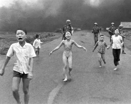
Take, for example, Nick Ut's iconic photo of the naked, Vietnamese girl fleeing from the bombing of her village by South Vietnamese forces, the napalm incinerating her skin, her mouth wide open in silent terror. The photo is credited with helping to change US public opinion about the war. Even for those of us who encountered it in our high school history textbooks, the photo is cemented into our cultural consciousness — a horrific reminder of the suffering of innocents amidst conditions of conflict. The visceral reaction we have to images like Ut's comes from a recognition of shared humanity — one that transcends national boundaries and political persuasions.
It is naive to overestimate the effect of graphic design on the shaping of social perceptions. Most people don't look at a poster and suddenly decide that they're going to support gay marriage after a lifetime of steadfast opposition. Political and moral convictions run deep, and it is dangerous to assume that people are going to repudiate their beliefs simply because we tell them to. However, I think it is an even greater disservice to society to pretend that graphic design does nothing to continually define and redefine the visual and cultural milieu we are immersed in every day.
Take, for example, Nick Ut's iconic photo of the naked, Vietnamese girl fleeing from the bombing of her village by South Vietnamese forces, the napalm incinerating her skin, her mouth wide open in silent terror. The photo is credited with helping to change US public opinion about the war. Even for those of us who encountered it in our high school history textbooks, the photo is cemented into our cultural consciousness — a horrific reminder of the suffering of innocents amidst conditions of conflict. The visceral reaction we have to images like Ut's comes from a recognition of shared humanity — one that transcends national boundaries and political persuasions.
Nick Ut's photo of the bombing of Trang Bang photo: Nick Ut/Associated Press
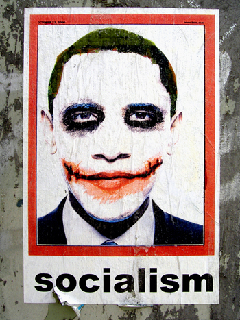
Just as design can be used to express the traumatic repercussions of social crises, it can also be employed to promulgate ideologies of hate and intolerance. In January of last year, University of Illinois college student Firas Alkateeb posted an image of Barack Obama retouched to look like the Heath Ledger-era Joker on his Flickr page. It has since been anonymously adapted into a poster captioned with the word “socialism” that has surfaced in a number of major metropolitan areas including Los Angeles.
The design is disturbing. Never mind that socialism and The Joker's anarchism have very little to do with each other. The poster paints Obama as white, with deep red gashes along his cheeks. It's likely that Alkateeb was just trying to “Jokerize” the president, but it is hard to ignore the racial subversion at work in the design, regardless of whether or not its creator had any racist intent. True, there have been equally damning portraits of George W. Bush-as-Hitler, but the Obama-Joker image damages the credibility of a country that has struggled to decouple itself from a history of slavery and racial subjugation.
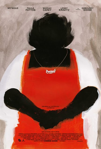
We need to fight back. The recent release of the promotional poster for Lee Daniels' film Precious does exactly that. The title character is an obese and illiterate black teenager who is pregnant with her second child. The design for the poster shows Precious in stark black, red, and white paint, her facial features entirely erased. The only sign of an identity is an ironic piece of bling around her neck. The design manages to capture the pain that typically accompanies racialized stigma and shame. It forces the audience to confront the reality that judging someone on the basis of their appearance alone degrades them to a status that is less than human. It illustrates the grief of a community that still struggles against the effects of institutionalized and internalized racism.
Just as design can be used to express the traumatic repercussions of social crises, it can also be employed to promulgate ideologies of hate and intolerance. In January of last year, University of Illinois college student Firas Alkateeb posted an image of Barack Obama retouched to look like the Heath Ledger-era Joker on his Flickr page. It has since been anonymously adapted into a poster captioned with the word “socialism” that has surfaced in a number of major metropolitan areas including Los Angeles.
The design is disturbing. Never mind that socialism and The Joker's anarchism have very little to do with each other. The poster paints Obama as white, with deep red gashes along his cheeks. It's likely that Alkateeb was just trying to “Jokerize” the president, but it is hard to ignore the racial subversion at work in the design, regardless of whether or not its creator had any racist intent. True, there have been equally damning portraits of George W. Bush-as-Hitler, but the Obama-Joker image damages the credibility of a country that has struggled to decouple itself from a history of slavery and racial subjugation.
We need to fight back. The recent release of the promotional poster for Lee Daniels' film Precious does exactly that. The title character is an obese and illiterate black teenager who is pregnant with her second child. The design for the poster shows Precious in stark black, red, and white paint, her facial features entirely erased. The only sign of an identity is an ironic piece of bling around her neck. The design manages to capture the pain that typically accompanies racialized stigma and shame. It forces the audience to confront the reality that judging someone on the basis of their appearance alone degrades them to a status that is less than human. It illustrates the grief of a community that still struggles against the effects of institutionalized and internalized racism.
The “Jokerized” Barack Obama
Promotional poster for the movie Precious, designed by Ignition Creative
Can we apply the same logic in the battle against homophobia? Unlike race, sexual orientation is usually invisible. One of the deepest difficulties LGBT people face is the task of coming out to friends and family. Here, I think we have a lot to learn from Lady Gaga. It is easy to ridicule her for creating indulgent, histrionic performance art that features over-the-top costumes and campy dancing. But in her most serious performances, she is externalizing a certain freakishness experienced by all people who have to hide some portion of themselves that mainstream society deems aberrant or even perverse.
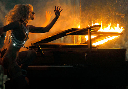
At the American Music Awards, she performed a song about her father's drinking entitled Speechless. After breaking a glass box containing a burning piano, she proceeds to smash liquor bottles while singing impassionedly about the experience of almost losing her father to heart complications as a result of his alcoholism. This personal narrative about her father coincides with a greater narrative about the need to confront “speechlessness” with honesty — to exorcise the sense of self-hate and fearfulness that shrouds stigmatized people in silence and shame.
Can we apply the same logic in the battle against homophobia? Unlike race, sexual orientation is usually invisible. One of the deepest difficulties LGBT people face is the task of coming out to friends and family. Here, I think we have a lot to learn from Lady Gaga. It is easy to ridicule her for creating indulgent, histrionic performance art that features over-the-top costumes and campy dancing. But in her most serious performances, she is externalizing a certain freakishness experienced by all people who have to hide some portion of themselves that mainstream society deems aberrant or even perverse.
At the American Music Awards, she performed a song about her father's drinking entitled Speechless. After breaking a glass box containing a burning piano, she proceeds to smash liquor bottles while singing impassionedly about the experience of almost losing her father to heart complications as a result of his alcoholism. This personal narrative about her father coincides with a greater narrative about the need to confront “speechlessness” with honesty — to exorcise the sense of self-hate and fearfulness that shrouds stigmatized people in silence and shame.
Lady Gaga at the American Music Awards
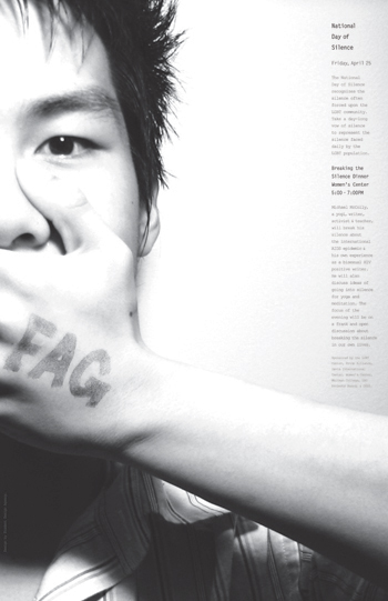
Poster for the National Day of Silence, image: Andy Chen
In the interest of pre-empting criticism that this post is all talk and no walk, I agree with those who believe that actions speak louder than words. As a gay man, I have endured unrealized but serious threats that once prevented me from being honest with even those closest to me. Silence, I thought, was preferable to fear. I have since realized that they are the same. Two years ago, I decided to design a poster for the National Day of Silence observance at Princeton. I appear on the poster covering my own mouth, the word “FAG” burned onto the back of my hand. The image depicts both my silence and the need to break it. Feel free to disagree with me as to whether I deserve the right to marry. But don't you dare tell me that I don't have a say.


Comments [12]
02.04.10
01:40
02.04.10
03:33
02.04.10
04:07
02.04.10
08:14
I'm still wrapping my mind around the fact that Cindy McCain and I actually agree on something.
02.05.10
07:52
1. I wouldn't have known that was Cindy McCain... the combination of the hip-chick outfit and the excessive retouching makes her unrecognizable. If someone has to explain to you who it is, that seems like a flaw in the design. And why does everything have to be styled and retouched like it's a page from Vogue? What does the "glamourpuss" look have to do with the message or the issue?
2. I am really sick and tired of public figures having a golden opportunity to take a stand when they can really make a difference, but they choose to instead remain silent because of their lack of courage. When they are out of office (politicians), washed-up has-beens (actors) or virtually forgotten (any former celebrity), they miraculously discover they have a bold position on a controversial issue they want to publicize. Remember how Colin Powell realized he was against the Iraq war... long AFTER he resigned as the Chairman of the Joint Chiefs? And how many actors come out as gay DECADES after they have any real popularity or relevance in the entertainment world?
It's only courageous if you have something to lose; if you've already lost it (your career) and you're using an issue to get publicity, let's not rush to congratulate that kind of opportunistic selfishness.
02.06.10
06:32
It's dangerous to assume what an artist's motivations are with a design. Just because someone offers up an opinion about a politician, celebrity, so on, does not mean that their motivation is race, gender, or sexual identity. It could just be dissatisfaction with what that person has done, stood for, etc.
That being said, people should be able to stand up for what they believe in, speak their minds. It's one of the things that makes this country great.
02.08.10
08:56
02.08.10
03:13
02.08.10
05:30
I don't see how inequality = silence. It's like human rights versus censorship, they are related, but also significantly disconnected. I also don't see how this cold, tacky, over-processed glamour photography connects with any of the issues either.
It's got strong semiotics (a clever, iconic logotype, hostage duct-taped mouths) but none of them seem to align in a way that communicates anything coherent. I attribute its popularity to everyone feeling like they are simultaneously 'hot' and 'socially aware' when they get one taken and put it up as their facebook profile pic. Once celebs started jumping on the bandwagon, it just got some additional Hollywood cache.
Its a disservice to the movement to fixate on these images and their sloppy semiotics, orange-county taste level, and junk food luster.
02.12.10
08:16
06.06.10
08:01
06.06.10
08:02