Looking for design in the Supermarket (as opposed to a specialty retailer like Whole Foods or Trader Joe’s) is a bit like bird-watching indoors. To end up here, Design ideas need to trickle down well past the middle-brow and survive extreme pressures of low margins and fast turn. But it is precisely because the environment is so unforgiving that it has so much to tell us about the meaning of Design in our culture as opposed to the culture of design.
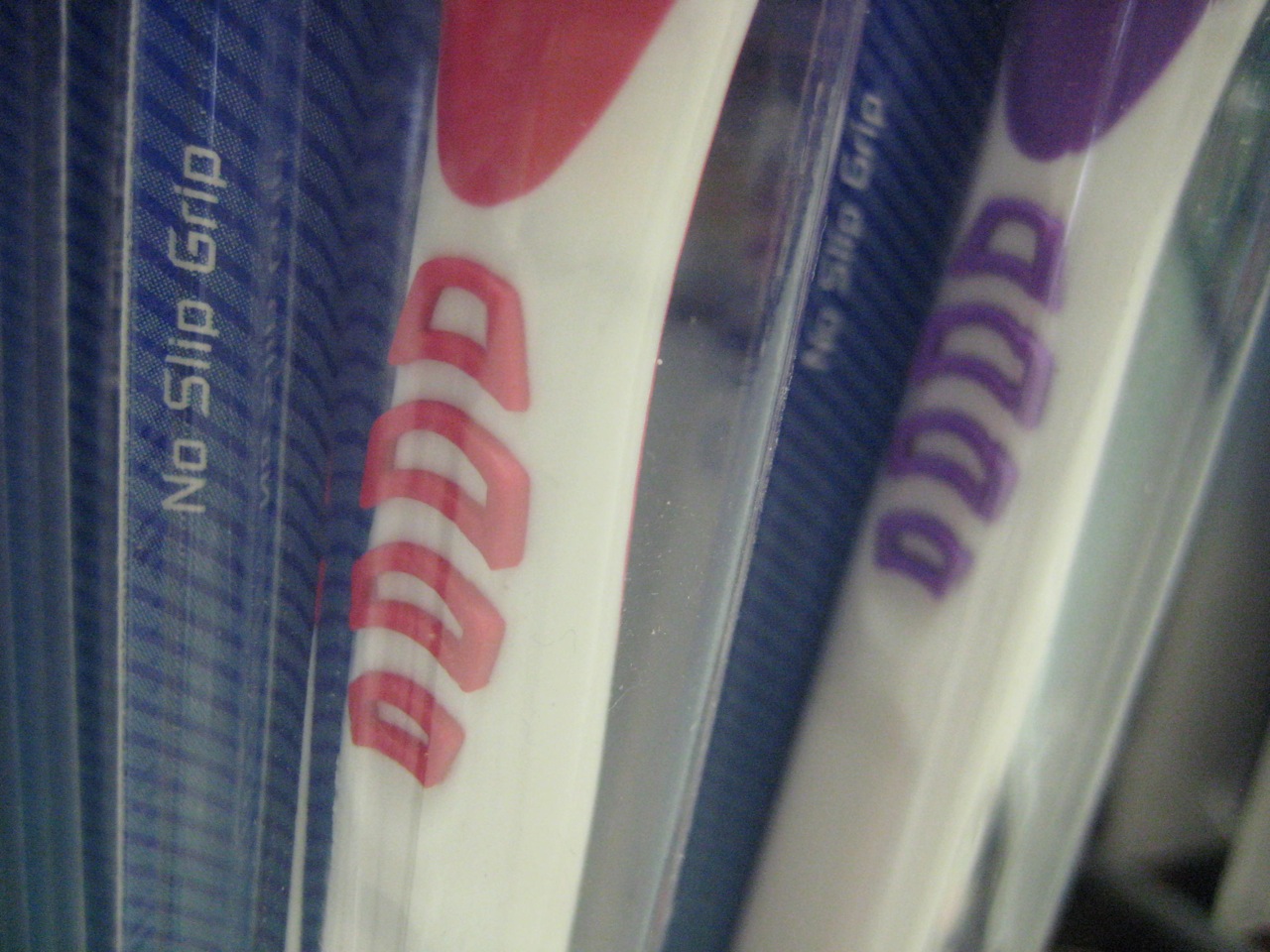
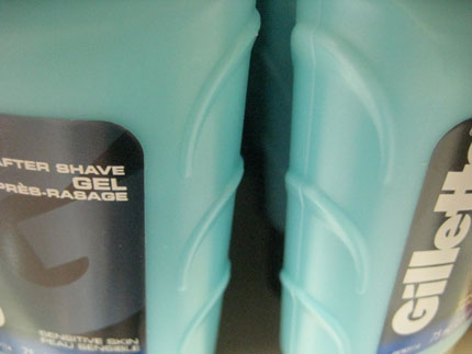
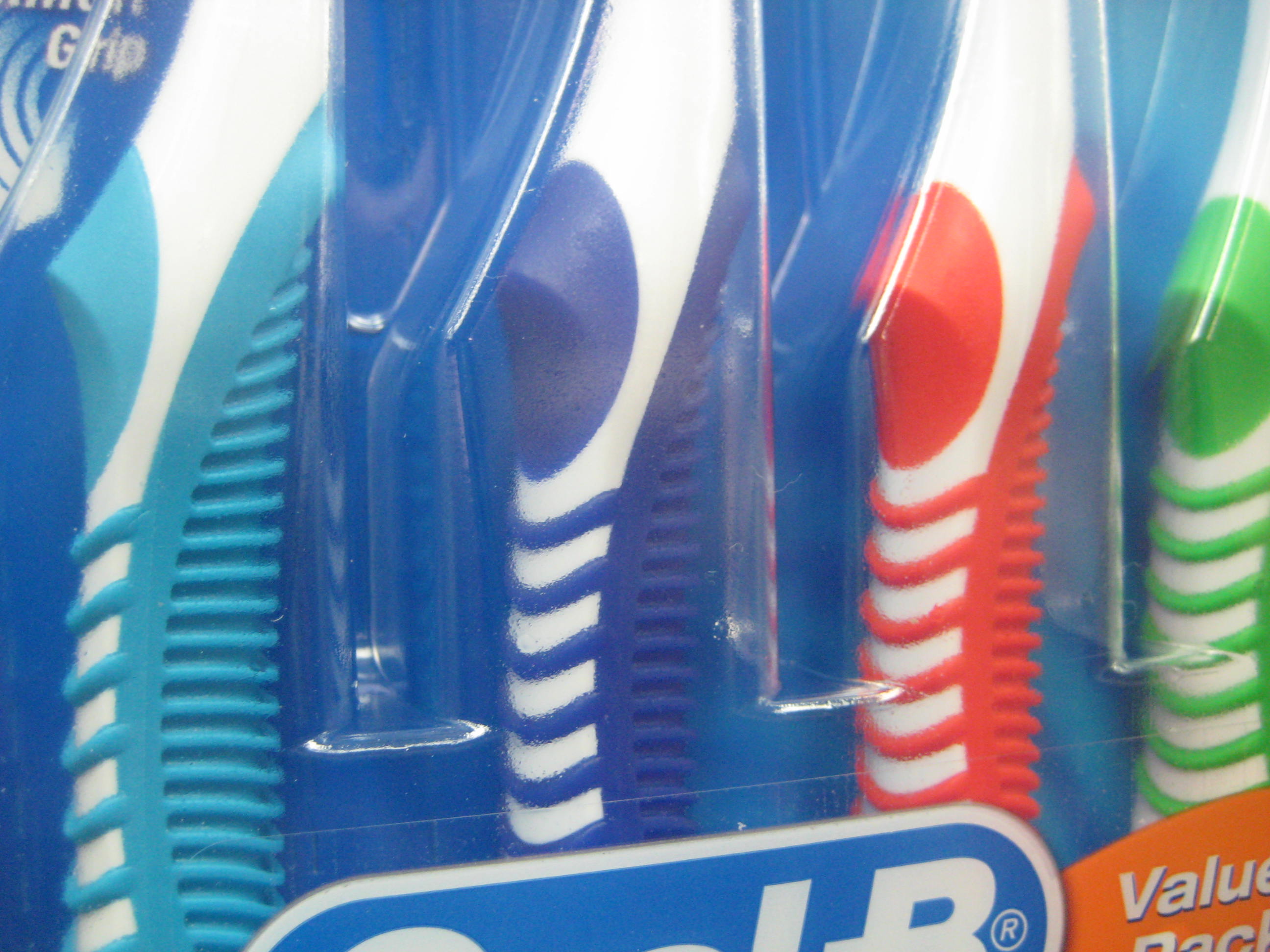
For example, strolling through the aisles of the Supermarket you might think that our species was cursed with fingerless mitts instead of hands. The shelves are an eco-system of plastic ridges, fins and nubs resolutely devoted to the promotion of grippage and the eradication of slippage. Apparently men are particularly afflicted with the inability to grip: the more masculine a product’s target consumer, the more layers of ridges and grippers it contains. The faux-ergonomic flourishes on shaving razors could make them serviceable for a walrus.
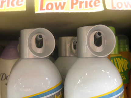
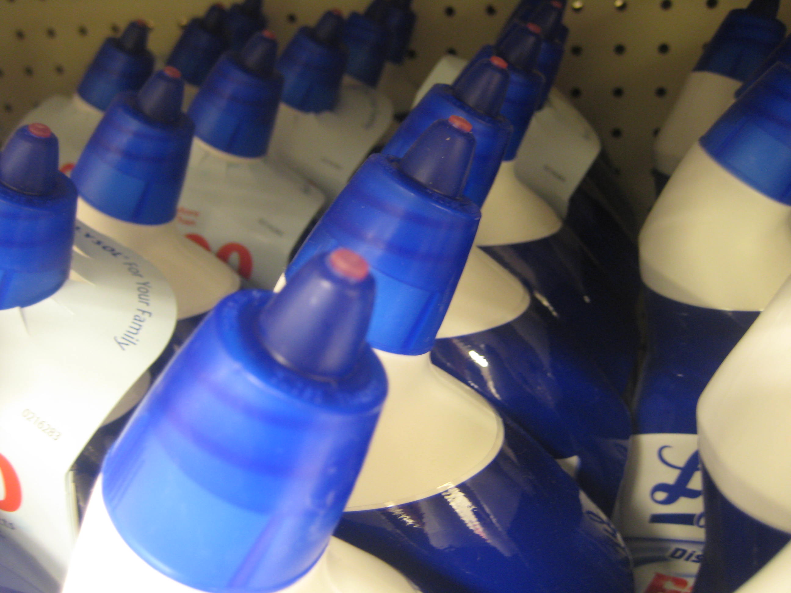
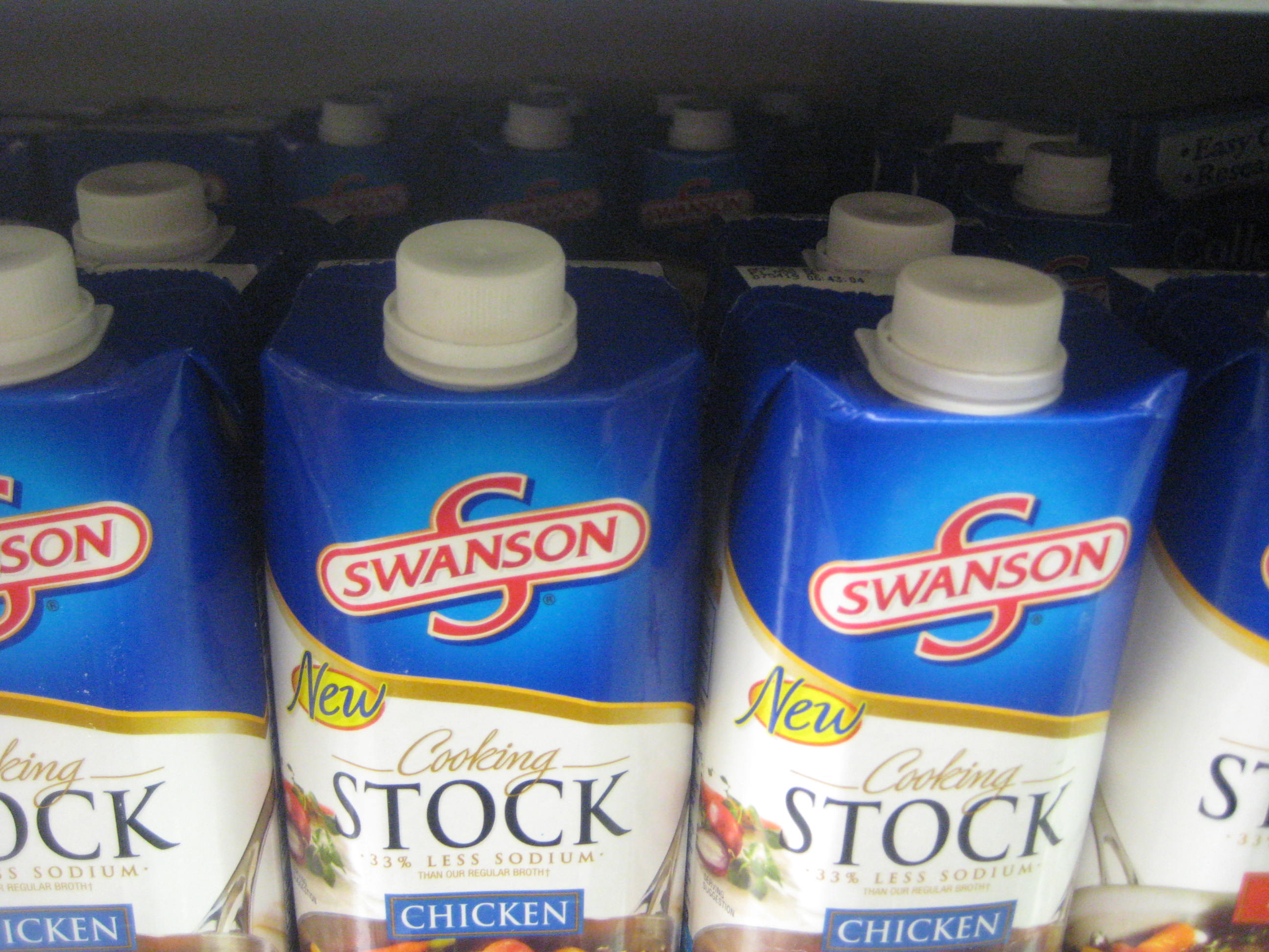
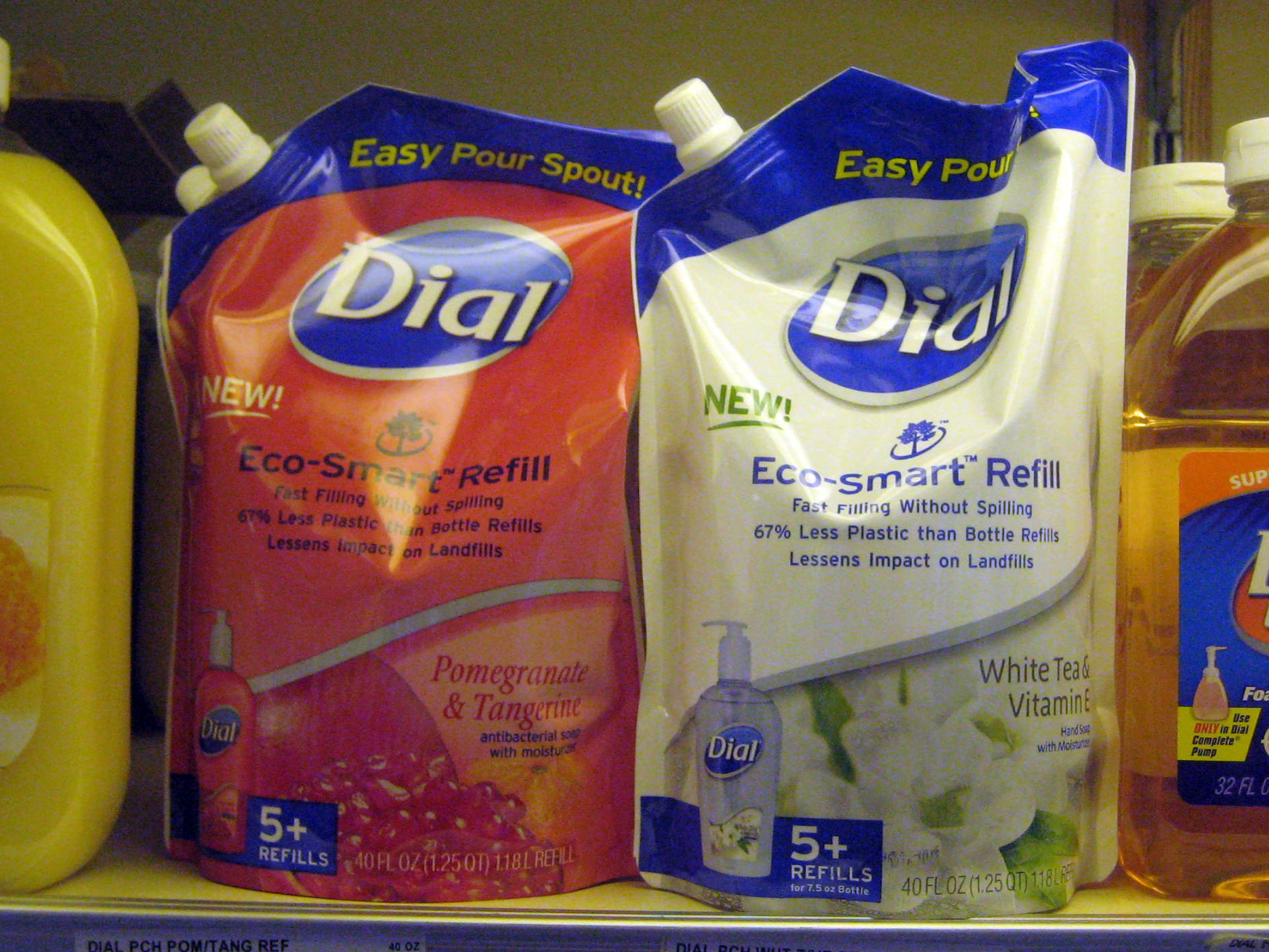
The Supermarket also reveals that we humans apparently require the ability to pour, squirt or spray any substance with laser-like precision. I was not aware that pouring pancake mix out of a cardboard box had a high margin for error, but apparently it does, as Bisquick has proudly created an “easy-pour” plastic jug for this purpose. You can get salad dressing with a pump dispenser and misting nozzle. I suppose that for some, this will elicit cries of “At last!” I understand that these dispensers may even help preserve flavor in some cases, but I find myself wondering if the task of pouring is a part of the human condition that really requires so much innovation. Like the grip strips, these myriad dispensers function largely as ornament.
In the late 19th Century, Adolf Loos argued that ornament was an aesthetic manifestation of socio-economic inequality. In his ‘Ornament and Crime’ he declared that decorative elements were the result of oppressive labor practices, and their appreciation was a tacit endorsement of society’s disregard for the quality of its workers’ lives. Grippers and spray nozzles are aesthetic manifestations of a different kind of social, cultural and economic neurosis. Where Loos was arguing against a decorative program of excessive nature motifs and flourish, today’s ornament, at least in the packaged goods arena form a visual language of absurd functionality. Designers have taken the notion of function and exaggerated to such an extent that it is as baroque and indulgent as any third-rate Art Nouveau pattern.
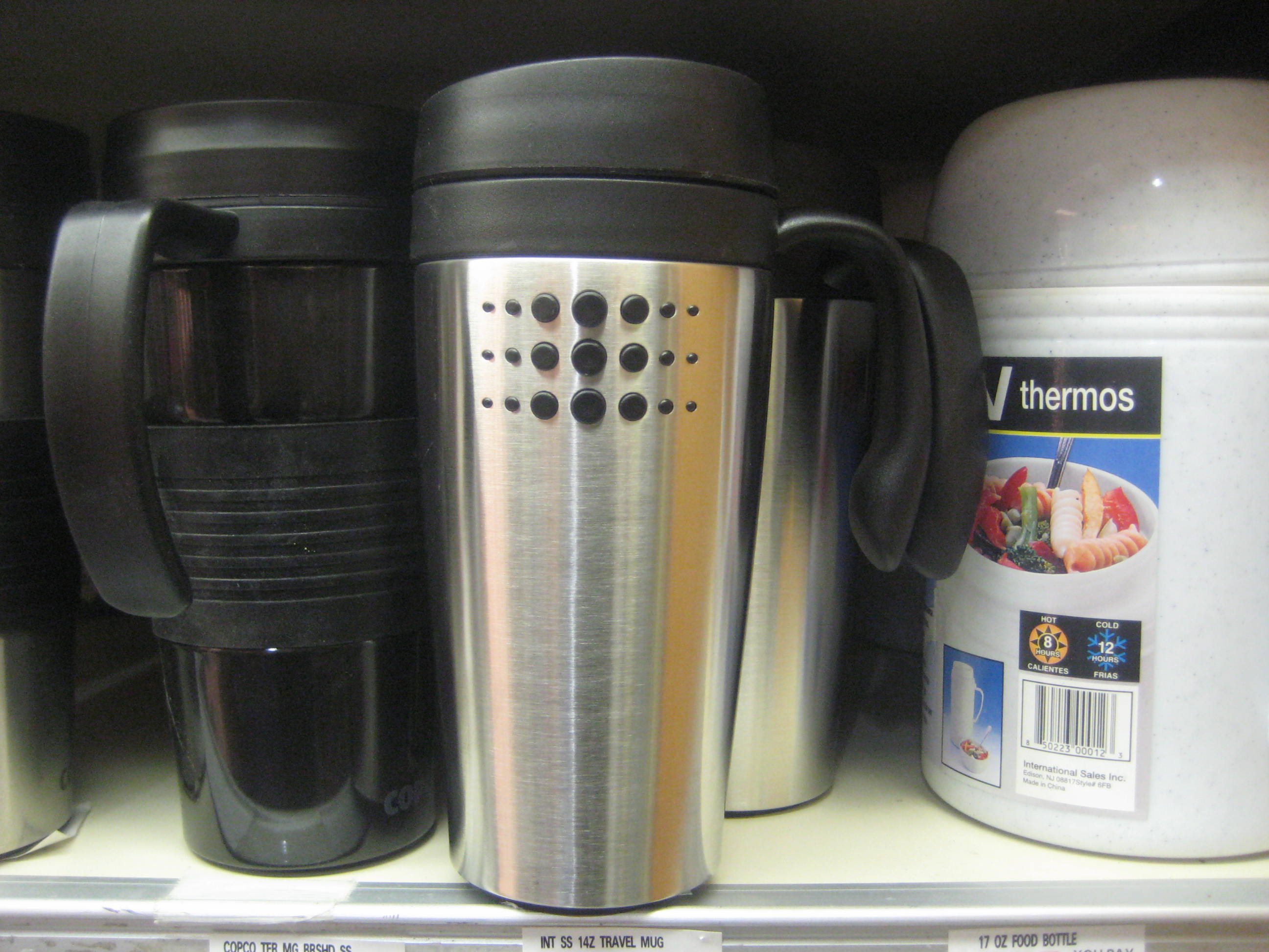
Look at the coffee cup on your desk. Mine looks like something out of a research lab. It has three distinct parts, all made from distinct and appropriate materials, disposable, sterile, and incredibly well designed. But is drinking a cup of coffee really that technical? If I had never seen one before I would think this vessel held something on the order of liquid cyanide. The cup looks as if it could be handled without spillage while scaling a shear rock face.
In 1899, Thorstein Veblen coined the phrase “conspicuous consumption” in Theory of the Leisure Class. The phrase is commonly understood to mean consumption for the purpose of demonstrating status without regard to utility. Ironically, the exaggerated displays of utility on display in the Supermarket are themselves a middle-class form of conspicuous consumption. Veblen describes how a rich man’s cane is a symbol of his membership in the leisure class precisely because he will never need to use it. The grip strips on a toothbrush and easy-pour spouts are exactly the same. They symbolize effort we will never have to exert.
The relationship between social status and conspicuous consumption is consistent with Veblen's time but the way it represented through evolves as culture does. Eco-smart, sustainable and green are well-developed (even well-worn) ideas in design culture but they are only beginning to make their way into the Supermarket. Making products more environmentally friendly is a laudable goal, but amidst the always-ripe produce and the over-stuffed aisles it is difficult not to perceive the advertised lack of consumption as conspicuous in and of itself. If sustainability is reduced to a set of visual cues for affluence and social status, there will be little change in overall patterns of consumption.
Design ideas have to reach a level of economically viable at a mass scale to survive in the Supermarket, but they are certainly found elsewhere in our culture. The fully equipped chef’s kitchen is a potent symbol of affluence precisely because anyone who can afford it clearly does not need to cook. The $400 Patagonia rain shell and the sport utility vehicle symbolize physical challenges and confrontations with the elements that their suburban owners can easily avoid, and so on. In this way the ornament of today is the complete opposite of that described by Loos — to him ornament symbolized excessive labor, today ours symbolizes pervasive leisure.


Comments [27]
09.17.09
12:42
09.17.09
01:37
09.17.09
02:20
I'm a product design graduate and working currently in an ad agency, so when walking down the isles of our local hyper-stores (which is very often) i am overwhelmed by the colors, textures, material, exaggerated forms and unnecessary functions, i now see most brands as beggars, or really easy girls who start coming on to you if you as much as glance at them!
You also stated one thing about "consumption for the purpose of demonstrating status without regard to utility", well, that's an idea I've been trying to explain to a friend; designers CAN change people's perception, but it's a gradual process that needs to become a new standard, a new designers cannon! a new revolution!! because people want what's better (in a general sense) but will eventually choose what's more popular!
If we keep conforming to outdated marketing ideas and misconceptions about consumer behavior, no one else would try to do anything because no one actually benefits from doing that but designers!
09.17.09
02:59
09.17.09
06:44
09.17.09
08:19
Many products at the time had none of this. Think of those classic 35mm SLR cameras with no grip and basically a sting for a neck strap.
The early low end industrial design products anyone could buy, were the very start of bringing ID down to lower level products. Plus, some of this, like the bend and grip on the Reach, really did help.
It has now gone overboard. But, why not. It is a cheap way to make a new shape for a bottle or, whatever. But most of it is less about function and more about marketing.
09.17.09
08:31
If the lonely 19 year old Harvard, MIT, or BU student can get that warm and cozy nostalgic hamburger phone or Hello Kitty Plush toy at the Harvard Square Urban Outfitters, why can't anyone of any age have a ultra grip, purple shampoo bottle with a special nozzle?
Democracy via design. Good or bad or mostly bad.
09.17.09
08:49
I couldn't disagree more.
Though they're obviously meant to communicate utility to a shopper--and if there's a non-visible feature, I'm sure the label designers will mention it in a big gold star--I can't see why the primacy of their functionality is assumed to be suspect ["exaggerated," "absurd," and the dreaded "ornament"].
These hyper-particular design elements evolve over years within their niche market environments, iterations in a system plakaboy describes, with the purpose of eking out some incremental advantage. It's like feature bloat in a software application.
And also, I'm sure that when asked straightup in a focus group, users would cite the goopy drips and messy cleanup of both detergent and pancake batter. And thus we get aerosol pancakes in a can.
09.17.09
09:02
There is too much choice.
Who will tell you, in a big box pharmacy which Flaxeed Oil is best?
How long will I stand in front of the absurd range of Colgate and Crest toothpastes? Or Band Aids? Why is the newest, grippiest, hideously colored toothbrush the most unnatural one, all synthetic, and why does it do a far worse job than the brush I used twenty years ago? The result for me is to want to move in the opposite direction. Hold on to less. Hold on to older things. Reject grippiness. Reject neon color in toothbrushes. And, in general, be less fussy.
09.17.09
10:41
Agree-
Packaging, products, or services are constantly reinvented, and sometimes these changes improve the quality of our relationship to them, but make no mistake, the end goal is to improve sales. The only changes in “overall patterns of consumption” corporations want is patterns of increased profit. So, more often than not, product innovation is less inventive than…well, a case of smoke and mirrors. They make green colored Windex for crying out loud.
But in this particular category our choices have more to do with, as Hadi said, what’s “popular” in a general sense, than communicating our social status. I have yet to have toothbrush or razor envy, yet my toothbrush is automatic and my razor has five blades, five rubber grips, and vibrates with the power of a Duracell battery. That’s it…I’m going back to buying a bag of Bic razors.
09.17.09
10:56
09.17.09
12:05
09.17.09
05:11
09.17.09
05:31
The underlying "psychology" is that most people led semi-functional, indirect lives with little "flow" — stuck in traffic, struggling with inane interfaces, filling our useless paperwork. What we really want is function, real flow. If the flow of the pancake batter package contributes to the "flow" of feeding our children, it is a wonderful thing, helping us to experience life.
Who knows, the next trend might even be quality batter in that quality package.
09.17.09
08:05
For me, it boils down to this: The human organism evolved to interact with textured (i.e. "natural") objects with varied shapes. Manufactured objects, especially those made with plastics, only exhibit texture or varied form factors _by design_. Ergonomic additions seek to redress unnatural sensations such as attempting to hold onto a slick, featureless stick of plastic covered in slippery foam. So what if they make for an extra design element?
09.18.09
05:46
Of course, I don't really believe that all these products are actually designed for the 99.999th percentile. But it's a nice thought that it may have happened by accident.
09.21.09
08:14
09.21.09
11:51
Also we are ambivalent. we want a lot of things. But we feel we shouldn't have them unless they are really necessary. So "really necessary" helps soften our resistance. And we end up with frivolously utilitarian.
09.21.09
02:33
As having worked for the company that produces many of the products shown above, I would contend that you would be naive to think that they are not engaged with meaningful design practices. Theory, especially in the world of design, has the unpleasant reputation of being the sole engagement of university and design writers. I can assure you that the same people that produce the ribbed toothbrush also produce next years hot design thinking epitaph.
One final point, the employment enjoyed by many of us would not be possible if not for that nozzle or superflous detail. This has always been the downside of loos's argument for me, the failure to factor In a larger macroeconomic model when thinking of ornaments criminality.
09.21.09
03:17
Top mounted intercoolers (TMIC) require these scoops. Without it, turbo engines would suffocate from heatsoak.
09.22.09
09:38
09.23.09
10:29
09.24.09
01:09
12.23.09
05:00
01.05.10
11:49
Thanks,
-Andrew
01.08.10
09:06
06.25.11
05:03