Steven Heller: How'd you enter the art and design of making TV and film graphic design props?
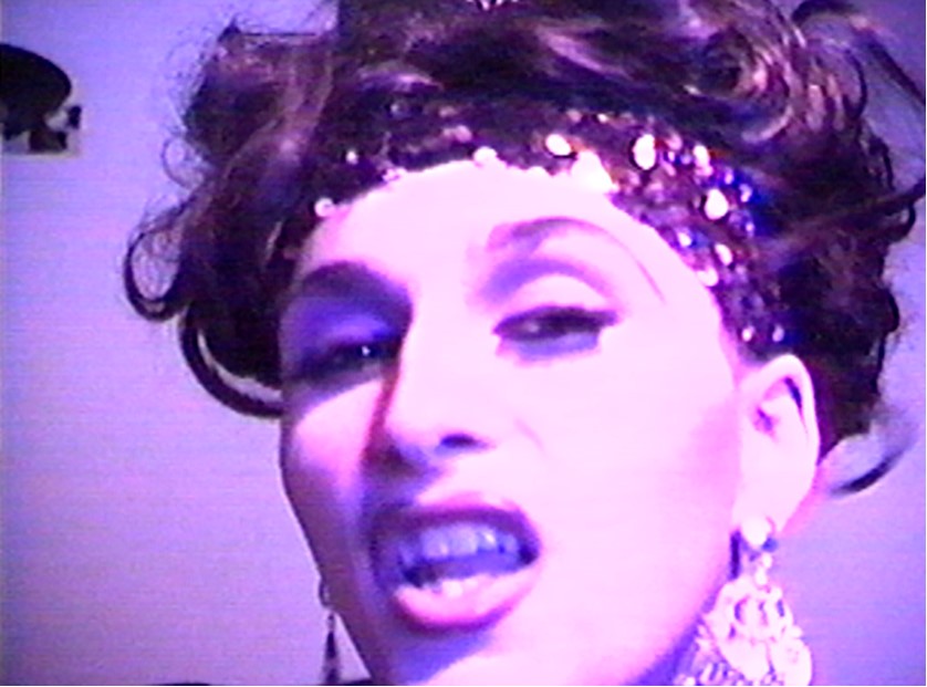
Derrick Kardos: My career started in two divergent paths in the 90s—I was a drag performer by the name of the House of Diabolique at night:
While in the daytime I worked as producer Christine Vachon’s assistant in independent films. Christine is known as one of the founders of the “New Queer Cinema” of the early 90s. Through her I became a 2nd AD, a Production Coordinator, and Art Department Coordinator and then finally...I made the move to graphic designer.
The year I made that move was 2003. I had just staggered back into my life from a terrible cancer hell and realized that I couldn't go on doing independent films for a living. I had spent over a decade doing low-paid non-union art dept jobs for independent films and while those were great experiences, one can only work 12+ hour days for chump change for so long.
Especially after my cancer hell, I was spent. I realized I couldn't do it anymore. I didn't see any path up or forward for me in that world. So I actually had bought a book on becoming an ophthalmic photographer—photographing diseased eyes for hospitals. A technical job, steady gig, sane hours, steady paycheck. I was ready for it.
It was then I got a random call to spend a day doing logo options for Jonathan Demme's “The Manchurian Candidate.” I recognized this immediately as a golden opportunity, so I exploded; I presented a week’s worth of logos in a day. What I did was so well received that my one day hire turned into a week, which then turned into two weeks, which then turned into Jonathan Demme coming to meet me in the office and saying "SO YOU'RE THE GENIUS!" and handing me the responsibility of designing the entire political campaign within the film!!! whoa!
SH: That’s the proverbial “a star is born” moment...
DK: The rest of the art dept—very experienced older people—were somewhat alarmed. "Where did you come from??" was something I heard. One of them derided me as "future boy". They also thought my designs were too wild, too out there. Too CRAZY. These are by now familiar criticisms to me but then, I was devastated by the disapproval. The assistant set decorator came in one day and slammed down some staid, real-life political flyers on my desk and said "This is what it should be! This is what's real!" I didn't have the confidence to defend myself but what I shoulda said was "We're not going for real! We're going for a deep state menace meets the circus by way of a soviet constructivist military coup vibe! This is what Jonathan and Kristi are feelin!" Ultimately what mattered was that Jonathan and Kristi [the amazing production designer] got what I was doing and they loved my wild stuff So I focused on that. I didn't censor myself at all. I designed things to the farthest reaches of my imagination, anything I thought would help tell the story they wanted to tell and wow them. To this day I think it is better to wow people then rein yourself in than to never wow people at all.
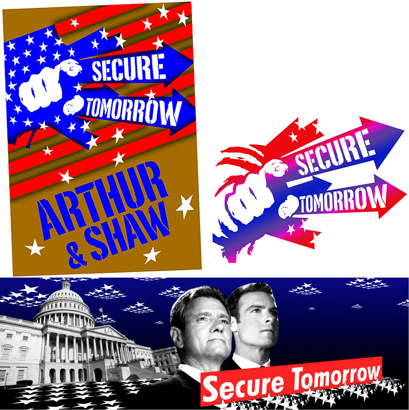
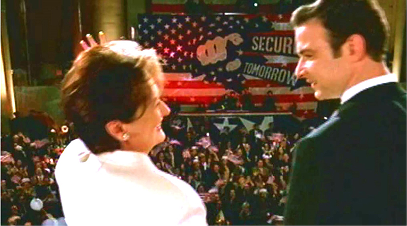
It wasn't until I saw the finished film that my fear I had ruined his film turned into pride. To this day there is no project that better features my goods. Att the climax of the movie, right before the assassination, he cuts to Meryl Streep and Liev Schrieber standing in front of that huge supergraphic I did of that Uncle Sam fist bursting through an American flag! I had an artgasm when I saw that.
What a brilliant movie.. both of its time (there is no better movie depiction of the Bush years) yet also so ahead of its time.. such a brave indictment of the corporate state, the corruption and utter rot of the political elite of both parties, and the mockery they make of elections and "democracy".
After “Manchurian Candidate” my life pivoted. I got paid to be creative on a string of big Hollywood movies after it: “Devil Wears Prada,” “The Departed,” “American Gangster,” “I am Legend,” “Revolutionary Road,” “Salt, Music & Lyrics,” “Black Swan,” “Brooklyn's Finest,” “Extremely Loud Incredibly Close,” “Wall Street II.” This was unbelievable to me because I never really thought I'd amount to anything. Looking back, I’m in awe that after the degredation of cancer and chemo.my life totally changed.. and for the better.. and it blows my mind to think that this would NEVER have happened were it not for [Demme].
Not soon after Jonathan’s death I read Jodie Foster say this about him in Rolling Stone: "He was pure energy; the unstoppable cheerleader for anyone creative." Jonathan Demme has passed. Long live Jonathan Demme!
SH: What is required of you when commissioned to do these? How much research is required?
DK: Every show requires research, but period projects require the most research. It is essential that everything I design passes for reality.
This is where my background as a drag performer has come in handy—also the theme of the drag documentary Paris Is Burning—the idea of creating an illusion so powerful that it passes for real.
SH: Have you ever made an error in terms of timeline or anachronistic typeface?
DK: NEVER! This would be my nightmare. I've never had a Helvetica on the Titanic moment and never will.
SH: What have been your favorite films and shows?
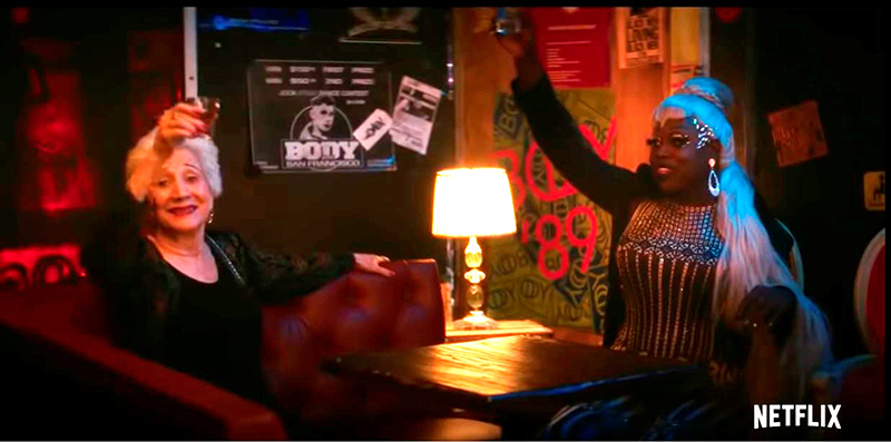
DK: It is hard to pick a favorite but most recently I was hired for three days to graphically create the 50-years history of a gay club for “Tales of the City.” This was one of my pieces:
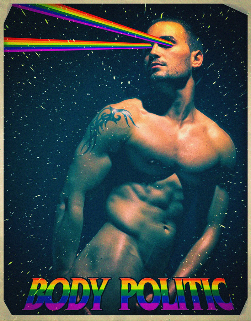
Now how many people are going to see a gay guy with lasers coming out of his eyes in outer space and know I’m making a reference to the opening night flyer of the legendary early 80s gay nightclub The Saint—which itself is a reference to Saint Sebastian, legendary homoerotic icon, with lasers taking place of the arrows? Not many. But the people who do know are going to notice! And they’re going to know that I know, and its a nod of respect to them and across time.
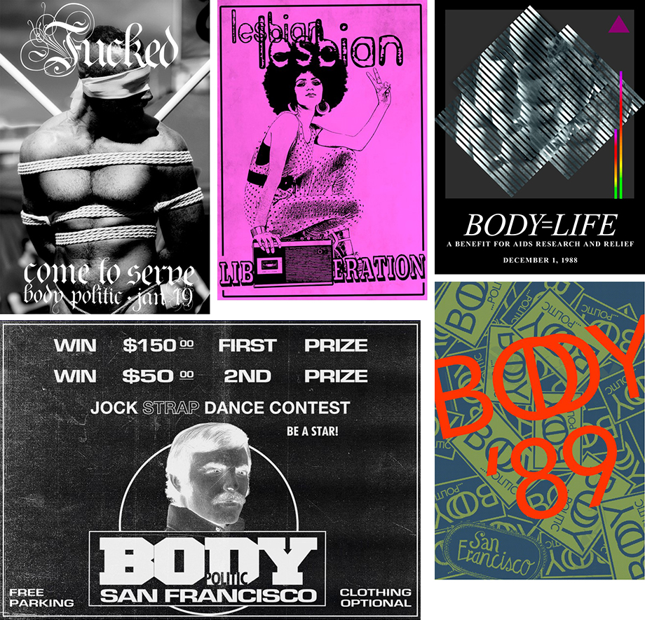
Here are a few of the posters in the show:
SH: What has been your most challenging assignment?
DK: In the Amazon show “Red Oaks” I had about a day to create a 1980s porn store—hundreds of VHS video cases and posters. Talk about teamwork—the Art Department Coordinator, Art Director, everyone pitched in to find a porn photographer from the time who had a photo archive with model releases that we could pull from. Finally we found somebody! And then it was up to me to work at breakneck speed to replicate all the strange typefaces and gradient, metallic, and glow effects that were used at the time on these covers. Not to mention coming up with the titles!
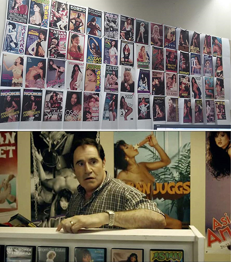
[Pictured above: my office wall at the time. Below: the scene in the show]
Since the “Red Oak” triumph every show based on porn or with a period porn element in NYC has contacted me for my contacts. I like to think I’ve set the standard for the realistic representation of unrealistic heterosexual porn in cinema.
SH: I know that sometimes these pieces are quite ephemeral, in fact, barely seen on screen. How do you feel when your work gets a millisecond of screen time?
DK: This doesn't phase me at all. It is part of the nature of filmmaking that most of what's shot is cut. This is true even for actors! Sometimes entire parts are cut. But it would be rare or impossible for my touch to be invisible from a project because I’m involved in so many departments, including even renderings/visualizations of what a location or set is going to look like before its painted and dressed. it's teamwork.
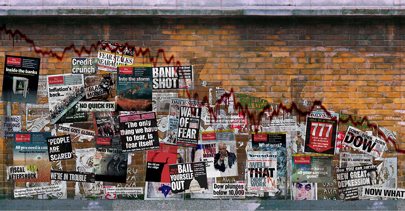
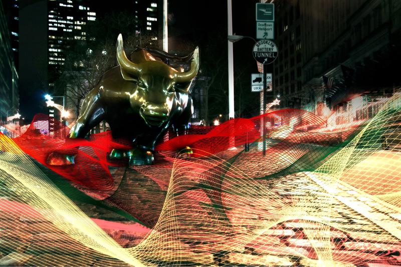
For instance in Wall Street II Oliver Stone had me do renderings—creative ways of showing the financial collapse that weren’t just charts or spreadsheets. So created visions of downward spiraling algorithmic lines attacking wall street in waves, along with fantastical graffiti that told the story. And if you watch the movie you’ll see he’s influenced by it all!
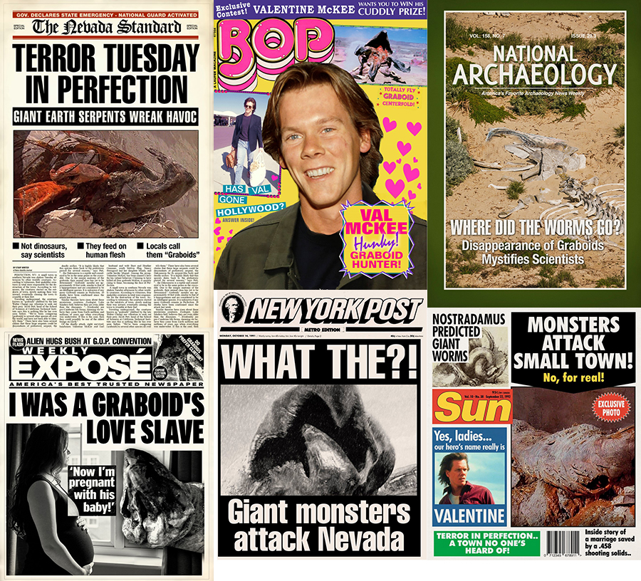
What’s was more painful than having an element or two cut from a show is doing a project, like a TV pilot, that you REALLY believe in that doesn’t get picked up. Then it feels heartbreaking. For instance I did a pilot called TREMORS with Kevin Bacon, based on his movie. The director was brilliant, the showrunner was brilliant. The designer, brilliant. And the concept of the show—brilliant—that town of the original film has become a run-down tourist/theme park destination based on the events of the original film. And yet the series wasn’t picked up. I don’t get that. There are so many shows about the FBI or the police.. and yet TREMORS gets a boot. SAD!!
One of my projects for that film was a press wall about the events of the original film. I’ve ALWAYS HATED how in film and TV, newspapers and magazine covers look FAKE. There is no reason for that!! So mine always look real, even if their parodic:
Even the town sign was fun to do:
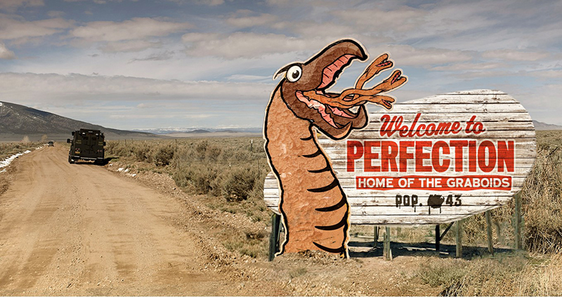
Alas, the project wasn’t picked up. As far as I’m concerned this is a crime against cinema. (You can see my sign in action in the TREMORS trailer, along with plenty of faux-press. Its a veritable Derrick-palooza!)
SH: What has, in fact, had the longest screen time?
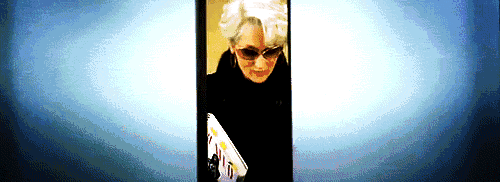
DK: I don’t know if this had the longest screen time but definitely the most notorious thing I’ve done is also the most uncomplicated. In “The Devil Wears Prada,” Meryl Streep’s character carries around her fashion “bible”—a work-in-progress of the upcoming issue of the magazine she edits: RUNWAY magazine. This prop plays a much bigger role in Meryl Streep’s hands than it did in the script. She possesses it, she wields it like a Talisman, like Frodo’s ring”
This movie has become a cult classic since its release. Every Halloween there are a lot of drag queens who do Miranda Priestly. And every year many of those queens track me down through IMDB and social media to see if they could get their hands that image, so that they can complete their outfit down to the last detail! I feel them! I’ve been in their heels and I KNOW their struggle. The devil is in the details! ;)
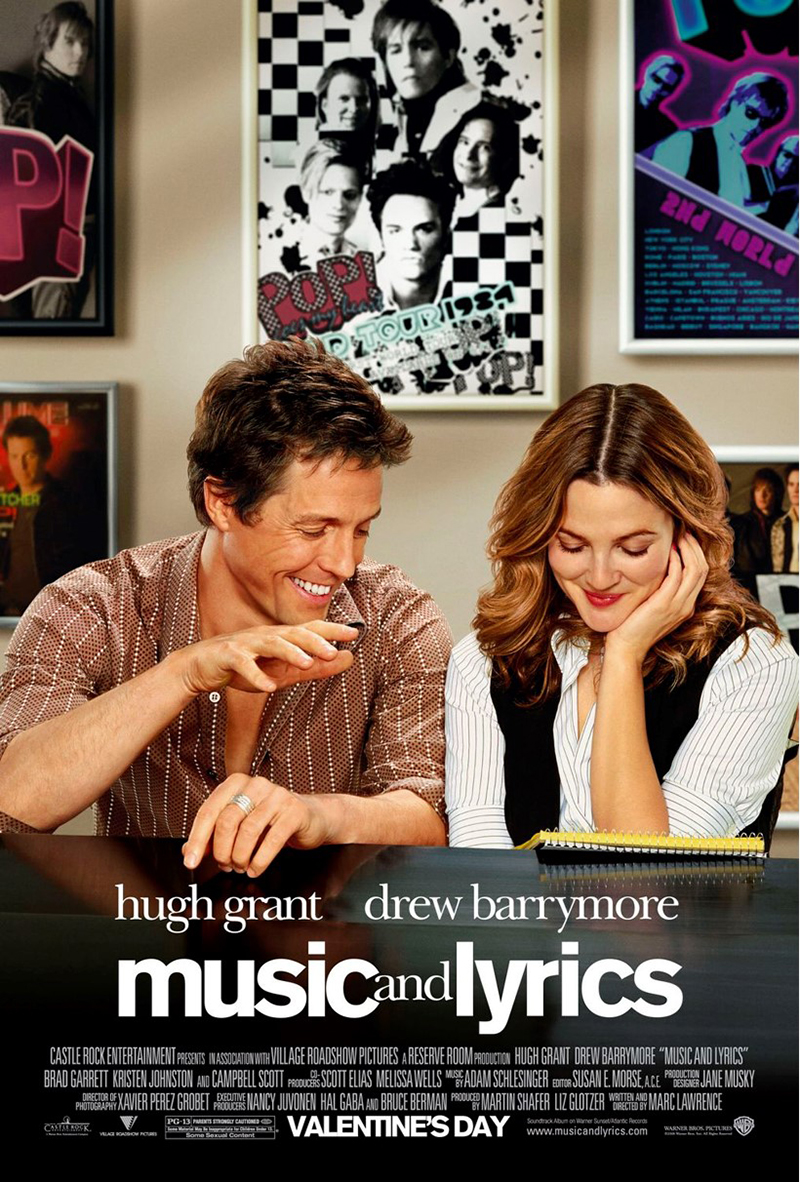
The second thing that comes to mind is the film Music & Lyrics. Graphically I had to tell the story of Hugh Grant character, an 80s pop star—the history of his music career is told graphically through faux-magazine covers, album artwork, newspaper articles, awards, and so forth. You can see my work throughout the film on the walls of his apartment. Not just that but the look of the opening music video sequence was based around my work—the black & white checkerboard for the early 80s moving into an earthy mauve late 80s. And then when the film was released, I was surprised and delighted to see that the posters I created for set are also in the movie poster! Right behind Hugh Grant and Drew Barrymore.
The marketing poster:
My posters within the film:
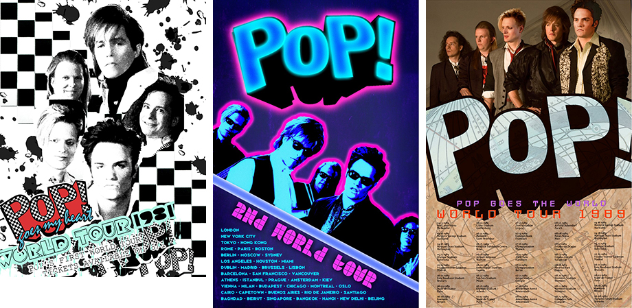
This was extremely exciting and gratifying to me… to know that I helped tell the story so well that even the marketing department took to it. And not just that—the graphic motifs and color schemes I came up with for the posters were also used for the music video that opens the movie.
SH: What is the largest and smallest of your jobs?
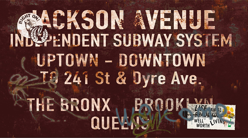
DK: The biggest job I’ve ever had in terms of the sheer volume of graphics was Ridley Scott’s American Gangster. Period 1970s New York, with lots of exteriors; full city blocks with storefronts that ALL needed to be designed. Not just the store signs but the products in every window of every store; any and all posters in the windows; any and all street advertising, graffiti, period picture cars like cabs, advertising on the cabs, police cars, ambulances, delivery vehicles; period street signs, subway signs; period shopping bags for extras to be carrying around, not to mention the interiors—think of an NYC police precinct in the 1970s—all the paperwork, the bulletin boards, evidence bags, badges, patches, IDs , everything on everyone’s desk - from letterhead to business cards to family photos, and the idiosyncratic personality everyone brings to their desk in an office—crossword puzzles, newspapers, handwritten notes—everything on a film of that scale that’s going to be projected has to be done in the most meticulous detail. The entire world of NYC in the 1970s had to be created graphically. This level of detail is probably not what the audience thinks about. But it’s definitely what the art department thinks about. This is our job!
This is the first image I created for that film—a subway signs complete with rust, dirt, graffiti, stickers and aging:
It was myself and an assistant, surrounded by rolls and rolls of paper, adhesive vinyl and canvas, in a constant state of generation and production.
It was exciting! And then the movie was nominated for an Oscar for Art Direction.
SH: I guess there is never NOT a need for this.
DK: Every project has at least one full time graphic designer. Often two. If there are screens involved with graphic elements moving about, then there are three, even four.
SH: Who do you report to? Directors? Prop masters? etc.?
DK: All of the above.. the director, the producers, the writers, the showrunners. It really depends on the project how involved I am, and with who. Some projects call for documentary style realness that gets out of the way, and on other shows I’m paid to wow the creators. I prefer to wow… but even WOW elements have to BE real within the context of the film.
“Got to be real”—Cheryl Lynn. Or like the queens say in Paris Is Burning, “It isn’t a take-off or satire. The goal is to look as much as possible like your straight counterpart—to make your illusion perfect.”
In this way my outsider, drag performer status its what gave me my edge ... I have an observational prowess that growing up a different way wouldn't have given me. I have talent for mimckry that others lack.
My goal is to bring a sense of glamour and eye-popping extravagance to movie graphic design. Glamour, in the original sense of the word, the Marlene Dietrich sense! It’s a trick! An illusion so powerful that you don’t see that the eyebrows are fake.
In fact if I could be known as the Marlene Dietrich of the niche and obviously underappreciated field of movie graphic design then I’ve won.


