
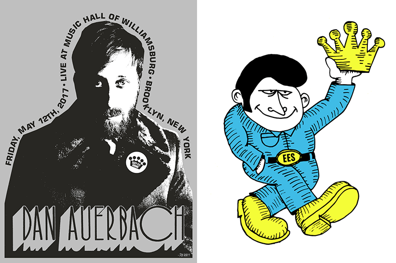
Images courtesy Perry Shall. RIGHT: Easy Eye Sound’s mascot, “Easy Eye Eddie.” “I’m from Philly and Dan’s from Akron—both are places with very real people. He kind of feels like the average Joe. That’s why he’s in the coveralls and could be a mechanic. Dan is kind of like a mechanic for music,” said Shall, “I don’t know If I came up with that name or Dan did...He’s just cool. He looks like he might be the coolest dude you ever met.”
Tacked inconspicuously in the front lobby of Black Keys frontman (and solo artist) Dan Auerbach’s recent concert at the Music Hall of Williamsburg in Brooklyn, New York, were t-shirts and posters emblazoned with Auerbach’s name in attenuated, sans serif type above flat images of the musician staring out from the large prints. The concert was in advance of the release of Auerbach’s upcoming album, Waiting on a Song, and while Auerbach’s name took the prominent position, there was a smaller name there too: in the bottom right corner of each poster was a signature, as if signing a note: “—Perry.”
Perry, it turns out, is Philadelphia-based artist and designer Perry Shall, and the brain behind the cover art for Dan Auerbach’s new album, Waiting on a Song, and its associated merchandise—spanning posters, t-shirts, record labels, and even bass drum hits. Shall also designed the logo and website for Auerbach’s Nashville label, Easy Eye Sound, and its new mascot and unofficial spokesman, “Easy Eddie.”
“Easy” seems to be the word when it comes to working with Auerbach: Easy Eye Sound; Easy Eddie; easy does it—with the design process and its outcomes beckoning an attitude that resists a polished industry finish and embraces an implacable and imperfect authenticity.
“I have no proper, real training in this stuff,” said Shall of his background when I spoke with him over the phone, “I dropped out of art school. I didn’t know what I was doing with my life. I figured that out on my own.”
Shall certainly has figured a few things out over the years. A musician in his own right, Shall played music and toured with bands working as a musician, tour manager, roadie, merch seller, and friend, and first came into contact with Auerbach while working with Nashville-based band Jeff the Brotherhood. Auerbach produced a record for the band, and when they went to Auerbach’s studio in Nashville to hear the record, Auerbach asked them who did their design work. They gave him Shall’s number.
“[Dan] asked me do the logo for [his] studio. Next thing I know,” said Shall, “I’m getting pictures of the logo spray painted on their studio and that was kind of it for a while. A couple of months later, he contacted me to do artwork for the Bombino record that he produced. That’s when we started working together more and becoming friendly.”

Image courtesy Perry Shall.
After Shall did the cover art for the Bombino Nomad record (released in 2013), Auerbach reached out to Shall to work on the art for his new record. “Obviously I said ‘yes,’” said Shall, “The next day we started texting almost immediately.”
One could imagine that creating the cover art and identity for Dan Auerbach’s label and new solo album Waiting on a Song, when Auerbach is so well-known as the Grammy-winning frontman of The Black Keys, could present a bit of a design challenge. How do you rebrand an established musician into a new and distinct entity, without losing the base he’s already established? You don’t.
“Design-wise, we have similar thought process for how things should be done,” said Shall of working with Auerbach, who was directly involved in the design process. “For me and Dan, it just comes really naturally. Most of the day is spent texting back and forth non-stop. I’m constantly in thrift stores and just taking pictures of albums—‘I like the color scheme on this one,’ etc. No explanation. And he does the same to me.”
According to Shall, the duo continued to go back and forth this way, discussing the design and composition of the album cover from type to placement and colorways. “It’s unlike the way I work with anyone else as far as communication works... It just kind of flows,” Shall said, describing his process as requiring both “a lack of thought but also very thoughtful.”

T-shirt design by Perry Shall; image courtesy Perry Shall. “Again, timeless,” said Shall of the record label’s logo, “A lot of record labels have used crowns for their logos. It wasn’t a conscious thing that we did. At first we tried an eye, and making it more literal to the name. We decided to leave it less defining and more an iconic cool that looks familiar.”
I asked Shall if they talked about how to distinguish this album and Auerbach, as a solo artist, from The Black Keys, but creating those distinctions between present and past didn’t seem to be on his radar so much as making design choices that fit the music at hand.
“Without thinking about The Black Keys, it was like, ‘What does this call for?’” Shall said, “With bands, I ask them to send me a record so I can get inspired by it. These songs weren’t ready for me to listen to though, so the artwork was finished before I got to hear an ounce of a song. Sometimes that could be a hindrance, but we just talked about it: ‘Who did you work with on this song?” That type of thing.”
When it comes to listening to music, Shall listens to all types: “Hard rock, punk, a little bit of everything. All of that comes out of my art. The jazz album covers are so iconic and vary so much—I try to think of all those different styles. Especially with Dan. The photocopying style, it’s a very traditional punk kind of look.” (Just ask AIGA Medalist Art Chantry).
Shall also harnessed the Nashville roots of this album in the cover treatment. “A lot of bands and labels are trying to do this classic-sounding stuff and trying to hone in that [Nashville] sound. But [Dan]’s making music in Nashville and using the musicians that other musicians want their records to sound like,“ said Shall. “When I pull those records out at record stores, I don’t think ‘How do I make this look old,’ I think, ‘How do I not overdo it?’” For Shall, the cover photo of Auerbach in a bunch of leaves (selected, with Auerbach’s input, from hundreds taken on film by photographer Alysse Gafkjen) brings a warm feeling reminiscent of Nashville country, but the background, treated in a silvery blue-gray, provides a tonal and sentimental contrast, making the album not identifiable as one American genre but rather, a fusion of many.
Once the photograph was selected, almost everything was done by hand. Shall has collected old typography books over the years (not to mention records and t-shirts). Taking inspiration from vintage type for Auerbach’s name on the album cover, Shall scanned physical letters onto the computer and then printed them, spacing the letters individually by hand, and then scanned them again, saying of the process, “I’d just use a font if I wanted it to be perfect, you know?”
“A lot of the stuff we’re doing is supposed to be reminiscent of older records you’d find in thrift shops. Because the process back then was way more faulty, there were a lot of misprints, or things would be off and not line up. If you were screenprinting and things didn’t line up perfectly, there’d be a gap between the colors—I love that. I thought, since I do a lot by hand, it shouldn’t be perfect,” said Shall, “That’s boring.” So on occasion, Shall offsets layers so they don’t line up perfectly, the result being a kind of typographic, visual reverb—as he did for the May 12 concert poster below.

Images courtesy Perry Shall.
It’s this kind of calculated imprecision that makes each piece seem one of kind—even though it’s sure to be mass-produced. “Even Dan’s border around the album had been printed out and scanned a bunch of times, and then cut out with the xacto knife. There’s a ton of things I do that no one’s going to notice I did... because that’s how I figured out how to do it. And I liked it, so I kept doing it.”
The work done by Shall asks the viewer to lean into the underground, unfinished feeling that many associate with Auerbach’s early days and that the design choices slyly present through old-school analogue techniques, subtly allowing the viewer to forget that Auerbach happens to be a multi-time Grammy winner (that is, until you hear the record). It’s not a nostalgia for the past; but rather an unexpected moment of déjà vu—both unplaceable and yet pleasantly familiar.
“I know a lot of the work I did with Dan looks ‘70s but I‘m really looking for something that will last forever,” said Shall. That ethic extends across everything that he produces. “Similarly to the album cover, I want you to buy a shirt that [will look] cool in 30 years. The shirts I had at the [Williamsburg] show—I realized in a medium or small shirt, the print was too big. I’m very particular about all of that stuff. Every aspect.”

T-shirt design for Waiting on a Song by Perry Shall; image courtesy Perry Shall.
For Shall, design and branding is essential to creating a musician’s persona. “I’m not alone in thinking that I will buy or pass up a record if it doesn’t look cool,” Shall said, “If I don’t share their taste in what looks good, I have a hard time trusting their taste in what sounds good.” In this way, Auerbach has found a solid partner in Shall, who shares his vision and whose body of work indicates he shares Auerbach’s aesthetic.
Shall deftly executes a pairing of opposites—perfection and imperfection; thoughtfulness with intuitive thoughtlessness—that fits the musician with whom he works and that leads to that spot directly between trying too hard and not enough; not perfectly polished but certainly cool. Shall told me, “I’ll say to Dan a lot, ‘Things are going to be perfectly imperfect.’” For the record, that combination appears to be just right.
Waiting on a Song is available in wide release on June 2, 2017.