 Editor's Note: The following conversation is an excerpt from Feminist Designer: On the Personal and the Political in Design (MIT Press, 2023), and is reprinted here with permission of the publisher.
Alison Place is a designer, educator, and researcher who practices feminism through design. She is Assistant Professor of Graphic Design in the School of Art at the University of Arkansas and the author and editor of Feminist Designer. She spoke to type designer Aasawari Kulkarni about the origins of her feminist typeface, Nari, and the patriarchal underpinnings of the type design industry.
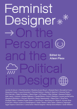
Nari Variable Specimen book.
Alison Place: What brought you to design, and what was your design education like?
Aasawari Kulkarni: I was a creative kid. Growing up in India, there were not many options for creative careers. I went to the National Institute of Fashion Technology, where I focused on different things like fashion journalism, fashion photography, and graphic design, which led me to type design. After I graduated, I worked at the Indian Type Foundry, where I designed my first Devanagari typeface called “Suhas.” I knew this was something I wanted to do, but I felt like I needed more education, so I went to graduate school at the Maryland Institute College of Art. That was the first time I realized design can be about more than just selling things; it can be about cultural criticism, cultural theory, and bringing that aspect of yourself and your journey into it. It changed the way I approached design.
AP: What sparked a feminist approach to your design practice?
AK: The first time I really thought about the patriarchy is when I read The Palace of Illusions by Chitra Banerjee Divakaruni, which was a retelling of the oldest classic mythologies from India, the Mahabharata, from the shero’s perspective. It got me thinking about the nature of patriarchal storytelling in India. When I got a chance to do a project on self-inquiry during grad school, I revisited one of my favorite stories from childhood that my grandmother used to tell me, the Ramayana. It’s the epic tale of the abduction of King Ram’s wife, Sita, by Ravana, the demon king of Lanka. King Ram has been worshipped on a pedestal equal to God, as being the most perfect human to have walked the planet. However, I found the ending of this story later: he abandoned his wife to keep the royal throne stain free because she was kidnapped by another man. It disturbed me that we have been praying to a man without considering the role, perspectives, and strength of the woman, Sita. I decided to retell the story in a way that focuses on her journey and perspectives in order to show that the god we have been praying to is not so perfect. I realized I am a storyteller. As designers, we all are.
AP: When did you begin to integrate feminism as a method or a process in your work?
AK: When I was researching for my thesis, I learned about variable fonts, and my mind was blown. I saw so many possibilities because of the breadth of choice and fluidity that variable fonts gave you. That summer I was reading about feminist theory and how to integrate it in design. Something clicked, and I asked myself, “How might I make a font that is feminist? How could I make a tool that is feminist as opposed to just making a stand-alone project?” When I was working on this, I was also working on a project with an organization called Feminism in India [that was] about how gender-based violence is portrayed in media and how usually the victim is shown in a very vulnerable position. We made illustrations where the victim wasn’t shown as weak and where the oppressor wasn’t shown as a monster because oppressors aren’t usually monsters; they’re regular people. The illustrations became a part of a media tool kit of open-source imagery that feminism in India has been asking media outlets in India to use instead of using pictures that depict women as weak. I liked the idea of making a “tool” that anyone could use and add to.
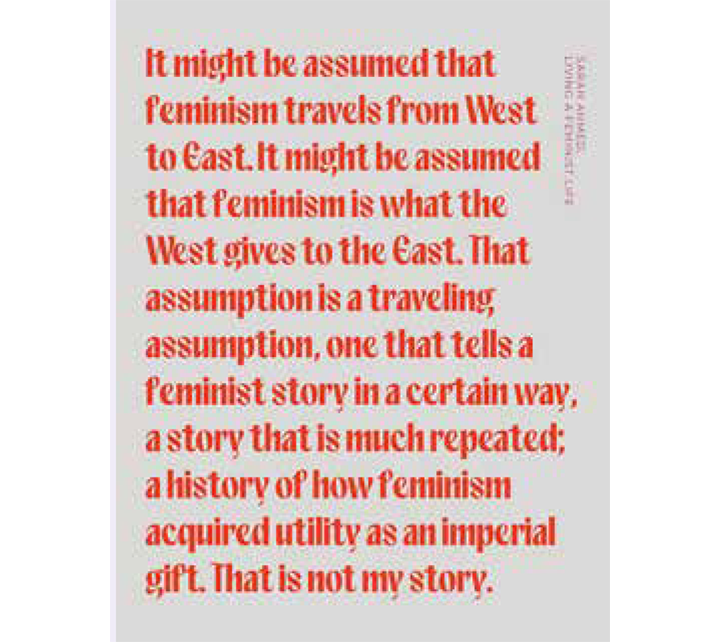
Quote from Sara Ahmed’s book Living a Feminist Life.
AP: You’ve written about what you call “typatriarchy.” What is that, and how did it inform the making of a feminist typeface?
AK: When I started this project, I was trying to understand what feminism is. I came across the definition by bell hooks that it’s not just about equality, but it’s a movement to end sexism and sexist oppression. I tried to write a definition of feminism for myself—the fight against patriarchal systems that deny choice, expression, and opportunity to a person on the basis of their gender—then I made an analogy of that to design. There are only a selected few fonts that have always sat on the pedestal of “good” design (i.e., patriarchal systems). Expressionist typefaces are always on the edges (i.e., denied choice/opportunity). They never get mainstream attention like grotesque typefaces. The patriarchal system in this case is the constant use of these typefaces, not the typefaces themselves, so I coined the term typatriarchy. Initially, I wasn’t thinking about the fact that when I am designing this typeface, I’m also bringing in my identity and my experiences as a designer, as a woman. I know that the identity of the people who make things matters and that representation matters, but [they’re] also not the only thing[s] that matter. Feminist design is not just about the identity of who makes things—it’s a constant struggle of integrating feminist ways of designing and thinking. Through the term typatriarchy, I was analyzing the positioning and hierarchy of typefaces in design.
AP: Why do you think that designers need more expressive typefaces in their toolbox?
AK: Freedom of expression is very important in design. We’ve been extremely limited by what is assumed to be “good design.” Type is about the literal meaning of what you’re designing but also the visual meaning. Choosing a typeface speaks a lot about your design—Who designed it? Why was it designed? Does it convey the meaning of the words that you’re using? There is a deeper layer of meaning to all your design choices because you invite someone else into your design by doing so.
AP: How do gender stereotypes underscore the “othering” of expressive typefaces?
AK: Gender stereotypes happen in type just like they do in the real world. Swiss, bold fonts are considered more masculine or neutral. High-contrast fonts are considered more feminine, more delicate. Who decided that? Instead of thinking about the gender of fonts, we could think about the greater meaning of what they stand for and what [a font] makes you feel. Is it a strong typeface? Is it an emotional typeface? Is it an angry typeface? That’s where the need for fluidity comes in.
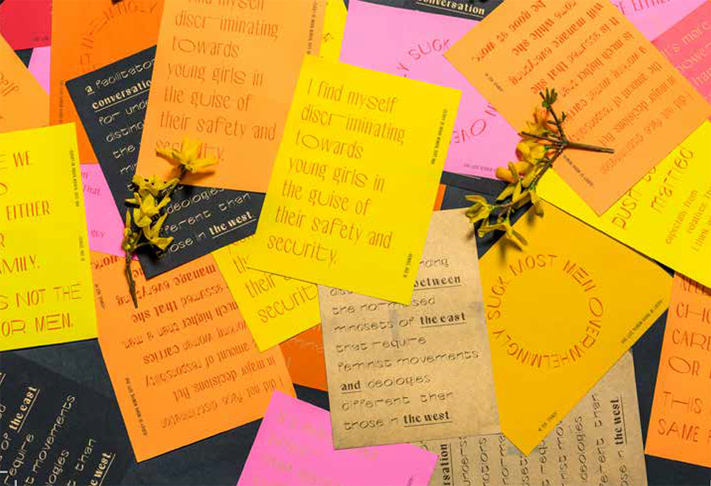
A conversation between the East and the West.
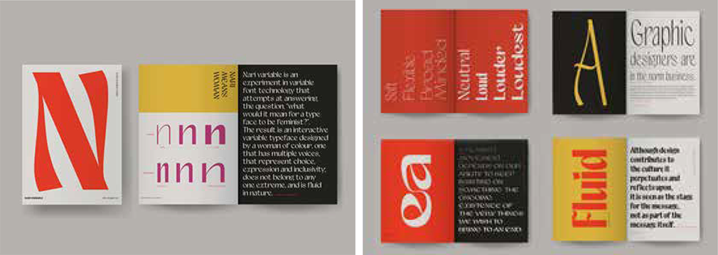
AP: Can you describe your Nari typeface and how it incorporates fluidity?
AK: Nari means “woman” in Hindi. While making [the typeface], I was thinking about what you feel when you select a typeface. Can a typeface be an extension of what you’re feeling? Instead of naming the different weights, like regular and bold, I named them with qualities, like soft, flexible, assertive, neutral, loud, or hostile, and you can move fluidly between them. Variable fonts work on axes, and Nari’s axes are voice (weight), which moves from soft to loud; mindset (width), which moves from narrow to broad minded; and fight (contrast), which moves from assertive to aggressive. I was thinking about the idea of soft revolutions. The qualities I chose represent the women I looked up to [while] growing up, who were soft but strong, loud with a purpose. In Indian society, women assume different roles at different points in their life. Nari is fluid. Instead of being labeled as one extreme, you can be anywhere on that whole spectrum. I want designers to pause and think about the meaning behind the choices they’re making with type, and perhaps that thoughtfulness will extend to other design choices they’re making.
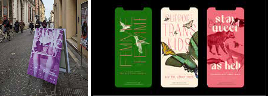
Nari in use. LEFT: BIOFILIE, solo exhibition of the work of Giulia Tomasello, exploring female intimate care through wearable technology and biohacking. Design by Tauras Stalnionis. Photograph by Giulia Tomasello. RIGHT: Animal species that have gender-expansive biology or behavior dance around queer-affirming statements. Images courtesy Biodiversity Heritage Library. Design by Shoshana Schultz.
AP: You’re also an educator. How do you integrate feminist theory into your teaching?
AK: I think about what was missing from my design education and what I wanted more of. One thing that has helped me grow into a feminist designer is being introduced to pluralistic points of view. There isn’t just one way of designing, and it’s so important to be introduced to different voices in the classroom. When we expand our minds, feminist design becomes more of a habit and a practice as opposed to just a stand-alone project. I teach about applying feminist theories of collaboration, citation, and mentorship to practice.
AP: Feminism in the United States tends to be positioned as the only way to do feminism, which often erases other feminisms in other parts of the world. Is there tension in the way you show up as a feminist in the United States versus in India?
AK: The feminist movements in India and the United States are so different. Living here, I feel like being a feminist is normalized. But in India, yes, there is a lot of tension talking to my relatives, both old and young. It’s still a big challenge to normalize being a feminist in the Indian household. Feminism is still a word that might be frowned upon. There’s a long way to go, but intersectional feminism is very, very important in India because there are so many different communities of people living together. Even though I am a minority in the United States, I come from a privileged background in India, and I recognize that. I have no authority to define the feminist movements of India from the narrowness of my own experience. That’s why I relied on research for the Nari Specimen, a conversation between the East and the West, which was a dialogue between the two different cultures. Sara Ahmed talks about how feminist movements have not come from the West to the East. It’s [the specimen] a collective sample of the many voices from India, brought into this society that likes to center movements around itself.


