In “The Persuading Image,” published in the February 1960 issue of Design, the monthly journal of Britain’s Council of Industrial Design, Hamilton wrote provocatively about how industrial manufacturers and designers should use sophisticated and witty imagery to seduce their consumers, to “design” them to products they had already created. His pragmatic stance and serious interest in such issues as surface-level styling, image re-touching, glamour, ephemerality, and planned obsolescence, disrupted Design’s narrow editorial perspective, visually, tonally and in terms of its content. His take on design challenged the established viewpoint the Council of Industrial Design, and the design professions it represented.
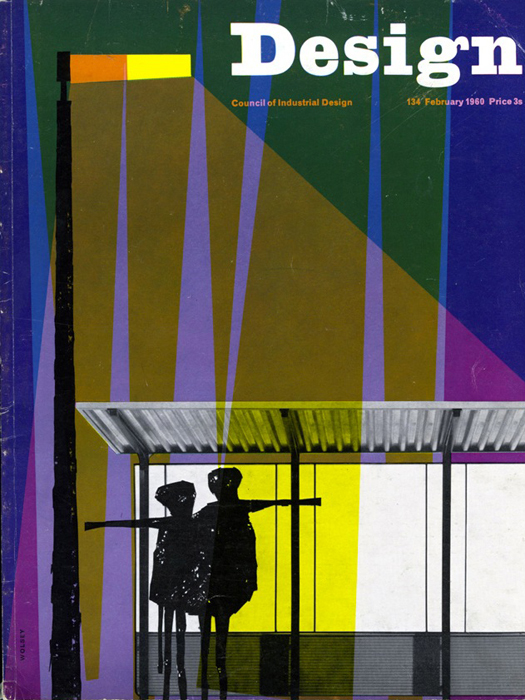
Cover of Design, the monthly journal of Britain’s Council of Industrial Design, February 1960
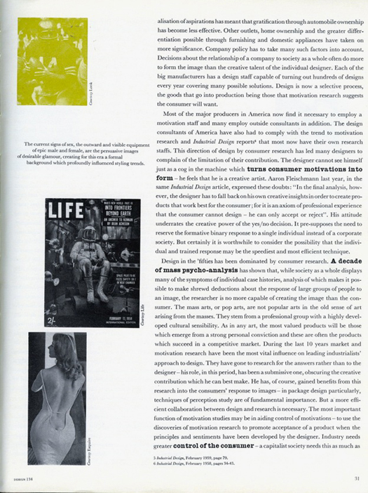
Page from Richard Hamilton's "Persuading Image" article in Design 134, February 1960
The article was based on a lecture titled “The Designed Image of the Fifties” Hamilton delivered in 1959 at the Institute of Contemporary Arts in London to members of a loose-knit discussion salon known as The Independent Group. Led by Lawrence Alloway and John McHale, the Group arranged a series of lectures on aspects of pop culture, and specifically American pop culture, as an alternative to prevailing standards of good taste in 1950’s Britain. Other lectures in this series included expositions on Elvis, violence in the cinema, and the design critic Reyner Banham on American car design. Hamilton’s lecture discussed appliances such as washing machines and refrigerators and the intricate network of designers, manufacturers, publicists, advertisers, and magazine editors, involved in the creation of the images used to sell these goods. “I covered that territory as thoroughly as Banham covered his study of automobile design,” Hamilton told me, “but I became interested in the sociology and psychology of advertising too. It was about advertising as much as the goods themselves.” Hamilton described his presentation as being rather “exotic.” He had three projectors and three screens; one of which was the whole of the back wall. This format was his response to the Eames’ multi-screen film Glimpses of the U.S.A. produced for the 1959 American National Exhibition in Moscow in which 2,200 images were projected on seven 20-by-30-foot screens. “In my modest little way I was trying to catch up with the avant-garde,” Hamilton recalled.
Michael Farr, editor at Design, who had studied English at Cambridge, under the tutelage of the literary critic FR Leavis and had worked at the self-consciously debate-driven Architectural Review, was at the ICA lecture in 1959 and commissioned Hamilton to turn it into an article for the magazine. Farr had a journalistic appreciation for controversy and saw how Hamilton's perspective could invigorate the magazine. Within the magazine Hamilton’s article is emphatically flagged. It’s the lead article. Its first page is printed on bright yellow paper, and color tints were used for the images, at a time when color tended to only appear in Design when a manufacturer paid for it in order to better show off their product. Ken Garland, art director of Design at this time, recalls that the bolding of key phrases was to “enliven and emphasize” the text and was done in consultation with Hamilton.
Hamilton’s use of imagery was also unique within the pages of Design. The images he and Garland selected to illustrate his piece float alongside the text allusively rather than as directly referenced examples. His enigmatic captions float too, fusing poetry and the language of advertising slogans. He sampled both these images and quotations from other design magazines such as Industrial Design, which he read at the American Embassy library.
While other writers in Design worked within a tight sphere of influence that spun on a shared axis of good taste — pure forms dictated by function, natural materials, craftsmanship, preferably Scandinavian — Hamilton provided a glimpse of the larger and messier circumstances in which design actually operates and canny commercially minded industrial designers, who he described variously as: “specialists in the look of things;” “marketing aids;” “men who establish the visual criteria;” operators of “the machinery of motivation control” and collaborators with “ad-man, copywriter and feature editor.”
Hamilton’s article was also conspicuous through its role as a conduit for an American perspective on economic and social practices. The idea, for example, that prosperity was contingent upon accelerated obsolescence had been propounded by economists like Peter Drucker and made available to Hamilton via George Nelson writing in Industrial Design magazine. In his 1956 article for Industrial Design on “Obsolescence” Nelson explained that America was so rich because it was so wasteful; that the waste-system enabled mass production at an ever-increasing pace. Nelson surmised that the European view of this was “a blend of appalled curiosity, downright disbelief, righteous indignation and envy.” Hamilton understood the social costs of such an economic model, but unlike the European response Nelson imagined, he applauds the way in which American industrial design had come to terms with mass society and had reached a situation of mutual appreciation with “big business” (one of the terms in his 1957 enumeration of pop art’s qualities.) Indeed, he was frustrated by the slow take up of such ideas on his side of the Atlantic.
Hamilton especially admired the people who knowingly constructed the “designed image of our present society” in the pages of “glossy magazines.” These are the very images, after all, that provided Hamilton and others at the Independent Group meetings of the 1950s with such a rich source of inspiration, raw material, and formats for their creative expression. He talks of their creators’ “skill and imagination” and “wit,” and quotes their slogans — “plush at popular prices” — surely aware of the goading effects such language would have had on Design magazine’s readership. Even the very use of the word “glossy” would have triggered complex reactions. Paper rationing continued in Britain for several years after the end of the war and even by 1960 it was still a recent memory for many. Hamilton was using the word as a descriptor for mainstream consumer magazines such as Life, Look, and Esquire of course. But he must have been aware of its pejorative connotations in a post-war Britain fearful of Americanizing influences of “ersatz” mass media.
His title, “The Persuading Image,” evokes Vance Packard’s 1957 book The Hidden Persuaders, a best-selling exposition of the media manipulation of the populace in the 1950s. For Hamilton, however, the constructed image was far from sinister. The identification and exchange of art-directed images was a shared connection among his peers, who were obsessed by pin-board culture, a habit he says they had picked up from students at the Architectural Association. “It was strange to walk into the houses of friends and find we all had exactly the same picture,” he said. “There was a picture of an American model wearing a backless dress, showing her backside cleavage, which was very venturesome. That was on everyone’s pin boards.” The image of swimwear model Vicky Dougan’s back, framed by a low-cut white dress, used to illustrate “The Persuading Image,” was clipped from Esquire and ended up in the work Hamilton created between 1958 and 1961 titled “She.”
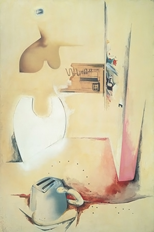
She, Richard Hamilton, 1958–1961
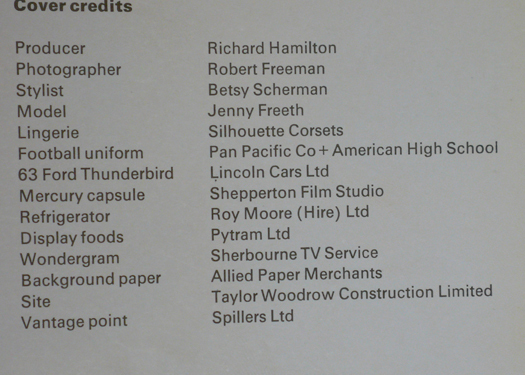
Hamilton’s fascination with the art direction of images is also evident in his inclusion of the 14-item list of the crew and props it took to produce a complex self-portrait that was used for the cover of a 1963 ICA publication called Living Arts. The image, photographed from above by Robert Freeman, features a 1963 Ford Thunderbird with a lingerie model sprawled on the back and a male model wearing an American football uniform leaning on the hood, a Mercury spacecraft capsule on loan from Shepperton Film Studios, a refrigerator stuffed with American food, a Wondergram, a vacuum cleaner, telephone, typewriter, and toaster all arranged on a background of high-gloss pink paper. Hamilton credits the photographer, the stylist and himself as the “producer” of the image.
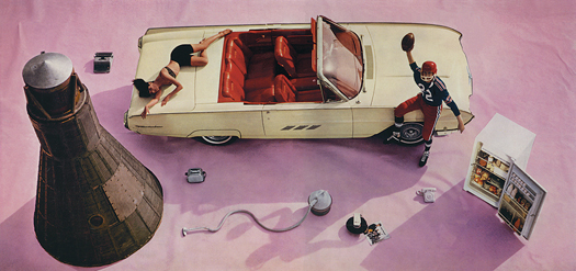
"Self-portrait," produced by Richard Hamilton and used as cover image for Living Arts, 1963
Design magazine invited responses to Hamilton’s article from a select group of American and European designers, manufactures and critics. Among them were Reyner Banham; Misha Black, the industrial designer and professor of industrial design at the Royal College of Art; and DW Morphy of the British home appliances firm, Morphy Richards. They reacted to the planned obsolescence and motivation research aspects of Hamilton’s piece, objecting to what they perceived to be Hamilton’s lack of morality and social responsibility. Under the subhead “Man without a conscience,” for example, Alberto Rosselli, the editor of Stile Industria, is reported as saying “the Hamilton prescription is immoral in that it might lead to indiscriminate use of persuasion.” The discussion went on for several pages and continued in readers’ letters in subsequent issues.
Hamilton was given the last word on the subject. He wrote, “The phrase that caused the alarm, ‘designing the consumer to the product,’ is a redefinition of a well-known process; for the ultimate political evil it was called fascism, when directed at purely commercial objectives it is called salesmanship, without the moral overtones it is known as education. We are all concerned, in one way or other with the conversion of others to a point of view.”
Indeed, the Council of Industrial Design’s longstanding mission had been to "design" the consumer of design in Britain by improving their taste. Design magazine, too, under pressure to sell more issues, was beginning to show curiosity about its own consumers. They employed Mass Observation to do some market research and its 1961 report on Design magazine’s readership unearthed a litany of grumbles about its form and content.
It turned out that the consumer of Design was harder to shape than its managers thought. Readers had specific views about Design and how it could be improved. One of the subscribers interviewed, a production planning manager in an engineering firm, said he wanted more articles by sociologists. In his rationale for this request he unconsciously quoted Hamilton’s article, saying: “The magazine should deal with the social side of design. You can now design the customer to the product as well as the product to the customer.”
Hamilton did not consider himself a design critic; “I’ve always thought of myself as a design hobbyist,” he said. And yet his perceptive analysis of the mechanics of image making and the social and economic implications of mass-produced consumer goods went against the grain of design discourse in post-war Britain and was expressed with a degree of authority and conviction seldom found among establishment-sanctioned design commentators of the period.