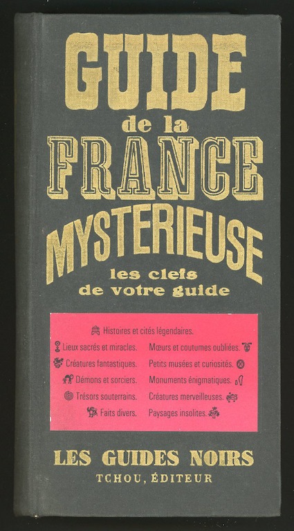
Guide de la France mystérieuse, published by Tchou
Paris, first edition, 1964. Design: Serge Kristy
At more than a thousand pages, the Guide de la France mystérieuse is a monster of a travel book. It’s hard to imagine tourists lugging this tombstone around France in their backpacks in search of strange locations and monuments of macabre history. Yet the volume, published by Claude Tchou in 1964, must have been a hit. The gazetteer spawned a series of spin-off guides to the mysterious regions of France and the original tome was reissued as recently as 2005.
I have been eager to get my hands on the first edition I lent to the Moravian Gallery for my Uncanny exhibition in 2010 and at last I have it again. The book contains a fantastical alphabet for the dictionary’s divider pages, designed by the Polish graphic artist Roman Cieslewicz, who had relocated to Paris. Margo Rouard-Snowman reproduced these surreal letterforms, collaged together from parts of old engravings, in her 1993 monograph about Cieslewicz. I showed the complete set of characters in Uncanny and they were also included in a Cieslewicz exhibition at the Royal College of Art in London curated by David Crowley and Andrzej Klimowski around the same time.
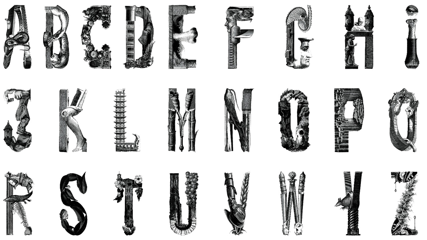
Alphabet by Roman Cieslewicz for Guide de la France mystérieuse, 1964
Here, though, I want to focus on the book as a whole. The letters need to be seen in their original context, where they were printed in red in a black oval frame, to appreciate how successfully Cieslewicz met the demands of the project, brilliantly matching his graphic inventions to the book’s antiquated Gothic atmosphere. In 1964, Jean-Luc Godard directed his modernist masterwork Une femme mariée, Roland Barthes published Eléments de sémiologie, bringing the clinical language of science to the analysis of cultural signs, and the sun-drenched Maeght Foundation for progressive modern art opened in the south of France. With its funereal binding, curiosity-shop title-piece, arcane symbols to classify entries, and hundreds of dark and disquieting 19th-century engravings, the contemporaneous “guide noir,” devised for the bookshops of modern France, looks more like a forbidden volume from a bygone era steeped in superstition, morbid folklore and an oppressive sense of dread. It couldn’t be more removed from the era’s confident technocratic modernity.
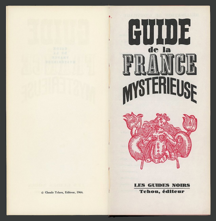
Title page
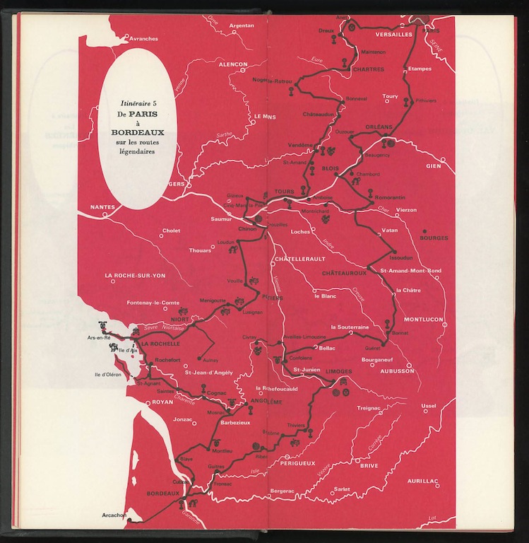
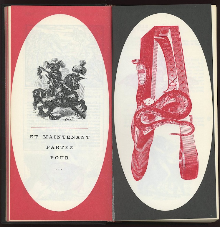
Itinerary no. 5, from Paris to Bordeaux on the legendary routes
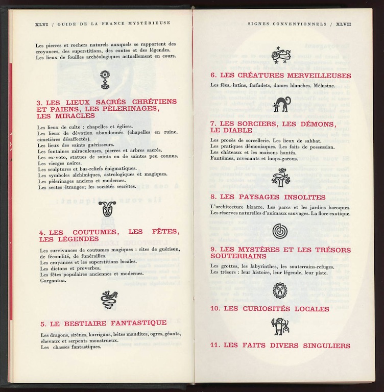 Definitions of the symbols used alongside each entry in the guide
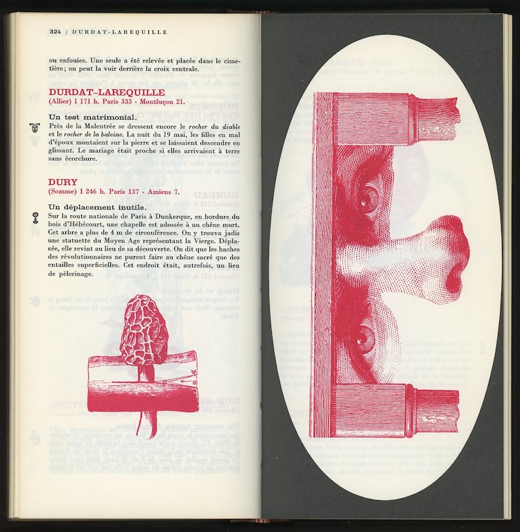
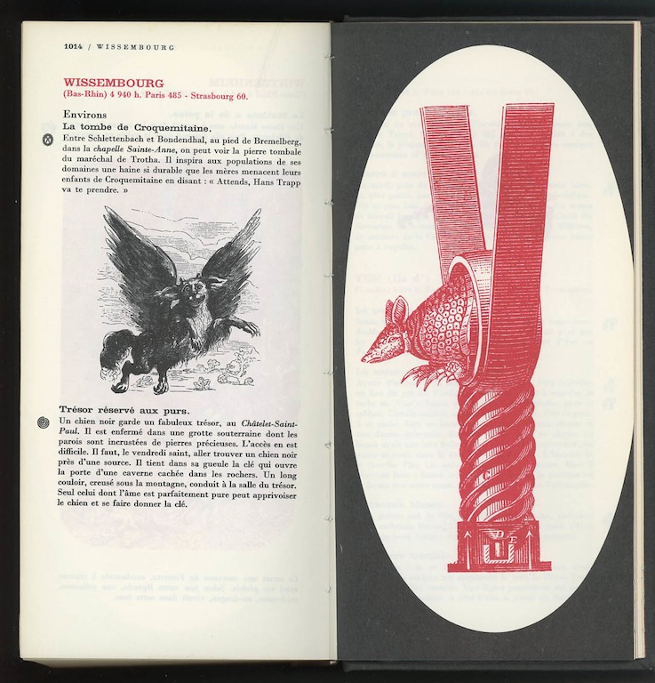
Every spread in the alphabetical guide has at least one illustration. There are looming spires and towers, ruined castles, grinning devils, giants, witches, flying chariots, nocturnal apparitions, writhing serpents, vampire bats, succubi, levitating skeletons, dancing crabs, a three-headed demon riding a snake, and the mysterious menhirs of Carnac. As well as the letterforms, Cieslewicz supplies smaller decorative collages composed of just two or three incongruous elements: a fossil with the head of a tapir; a pair of eyes trapped inside a cogwheel; a giant snail in promiscuous congress with a mandolin. These, like his bizarre alphabet and some of the historical engravings, are printed in red, and the graphic equivalence of the two kinds of visual material, the archival and the manipulated, draws out the implicit connections between Gothic imagery and mid-20th-century Surrealism.
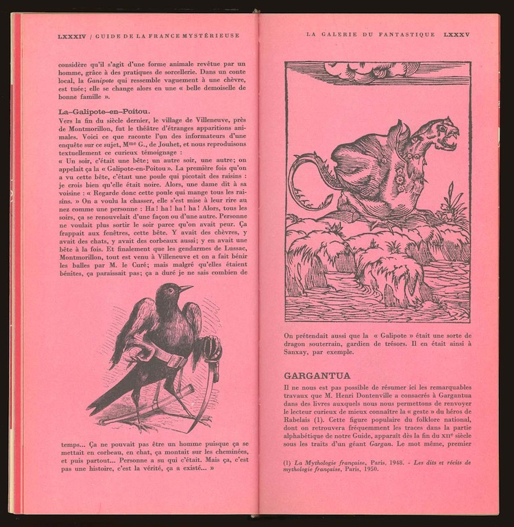
Gallery of the fantastic: a glossary of essential terms
Opening spread of the dictionary. Letter A by Roman Cieslewicz
Entries in the A section
These literary influences were present from Surrealism’s inception. In the first Surrealist manifesto, published in 1924, the movement’s founder André Breton cites Matthew Lewis’s Gothic novel The Monk (1796) with approval, and he also refers to his undiminished taste for Gothic novels in his book Communicating Vessels. Max Ernst’s collages — the obvious influence on Cieslewicz — abound with deranged Gothic images and settings, which can be found in the work of many other Surrealists. Man Ray depicted the Marquis de Sade, a Surrealist anti-hero, as a brooding, impregnable castle made of stone. The Dictionnaire abrégé du surréalisme (1938) features decorative initials in various ornate Gothic styles. In 1935, the Czech writer Vítězslav Nezval, editor of the journal Surrealismus, published a Surrealist Gothic novel, Valerie and Her Week of Wonders, in thrall to the influence of Ernst’s collages and Lewis’s The Monk. As a sign of growing interest in a topic that has never received the close scholarly attention it deserves, the journal Gothic Studies is preparing a special issue investigating the relationship between Surrealism and the Gothic.
Collage and letter E by Roman Cieslewicz
Entries in the M section
Letter Y by Roman Cieslewicz
In the years after the Second World War, Surrealism was still an active cultural presence in France. An International Surrealist exhibition dedicated to the theme of Eros took place in Paris in 1959, and a succession of new Surrealist journals made their appearance. Breton continued in his position as leader of the Surrealist movement, which was only disbanded following his death in 1966. The guide’s publisher, Claude Tchou, also produced books by Breton, Ernst and the Surrealist poet Paul Eluard; in 1968, he published an edition of the notorious Story of O by Pauline Réage, with illustrations by the Surrealist painter Léonor Fini. The markedly surreal dimension of Tchou’s strangely ancient-looking handbook-cum-passport to enigmatic monuments, miraculous occurrences and marvelous beings reflects the incredible persistence of an internationally influential movement that had begun in Paris four decades earlier.
Regrettably — in case anyone is tempted to track it down — the 2005 edition is a shadow of the original. Oddly, too much has been left unchanged. Most of the old engravings are retained, as well as Cieslewicz’s images, although everything is printed in black, losing the subtle black-and-red interplay of the original. The paper is too white, the redone typesetting lacks the graphic punch of the early edition, and the blacks are less black. A 16-page color section added to the middle is misplaced; the whole book should be in color now. The binding is so hard and unyielding that it looks and feels like a brick. The guide has lost its profound sense of mystery and the marvelous, and its impression of kinship with early Surrealism. It needed to be re-imagined in a style that would look convincing today. Fortunately, old copies of the magnificently weird first edition can easily be found.
Later uses of Roman Cieslewicz's alphabet for Guide de la France mystérieuse
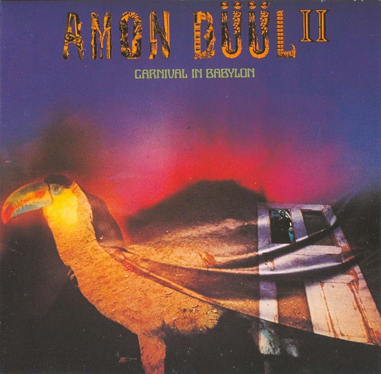
Carnival in Babylon by Amon Düül II, LP cover, United Artists, 1972
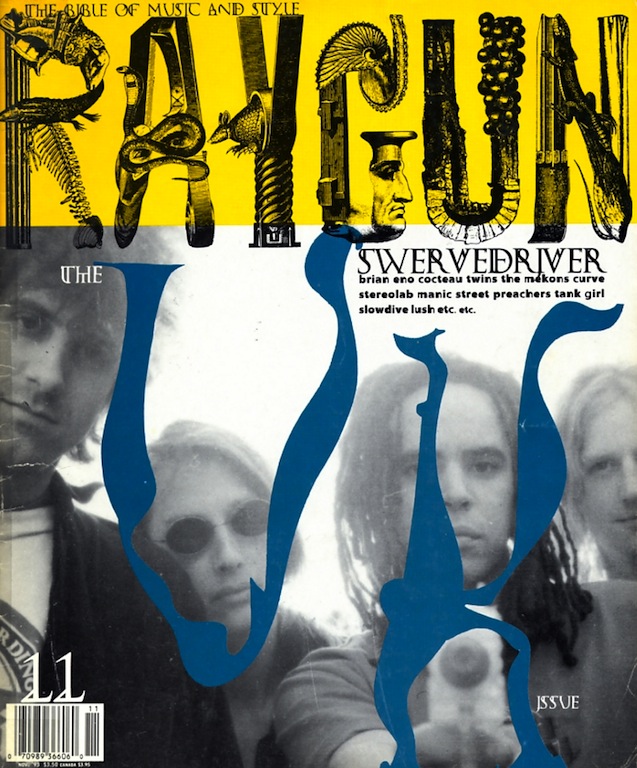
Ray Gun no. 11, 1993. Art directed by David Carson


Comments [1]
08.01.14
08:16