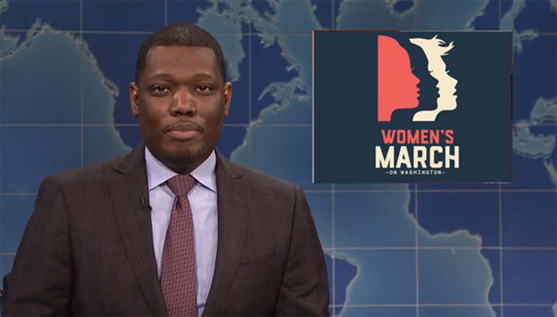
Michael Che announcing the new Women’s March logo at Saturday Night Live’s “Weekend Update” December 17th, 2016
A logo unrelated to the cause
On Saturday Night Live’s “Weekend Update” on December 17th 2016, Michael Che announced that “the organization planning the Women’s March on Washington in January has released the official logo for the event. It’s a great logo, because like many feminists, it puts the white women in the front. [Audience laughs.] I can hear the keyboards.” But there was no sound of keyboards. In fact, aside from a few blogs that have written generally about the logo and a couple of simple Q&A’s with the illustrator who drew it, a discussion about its political implications has been missing completely.
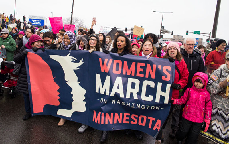
When I first saw the logo I was struck by how simplistic it was in comparison to the very ambitious and complex goals of the Women’s March. The march had as its mission to bring together all kinds of people––not just women––at risk under the new administration. As the organizers put it, “we join in in diversity to show our presence in numbers too great to ignore.” The March became an umbrella event for anti-violence, civil rights, LGBTQ rights, reproductive rights, disability rights, immigrants rights, workers rights, and environmental rights. I’m not proposing that the logo should have been a mishmash of all these issues; a logo’s strength usually lies in its ability to simplify and be easily interpreted. However, a logo’s strength is also measured by how well it reflects the organization it represents, and for a march that speaks out about issues of marginalization, it is counterproductive when its logo relies on reductive and stereotypical representations.
Celebrating (or stereotyping) differences
The logo depicts three staggered silhouetted figures colored in red, navy, and cream. They all have long eyelashes and half-open, pouting lips, and heads slightly tilted upwards. It is a simple illustration, but it is clear from these enhanced attributes that these figures are meant to be women.
Each woman’s features varies slightly, and as Michael Che noted on SNL, it’s obvious that they represent different races. The woman furthest to the right is white not only because she is cream-colored, but also because she has fine hair and thin lips. In comparison, the black woman has full lips and a tall forehead, and is depicted in dark blue. Finally, in the foreground we see the woman in red, who appears to be a mixed representation of all other races “in-between” black and white.
This was indeed the idea behind with the logo. Wolfgang Strack, a designer who worked with the team at Big Monocle to bring the concept to life clarified in a post about the logo on Medium, “the idea was that we’d have multiple silhouettes representing a group of women from different backgrounds, coming together to build a movement. The silhouettes are not supposed to represent all women though — we would need at least a dozen variations to try to get close — rather they symbolize the ideas of diversity, solidarity, and determination.”
Similarly, the Women’s March mission statement signed off with a quote from activist Audre Lorde: “It is not our differences that divide us. It is our inability to recognize, accept, and celebrate those differences.” I can see how the designers felt that the logo did recognize, accept, and celebrate differences. But although the logo depicts three women of three different races, its representation of them actually perpetuates stereotypes of gender and race—things the march stood against—making the logo itself hypocritical.
The team behind the logo
When I first heard of the March, the graphics consisted of a set of outlined gradient text overlaying an image of the Civil Rights March on Washington in 1963––far from the sleek professionalism of the official logo to come later. How did the brand come to be?
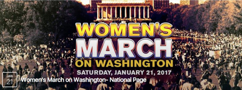
Facebook banner for the national Women’s March page, November 2016

Actress Scarlett Johansson speaking at the Women’s March January 21st, 2016
Teresa Herd, VP Global Creative Director at Intel, collaborated with Marianne Besch, Executive Creative Director at McGarryBowen, to put out a call for pitches to create an official brand for the Women’s March (as well as a PSA that they made with the production group Hungry Man). Herd, in turn, had gotten involved through a friend at Gathering for Justice, the non-profit that helped to organize the Women’s March, and whose Executive Director, Carmen Perez, is the Women’s March National Co-Chair.
Amy Stellhorn, who had previously done work for Intel, paired her creative team at Big Monocle with Wolfgang Starck of Starck design, and came up with a couple of concepts to the pitch. They engaged illustrator Nicole LaRue to execute.
Wolfgang Starck concept illustrations
Based on the concepts created by Stellhorn and her team, LaRue completed a number of illustrations in one day. The pitching process for the Big Monocle team took about a week. Out of the number of variations they submitted, LaRue’s version was approved with minor changes. The Women’s March now had an official logo, which launched in mid-December 2016, approximately the same time that the march attained its permits.
Taking a second look
There are several design elements that require second consideration. For instance, the Under Consideration design blog Brand New quotes LaRue as saying that the logo “conveys diversity and women standing together and speaking out in a united voice—a voice that calls for solidarity, demands equality and confronts injustice.” However, the women’s mouths are barely open. How can they be “speaking out”? They seem passive, calm and non-vocal; there is no calling out for demands or confrontation. They might be standing together in silent solidarity, but there is no explicit action.
Alfalfa Studio, a New York-based design firm, wrote that the design team behind the Women’s March logo took “cues from The Girl Scouts, Soviet-era Constructivism, the WPA, and [artist] Kara Walker,” presumably because of the use of simple illustrations and strong typeface. But what is missing from the Women’s March graphics is the call to action and urgency that WPA and Rodchenko posters are known for, and the comparison seems like a stretch made to legitimize the logo as a progressive design for a just cause.
In fact, it seemed the design team failed to honor any references or inspirations. In an interview on the Working Not Working blog Free Range, LaRue claims that the illustration has no intended historical references, with the main influence simply being the need “for unity and solidarity and the need for a much bigger voice.” However, as design blog Casual Optimist noted, there is a distinct similarity to the Girl Scouts logo, made by Saul Bass in 1978. This seems like an obvious parallel, as the Girl Scout logo is also silhouetted profiles of three passive women.
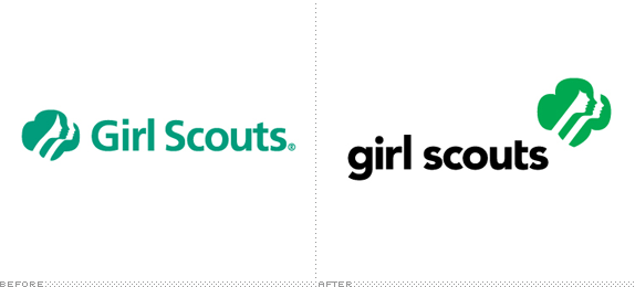
Saul Bass 1978 Girl Scouts Logo, and the 2010 update by Original Champions of Design.
Claims that the design sends a strong message about confronting injustice sound like an afterthought. In order to win pitches you need to use marketing language to sell the concept to the client, convincing them that the design is unique in comparison to potential competitors. But in the end you could well spend more time justifying the work than creating it and determining if it is actually doing its intended job—sending the right message on paper.
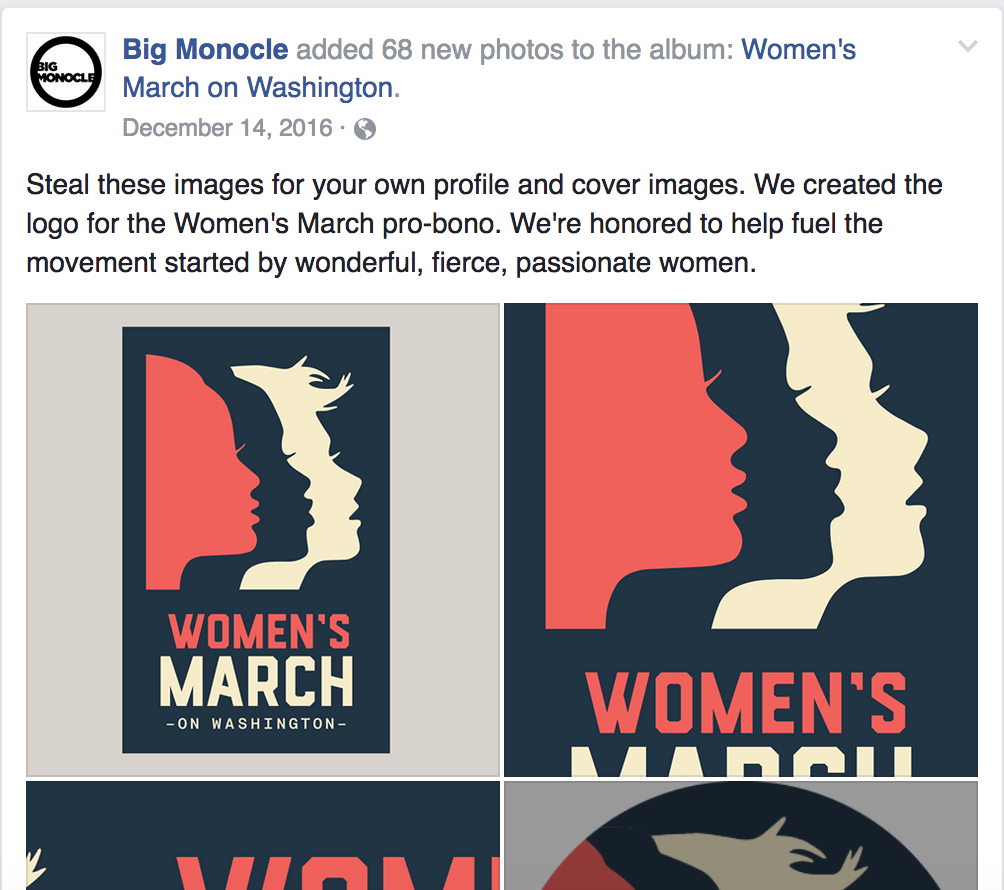
Women’s March on Washington logo on Big Monocle’s Facebook page, December 14, 2016
Though the people involved in making the logo (not including the team that made the accompanying PSA) were mostly female, to the best of this author’s knowledge, they were all white. Maybe with a more diverse group of designers someone would have been able to recognize and point out some of the reductive stereotyping?
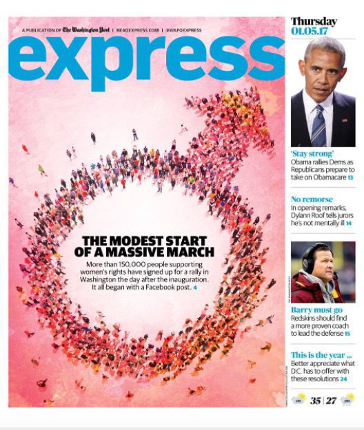
Washington Express January 5 issue cover
And could it really be that nobody, except for a SNL comedian, took a second look at the logo and asked whether it might be seen as hypocritical? A parallel here is the mistake of the Washington Post Express, which featured an illustration of a male symbol instead of a female symbol for a cover story of the Women’s March on January 5th this year. Is nobody fact-checking the visual language?
Weighing intentions and outcomes
This is the time to volunteer our services as graphic designers. Many organizations and causes need help in making their messages clearer and more approachable, and as visual communicators we have enormous influence over how messages are conveyed. Of course there are several challenges to navigate—we might not be able to decide who sees our work, or when, and we still need to reassure skeptical non-design collaborators or clients that the design direction will work. What we cannot do perpetuate stereotypical images in our designs—and so we must be conscientious of what ideas and images we are referencing.
The design team behind the women’s march logo had the best intentions, and their work was pro-bono. It might seem unfair to critique something that a group of people had spend long and unpaid hours to create. But it is not enough to be well-intentioned and willing to help if we don’t also have a critical dialogue around the images we produce.
In the current political climate things may feel urgent and chaotic, but we can’t default to the easiest and quickest solution. If a design brief calls for a logo of a group of women, consider all the ways a woman can look and be depicted. Even better, if designers work together with the client from the beginning, skipping the pitching process and writing the brief together, maybe the design will take a whole new turn, and the visual language would better extend the meaning and the message of the cause.
There are ways the design team could have depicted “diversity, solidarity, and determination” without having to play into typical gender and race stereotypes. Take, for example, illustrator Stina Lofgren’s logo for “Online respect.” It depicts a red smiling figure looking down holding its arms in a hug, and in the negative space between the arms, there is a purple speech bubble with a smiling face meeting the red figures eyes. By keeping the figures androgynous, and the message positive—for online respect, rather than against cyber bullying—Lofgren makes it easy for the viewer to identify with and relate to the cause. The logo could have easily referenced a struggle between a bully and a bullied person, but instead of perpetuating stereotyped ideas of aggression and violence, it looked toward a positive solution.
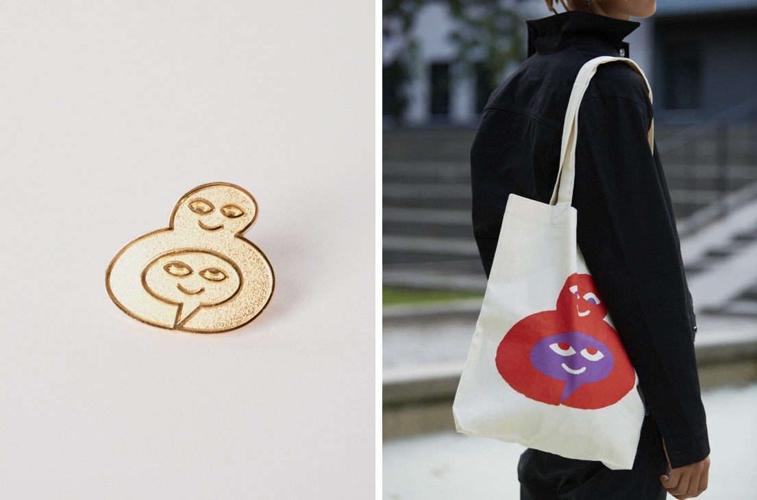
Stina Lofgrens Logo for “online respect”
It is our job as designers, despite a sense of urgency, to ensure design identities reflect the values of the organizations and people they represent. Taking a second look at both our own and each other’s work will make for a more consistent argument as we stand to fight inequality and take steps toward being less hypocritical in our political activism and visual language. And that’s a mission we can all get behind.