James McCague, The Cumberland
New York: Holt, Rinehart and Winston, 1973
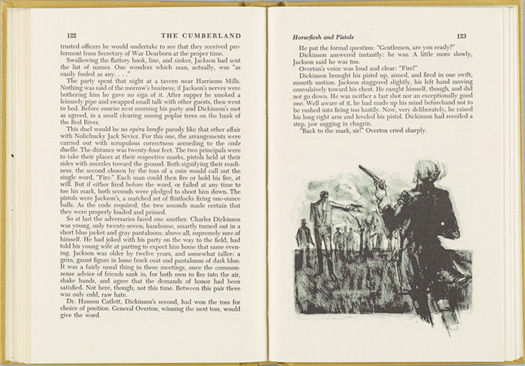
“This series [Rivers of America] had begun in the early Nineteen Thirties with Carl Carmer’s ‘The Hudson’; after the original editor’s death …it was continued, highly successful, by Carmer himself, comprised by this time about 50 volumes, and kept on growing at the rate of one or two volumes a year. (The rivers themselves, of course, become ever smaller.) The prototype I worked from was 1938’s ‘Suwannee River’ by Cecile Hulse Matschat [?]. Textual typography of the new volumes in the series is uniform, variety arises from different handling of display type, and very individual artwork. Local artists with adequate knowledge of river features were hard to come by, apparently, and their quality varies sharply. The budget on these books was very low, control by the in-house editor quite strict. The strict control of the various features of the ‘River’ series is frequently a disadvantage to their design. Example: using a map of the river as a double-page spread inside the book, not as an endpaper. So that libraries, hav[ing] the volume rebound after frequent use, would not lose the map. (It’s not the problem, it’s the solution that is wrong). The Cumberland by James McCague is one of the better volumes in this series.”