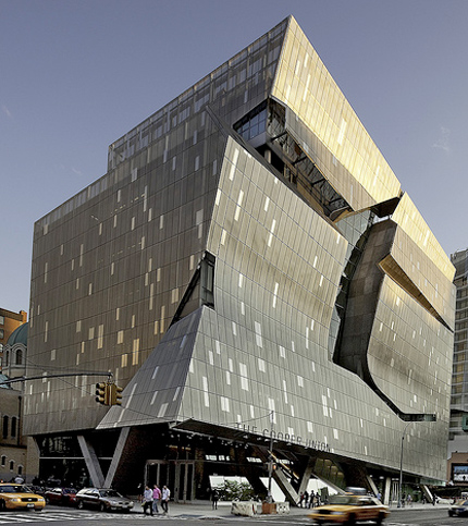
41 Cooper Square, designed by Morphosis, photo by Adam Elstein
I never thought I would say this about a work by Thom Mayne of Morphosis, but I think 41 Cooper Square is too small. Cooper Union’s new, sustainable academic building on Third Avenue is nine stories, 175,000 square feet, takes up an entire city block, and yet, with all the other wonderful and terrible architecture happening on the Bowery and its side streets (the Cooper Square Hotel’s tower version of Frank Gehry’s IAC Building, Herzog and de Meuron’s disco-visionary 40 Bond, Foster + Partners’ Sperone Westwater Gallery) it blends right in. All the photographs I had seen, most taken from the air, made it look like another Mayne Death Star, a chunk of some intergalactic space ship deposited here for repairs (there is that nasty cut across the front).
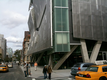
But in reality, 41 Cooper Square is contextual, similar in bulk and heft to what we might now call Cooper Classic, the art, architecture and engineering school’s 1859 Renaissance Revival brownstone building across the street. It kindly nods to the St. George Ukrainian Catholic Church around the back, with a gangly hexagonal cut-out in the perforated exterior stainless steel screen that frames the reflection of the church dome when you stand on the sidewalk across the street. That screen closely follows the rectilinear glass curtain wall that the is building’s real outer envelope on the back and sides, but swoops and bends away from the glass in front, creating horizontal creases that turn into an awning that points uptown. This is not an attack on the dullness of the New York contemporary architecture scene, or the building that restores the city’s place at the architectural center, but a minor work. Just as some architects can’t play at an institutional scale, Mayne seems a little dull in miniature.
The creased facade and the cut taken out of its upper half, I truly don’t understand. They look cool, but that’s about it. Call me old-fashioned, but I like my facades to interact with the interior, to develop from the inside out as well as the outside in. I can’t figure out how the interruptions are supposed to interact with the city, with Cooper’s pedagogical purpose, with the design. They seem merely willful.
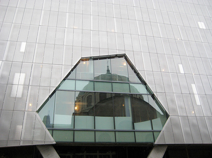
41 Cooper Square with the reflection of a Ukrainian Church, designed by Morphosis, photo by Erinn Wenrich
In The Architect’s Newspaper Thomas de Monchaux compared the staircase 41 Cooper Square to “a partially cored and peeled apple”. I am not quite sure how you would perform that operation, but my hungry mind drifted towards the interior of an undercooked chicken, pale, bones protruding, and more than a little but claustrophobic. Like the disastrous staircase at NYU’s Kimmel Center, also meant to ape the sociability of steps on Beaux Arts campuses like Columbia’s, the flight goes up so steeply I couldn’t see my goal at the top. The floor landings that interrupt the precast concrete treads are almost invisible at ground level. If this is meant to be the school’s mixing space, it is hardly enticing, and the day I was there no one seemed to be stopping. Although the stairs, and the five-story atrium above them, successfully channel daylight through those many floors, you can only see the sky (in a double-height window to the south) once you start walking up.
What you are looking at is Mayne’s architecture: the lattice (tubular steel encased in glass-fiber-reinforced gypsum) that starts in the lobby and twists up and around the stairs, the sideways sway of the staircase itself and, as you ascend, the more crystalline geometry of the acrylic-lined stairs, suspended in the atrium, that take you from floors 5 to 9. The light that filters down is distinctly northern in cast, reinforcing the building’s cool, stripped-down palette. Many of the interior materials are renewable, recycled, and low-emission, part of 41 Cooper Square’s bid to be LEED-certified platinum, a first for an NYC academic laboratory building. The walls are white, the floors mirror-polished concrete, the signage (by Cooper graduate Abbott Miller and his team at Pentagram) stainless steel.
Gruzen Samton Architects did much of the interior programming, layouts, and material specifications.
41 Cooper Square view from inside, photo by Vivian Bratone
If the perforated metal was hard to see through, I could understand the need for some unmediated views, but it is not. The sad little concrete bench built in next to the window behind that cut-out is nowhere I would want to hang out. And to make the cut-out work, Mayne has had to engineer a huge curve of concrete running perpendicular to the edge of the slashing “gesture.” This takes away much of its energy, and anarchy. The difference between a real cut and one embalmed in architecture is similar to the difference between revolutionary Frank Gehry and the one we see today. When he tossed chain-link fence up in the air around his house in 1978 it was loose and direct; contrast that with the frozen music of the IAC Building’s scudding waves. The former seems like a better lesson for students than the mid-career signature style of the latter.
Mayne’s 2007 Federal Building in San Francisco, which I saw last spring, is a powerful piece of architecture, also more horizontal than vertical, and also employing a metallic wrap. That building owns its corner, and suggests that the future of organizations (corporate or governmental) is not in the vertical skyscraper. But it, like 41 Cooper Square, is also aggressively anti-urban. The Federal Building’s ground floor, which includes a “plaza” and a saw-tooth-roofed snack bar, seems to repel people. That may have been what the situation required — the building’s location on Mission is grungy, and there are a lot of obvious efforts downtown to homeless-proof the new architecture — but judging by these two examples, hermeticism is also part of the Morphosis DNA.
At the sidewalk 41 Cooper Square might as well be set in the middle of a parking lot in Mayne’s native L.A. I was thinking of the criss-crossing concrete legs as Breuer-esque (there are lots of big boxes lofted on diagonal columns in his campus buildings in University Heights) when another building, closer to Mayne’s home turf, popped into my head: Eliot Noyes’s 1964 IBM Aerospace Building in Los Angeles, now the Otis College of Art and Design. Almost a cube, clad in precast concrete panels punctuated with windows that suggest a punchcard, Noyes’s building lifted its symbolic screens off the ground on shifted diagonal legs and does sit in the middle of a sea of cars. Noyes’s building offered shaded space at the base, before the glass entrance, but in Mayne’s building, the space between concrete and glass is narrow and empty. A strip big enough for some sociability opens up on the south side, where a bookstore is scheduled to open. Maybe they will put out a few tables? In their loneliness the interstices of the legs are filling with bits of trash.
There is a small publicly-accessible lobby inside the entrance at the corner of Third and East 7th Street, and the guard ringed by the front desk will point you downstairs to a gallery. But the reason anyone would want to come inside, the lattice-wrapped, four-story, daylit “vertical piazza”, is only half visible, buried at the center of the volume.
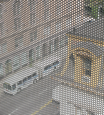
Cooper Union's Foundation Building and the building on the corner of 7th Street, through the perforated skin of Cooper Union's New Academic Building, photo by user44/Nick
In The Architect’s Newspaper Thomas de Monchaux compared the staircase 41 Cooper Square to “a partially cored and peeled apple”. I am not quite sure how you would perform that operation, but my hungry mind drifted towards the interior of an undercooked chicken, pale, bones protruding, and more than a little but claustrophobic. Like the disastrous staircase at NYU’s Kimmel Center, also meant to ape the sociability of steps on Beaux Arts campuses like Columbia’s, the flight goes up so steeply I couldn’t see my goal at the top. The floor landings that interrupt the precast concrete treads are almost invisible at ground level. If this is meant to be the school’s mixing space, it is hardly enticing, and the day I was there no one seemed to be stopping. Although the stairs, and the five-story atrium above them, successfully channel daylight through those many floors, you can only see the sky (in a double-height window to the south) once you start walking up.
What you are looking at is Mayne’s architecture: the lattice (tubular steel encased in glass-fiber-reinforced gypsum) that starts in the lobby and twists up and around the stairs, the sideways sway of the staircase itself and, as you ascend, the more crystalline geometry of the acrylic-lined stairs, suspended in the atrium, that take you from floors 5 to 9. The light that filters down is distinctly northern in cast, reinforcing the building’s cool, stripped-down palette. Many of the interior materials are renewable, recycled, and low-emission, part of 41 Cooper Square’s bid to be LEED-certified platinum, a first for an NYC academic laboratory building. The walls are white, the floors mirror-polished concrete, the signage (by Cooper graduate Abbott Miller and his team at Pentagram) stainless steel.
Gruzen Samton Architects did much of the interior programming, layouts, and material specifications.
The corner of 41 Cooper Square, photo by Mason White
The few spots of color are hidden away, largely invisible both from the outside and from the staircase. I saw an orange-red fire stair in the northwest corner, and a yellow box to the south (it houses some offices). I would have liked something bright to warm up all those matrixes, but the pop sensibility was denied. Mayne’s building seems like it should have some warmth, since he’s working with curves and texture and fabric shapes, but every one of his matrixes turns out to be hard and cold to the touch. In the lower level Frederick P. Rose Auditorium, ordinary screen mesh has been molded to ripple like the surface of an ocean on walls and ceiling — there’s acoustical material behind, and it looks lovely — but it is as rigid as a metal plate.
When I originally embarked on this review, I wanted to talk about the building as an educational space. Most other reviews I had read were filed before students and faculty moved in, even, in the case of the New York Times, before the building was finished. But on my tour I was whisked past the classrooms, and told not to hang around with a notebook for fear of disturbing the students. The classrooms and labs looked like perfectly nice plain rectilinear rooms with natural light ringing the outside edges of the building. A few looked like corporate conference rooms. The double-height student lounge at the top of the big stairs was dominated by the vending machines, as they always are. Someone forgot to work bulletin boards into the design, so the walls between the elevators are already covered in 8 ½ by 11 posters.
What all these day-to-day bits of student life had in common was they had nothing to do with the staircase, and nothing to do with the exterior screen. Students can almost entirely avoid engaging with either simply by taking the elevator, crossing Third Avenue. Those gestural parts are only applied to the Cooper experience, as if to say, If you’re lucky, this is what you get to do. Both elements already feel a little like museum pieces from 2009, show-offy but not integral. Paul Rudolph’s Art and Architecture Building at Yale, where I took my architecture classes, and wrestled with his unforgiving staircase, is not everyone’s cup of tea. But the design did impact every part of your student life, the tiered studios, the two sets of stairs, the skip-stop bathrooms, the snack bar with a view. Mayne’s work for Cooper Union feints at that kind of mind-altering, shape-shifting experience. But it didn’t make me feel pummeled or exalted, just curiously bored.


Comments [17]
My reaction to the Cooper Building was different than yours. Like a lot of Mayne's architecture, on the street I think it conveys alienation and nihilism, qualities I'm sorry to see in a presumably enduring building from a Liberal institute of higher learning. I haven't been inside, so I can't comment on that.
Alienation and nihilism are fine on a wall in a gallery, where we can choose to ignore what the artist wants to say if it doesn't appeal to us. But this building should both express the wishes of Cooper and its students and still be standing on the public street 200 years from now. Timelessness works better for public buildings than the fashion of the moment.
I'm interested in your comment because recently I've been visiting a lot of contemporary "autonomous" avant garde architecture and I've generally thought "So what?" Last week, for example, I saw the Make It Right post-Katrina houses financed by Brad Pitt in the Ninth Ward in New Orleans. Seen in the context of the street, they were not exciting or shocking, as one might think from the carefully controlled photos one sees. They were boring objects, and they did not add up to a good street.
10.26.09
03:29
"I think the interesting thing about Thom is that the way he talks about his buildings is that they represent freedom and openness and a kind of optimistic spirit about what architecture can do," Hawthorne says during the show e2, narrated by Brad Pitt. "And I think most people including me see them as much more aggressive and they have a kind of brooding quality. It would take a psychologist to untangle the contradictions in the work."
10.26.09
03:47
10.26.09
06:23
This project is criminal. It is highway architecture dropped into downtown Manhattan. It’s a retro sculpture, not a functioning building. The gash in the main facade is best appreciated at 65mph, or faster still to escape this monstrosity.
The proportion of the atrium (non-usable space) to the classrooms is ridiculous. I took a construction tour of the building and asked where the classrooms were – they pointed to tiny rooms (3m x 3m) stacked along the perimeter that were barely sufficient for a professors office space. Perhaps they intend students to learn in the stairways?
The scale of it is off in so many ways – Thom should stick to building in California where there are highways and huge expanses of open space. He has no sense of density or urbanity.
And in my opinion the backside of the building looks like a jail. It’s an opaque metal skin as viewed from the street, with no visual interest for pedestrains.
10.26.09
07:44
But this is just the beginning: when the pigeons take root at the apex of the angle, ground-floor curtain walls, and cover the glass with guano, it will then take on qualities of the nether-reaches of the Javits center; Travis Bickle will feel right at home.
Too bad too, b/c its a fairly interesting form, looking like a sort of expensive version of cloepfil's reclad of 2 columbus circle (yes, mayne's building feels like a reclad, like a straining of intention to cloak an otherwise conventional form that was too expensive to take down, but all in all a pretty interesting cry for attention that seems like it lets the light in) but the ground floor is killer in a bad way; like a 60s car wash that was closed for a renovation that never happened.
10.26.09
08:51
10.26.09
09:34
41 Cooper Square > you think.
It is a beautiful thing to have Sustainability as the unwritten core curriculum for Cooper Union’s three schools Art, Architecture and Engineering. Cooper’s educational process has always been to nurture creativity and innovation. Now the new building at 41 Cooper Square will not only strengthen the cross-disciplinary interaction within the school and promote freedom of expression, it will also help its student body make an extraordinary contribution to the community. From its symbolic vertical piazza and sky bridges to its pastoral classrooms designed to for study, the building embraces Peter Cooper’s optimistic ideals. — I also love the signage by Abbott Miller and his team at Pentagram.
10.26.09
10:41
10.27.09
03:36
10.27.09
10:20
This building is sadly anti-urban as you say!!
Denuded "Diesel Punk" is not edgy. A structure that strives to look like a model out of a Star Wars scene seems too obvious to garner so much admiration. The skin is dull and monolithic. That goofy stair space is a "special effect" used by almost all grad students. The scale is imposing and the main street facade which looks out onto Cooper Square (like a black tooth) upstages the urban wall of the square to the detriment of Cooper Square and The Foundation Building.
Also poor Ukrainian Church and poor McSorleys (on a darkened 6th Street). An upturned finger to the Lower East Side ...Cooper has forgotten it's roots in this community.
Dated and "in your face" all at the same time this is sad architectural statement for a great urban school like Cooper.
FYI : I am a graduate of The Cooper Union School of Architecture.
10.28.09
11:50
“Maybe even . . . kind of a pretty building for somebody.” —Thom Mayne
11.28.09
10:16
Among many glaring inadequacies that others have mentioned here, a few are particularly painful to the students. The wall space of this building was clearly not designed with art students in mind, for unlike the foundation building, there is absolutely no space to hang work. The stairs, as whimsical as they are at first glance, are not in at all functional; in many places they are too small for students to pass each other (let alone have a conversation or share ideas) and between the sixth and seventh floors there is no connection at all. And for a supposedly sustainable building, the revolving door is much less prominently placed than the regular door, so no one uses it unless prompted by a sign.
It seems like an utter betrayal of everything the school stands for to bring in an LA architect who has evidently knows nothing about cooper.
01.08.10
12:02
The spaces are ugly... the big stair is a big bore... the gash in front promises to disembowel the building...
How could Cooper have build it????
Intensely disappointed....
Don Mallow, Architect Arch '50
06.23.10
06:37
08.10.10
09:28
The ventilation system draws into the central core. Any chemical spill (Chemical Engineering is one of the majors offered, chem lab remains a core requirement) will issue vapors to be distributed. So will smoke from any fire.
The student lounge is ~1/6 the size of the old Wollman lounge. There did not appear to be any space sufficient for students to gather in numbers, nor any place to play bridge or poker. When I was a student, those activities were reserved for non-study areas (Wollman lounge) by common, unspoken agreement. Also, the food service area seems woefully inadequate, and again, there is not enough area to for more than a handful of people to eat.
The civil engineering labs seem to only be adequate for their current purpose. Most equipment appears to be the same stuff we had when I was a student, but the labs did not appear to allow for new equipment, or repurposing for new directions in research. One example is the wave trough. The room is long, like the trough. What if the faculty gets a project that needs a wide hydraulic lab?
The computer lab looked even less comfortable than when I was a student. Who chose those chairs? And did they ever sit in one like that for hours on end? Yes, students work on projects for extended periods of time, but I couldn’t on those chairs. Also the spacing seemed to lack space to have a book or two or three at hand, much less a large sketch pad – not unheard of combination.
Ms. Lange has written about the halls, I second her comments. While Ms Lange noted the staircase, she was unable to ask questions. I was fascinated by the wide staircase. Our tour guide seemed surprised when I asked how many people had fallen down them. Not that people had not, but that I could tell just by looking at them that people would. Wasn’t the staircase closed off to access in the Foundation Building because people fell down? Okay, maybe I am remembering a different building, it was 30+ years ago.
I sized up some of the classrooms. There was something odd, and disconcerting about them, but I did not have time to figure it out. The professors can tell us if it was just me.
That marvelous skin! Has anyone heard of a Faraday cage? I had no bars on my BB when I was in the building. That cutout is so that people can get cell calls.
And last, but not least is the rumor that no Cooper artist, architect or engineer was part of the design team. And it shows. So no graduate of the school is skilled enough to be a significant member of the design for a replacement for the Nerken building? I somehow doubt that. At least we got to be part of the signage.
08.10.10
10:29
08.10.10
10:58
08.19.10
06:18