
Image by Chip Somodevilla / Getty Images (via BuzzFeed)
Over the weekend, Zeke Miller posted an item at BuzzFeed about the new Obama typeface. Rolled out during the president's recent Midwest bus tour, the fonts were chosen to present the Obama 2012 campaign's new slogan, "Betting On America." This only counted as political news because "America" was set in what looks like Revolution Gothic Extra Bold, from MyFonts, described as follows:
The original font is inspired by retro propaganda posters and wallpainting in Cuba from the 60s to 80s. And the original PAG Revolucion is the most popular font from Prop-A-Ganda.In other words: a Communist typeface conspiracy theory in the making.
More striking to me than the name of the font, and even its tenuous Cuban connections, was how ugly this poster is. I know ugly is not a term of criticism, so let's unpack. Obama's current campaign strategy seems to be to paint himself as a champion of the working and middles classes, and Mitt Romney as an out of touch rich guy. The Camp David vacation, the bus, the diners of early July all send that message. Who is betting on America? He is, by not cutting jobs and offshoring industries. And we are, by rallying around the largest word on the poster, America. Uncontroversial when spelled correctly.
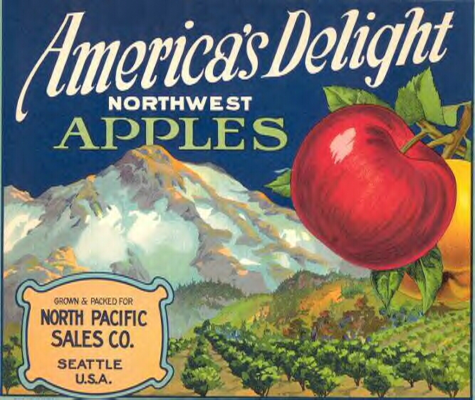
The curved square corners, the low-riding bar, the slanted ends of the arms all suggest a pre-digital, possibly hand-drawn typeface, not 1980s but 1940s [or maybe 1920s]. When paired with the script [identified in the comments as MVB Mascot, designed by Mark van Bronckhorst in 2012], the combination suggests to me early advertising, printed but "personalized" with a script message. My first thought was fruit crate labels, which often combine block letters, script, and images of fruit orchards and fields. What could be a better association for a trip to the heartland in summer, when strawberries, if not apples, might be consumed?
And yet, something is missing here. I see the possible references, but the result is mechanical, cold. The color palette, white on midnight, doesn't help. The American flag field, so effective when combined with Obama 2008's large Gotham O, is shrunk to the size of a button at the top. Gotham appears in both its 2008 (sans serif) and 2012 (slab serif) versions, but also shrunken. Compare the mixed messages and mixed fonts of "Betting On America" to the simpler, bolder "Change." Change, in word and font, was forward-looking and sophisticated. The script and the block letters are both awkward, angular versions of their kind. Without the landscape, without the energy of a softer, realer script, it looks like an ersatz version of American nostalgia.

The result lends itself to a critique of Obama's campaign poster similar to the current critique of Obama's campaign style: the words are all appropriate, but some feeling is lacking.
What do you think? Do you see different references? More curb appeal?


Comments [21]
07.11.12
10:48
The font reminds me a little bit of "Lobster" also. The fact that any of it is related to Cuban materials doesn't bother me a bit. Some of the best art comes out of revolutions, for better or worse.
07.12.12
08:34
Here's the Script Font ID Guide link: http://bowfinprintworks.com/Script07Pg14.html
And here's Lobster, which has a similar cute lowercase G, but is not as rounded: http://www.dafont.com/lobster.font
I agree with Kellie (and I meant to say this) that gambling metaphors don't sit right in the context of government. But look at how many states' finances are being propped up by gambling! Tri-state area politicians seem desperate for more casinos.
07.12.12
08:41
http://www.mvbfonts.com/mvb_mascot/
07.12.12
05:23
its actually late victorian
or early 1900s inspired
typography.
07.12.12
06:56
I've looked further on some of the many fruit crate label sites, and neongrain is right that 1940s (my date) is probably a little late for this image, and the typographic combination. Most of the sites suggest 1900 to 1920 as the heyday of colorful labels with landscapes like the one I used here as an example.
From BlueSkySearch.com:
"Early labels were designed to appeal to the senses, conveying health, freshness, vitality, and flavor. They also were made to catch a passerby's attention, glued to the short end of the crate in plain view of shoppers hurrying down the street past the neighborhood market. In short, the labels had to be eye-catching if the crate's perishable contents were to sell in time."
Is there a political message in that?
07.12.12
07:33
And there you have it, graphic design criticism.
07.13.12
01:39
I also want to add how much I feel this site has declined in usefulness and ease of use over the last couple years. I recall when you had a single, interesting column with terrific links to really unusual and provocative links. It was a sure-fire thing. I really dislike the site redesign. I have no idea what your esoteric titles mean: 'Observatory'--'Change Observer', etc. (is that where the column is, or whatever...?) usually, these comments only consist of a spammer that you don't pay attention to or care to block. It's like revisiting an old, comfortable neighborhood and seeing trash on the street.
You have way too much information you're trying to offer up to users. I don't know who 'Omnimedia' is, but if they are the reason this change was made, and I know it was a while ago-they've created a mess. You know it, too. Your user comments have gone way down over the years, and I'd imagine it's due to feedback like mine, impossible to focus with the site as it is. Then 'Mr. Spammer' is on every article and it looks like you don't care enough to even block them/clean him out.
-Wish you'd left the format and the simplicity of content alone.
07.14.12
01:34
07.14.12
02:18
07.15.12
02:18
Which, in its layers of meaning, and in particular consideration of what other posters have noted about modernity & drones (see Tom Junod's The Lethal Presidency in the latest Esquire) makes this appeal even stranger - who is the target audience here, why has a cookbook been reduced to a bet, how can we compare a fully engaged war of military & civilian sacrifice of the 1940s with our present wars borne only by military families while we shop and fret over gas prices and kindles, etc.?
It seems like a design approach that would be spun out by IBM's Watson, both a clinical exercise in pattern nostalgia and revelatory about the national condition in ways not pleasant.
07.17.12
09:13
Looks like both stories got the type wrong. It's one thing when Buzzfeed gets the type wrong but sad when Design Observer
does not identify them correctly.
07.17.12
05:05
While Michelle is off congratulating National Design Awards recipients her hubby appears to be crowd-sourcing his campaign logo.
07.17.12
07:08
And as for the color palette.: it's gotta show up on tv and God knows they aren't going to use red!
07.20.12
09:14
07.21.12
04:48
@NM Design I don't think using the word bet here is a negative, because the previous winner is using the term bet. Here it would seem more of a positive use because you would be betting on the person who won last time. Also betting isn't illegal everywhere, we have things like Casinos, the stock market. Betting is something everyone can relate to, it's also more tangible than hope/change.
It's like opening a carton of florida orange juice, you know what you are getting and you know it's going to taste good. Look at the back lash tropicana had when they changed there branding from l ol' fashion to contemporary. In this case they are going for being contemporary to being more palatable by many.
07.23.12
11:48
The subhead to the fundraiser reads: “Wish Barack a happy birthday, face to face.” . . . and they are not talking about typefaces.
07.24.12
11:05
http://www.myfonts.com/fonts/jawfonts/fenway-park-jf/
http://www.myfonts.com/fonts/mti/gill-sans/gill-sans-std-ultra-bold-116368/
http://idsgn.org/posts/know-your-type-gill-sans/
07.25.12
12:27
07.28.12
10:15
And I have to wonder: What if—and stick with me here, because it's quite a leap—the Green Party ever got it together to hire an actual graphic designer? Would it be the making of their party? Would they find greater resonance with the American populace if they abandoned their own flavor of nostalgia (something akin to 1970s macrobiotic cuisine) in favor of a wink-wink, in-the-know, under-40 aesthetic with just the right touch of Americana? Or would the mainstreaming of the Green Party simply dilute it until it is as underwhelming and disappointing as the Obama administration? It is all in the kerning?
07.30.12
12:18
07.30.12
12:21