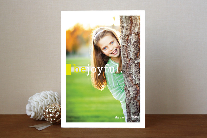
Be Joyful card, Minted
After you’ve pushed back from the Thanksgiving table, it will be that time again. Time for Christmas letters, Nordic sweaters, the occasional decoratively-deployed stile. And as in years past, the designs of holiday photo card makers like Minted, Paperculture, Pinhole Press, and Tiny Prints reveal the aesthetic preoccupations of the moment. In 2009, the “Modern” category was anemic, populated by a few red squares and Helvetica greetings. By 2010, it had grown apace, though, as I wrote then, “card designers' idea of modern runs only to the first string of sans serif fonts: Arial, Avant Garde, Trade Gothic.” Last year I did not see much that was new, and gave the cards a bye. But for 2012, I can identify four key trends that have trickled down from Brooklyn restaurants, across from Pinterest, and through the cloud from Instagram and Facebook. This may be the one time this year most of you buy stamps (I recommend these), and one thing is clear. By our holiday cards, you shall know our social media preoccupations.

Bokeh Bubbles card, Tiny Prints
#1: Instagramminess.
Holiday cards are by nature a way of capturing your children’s cuteness. So is Instagram. Put the two together and you have either achieved cute nirvana or caused all your friends to roll their eyes. Had it been me, I would have cut the nostalgic charm of chubby cheeks + rounded corners + golden glow with a bolder, non-script font. A stamped Franklin Gothic? Bodoni Joy?
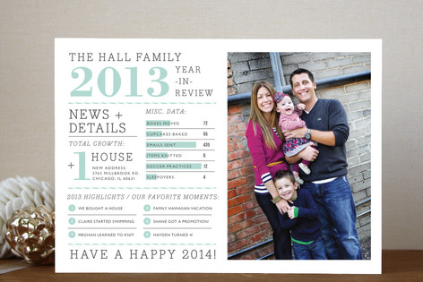 Family Year in Review card, Minted
#2: Feltron greetings.
Nicholas Felton’s Feltron Annual Reports used to be a designer nod, but then he was hired to create Facebook’s Timeline, and bring data arrangement to the masses. Now we can all chart our progress through the year, and skip the holiday letter in favor of an infographic. I’d love to see a side-by-side comparison of a few of these to see how the humblebrag potential of the letter translates. For those who haven’t been data-mining (or who are expecting a Nike+ FuelBand for Christmas) there is the simpler Top 10 List format from Paperculture.

A Merry Spot card, Tiny Prints
#3. Downton details.
We all want to be Lady Mary, right? (Except for that dead Turkish diplomat incident.) Several card companies have upped the ante in terms of paper weight, edge designs and wallpaper-like back-of-card patterns, making the digitally photographed, designed and ordered piece into a one-of-a-kind luxury object with the texture of letterpress. Minted offers fancy shapes, scalloping and notching the corners (even when, as in this case, the edge conflicts with the Archer). Pinhole Press offers Ultrathick cards with a pinstriped edge. And Tiny Prints lets patterns wrap from front to back. All these options suggest that people are thinking, If I’m only sending one card a year, I want it to be all it can be.

Gift Tag card, Paperculture
#4. Virtual scrapbooking.
Tags, ribbons, bows, fabrics, hand-drawn letters and layered effects. Each card is an opportunity to deploy your favorite scrapbook techniques, albeit in pre-printed form. The shaped stickers and ribbons have been around for several years. What I see more of this year are large script legends, rendered with scratchy faux-calligraphic edges. I associate this kind of typography with the better chalkboards outside the restaurants in my Brooklyn neighborhood, which always make me wonder if servers are now hired for their lettering skills.
For my own card, I start with the photo. Getting both kids in the frame, in coordinated clothing and in focus is the priority. Maybe just in focus. After that, I’ll pick my colors and my type – though I do always like a nice big number.


Comments [3]
11.30.12
07:53
12.01.12
12:09
Then I read the article and was even more disturbed. "Holiday cards are by nature a way of capturing your children's cuteness." I realized I was not the demographic being pandered to (white, with children, hipster, vain, brooklynite).
At least we found the blueprint for the sequel to American Psycho: hipster-brooklyn maternal vanity.
I can understand Peter's feeling that this might be irony. A clever parody of Martha Stewart? That would be generous. Though I'll have to read it again to see if there is an honest human emotion under all of the bubblegum marketing and namedropping.
12.02.12
01:59