
James Turrell, "Twilight Epiphany" (2012). Photo by Paul Hester, courtesy Rice University
This essay was originally published in Cite 92: The Education Issue (Summer 2013), in slightly different form. Republished with permission.
A Tale of Two Signs: James Turrell's latest skyspace, "Twilight Epiphany," and the newly renovated Blaffer Art Museum at the University of Houston demonstrate how art can animate and reshape campuses.
TWILIGHT EPIPHANY, Rice University, James Turrell
When Ralph Adams Cram planned the Rice University campus in 1910, he imagined two long arms of buildings stretching away from the Sally Port with an uninterrupted rectangular lawn bridging the gap between the shady arcades and façades of St. Joe brick. The university destroyed that vision in the late 1940s when Fondren Library closed the first quadrangle of Cram-designed buildings, which left a second quad running raggedly downhill toward the stadium. Over the past 15 years, Rice has been trying to make that second space into a place. The façade of Ricardo Bofill’s 1991 Alice Pratt Brown Hall, housing the school of music, provides an excellent backstop on the interior of the quad, its industrial Doric columns large enough to read at a distance (though its rear façade, twice as tall, is messy and generic). Fussy postmodern buildings by Robert A.M. Stern Architects and Hammond, Beeby & Babka pinch the quad’s sides, flanking a fountain and offering a sense of containment that is pleasant, even if the buildings feature a mismatch of size and detailing. Until last summer, however, there was no reason beyond academic ones for anyone to go down to that end of the axis. The residential colleges, the gym, even Thomas Phifer and Partners’ delicate 2008 Brochstein Pavilion, intended to give the university a social mixing space for students and faculty, were grouped at the other end. You could wave at the fountain in the distance, but why walk there?
In June we got a reason: the James Turrell work “Twilight Epiphany,” 73rd in the artist’s series of transcendent light sculptures. Thomas Phifer and Partners served as architect. The skyspace, though called a “pavilion” in its full appellation—the Suzanne Deal Booth Centennial Pavilion—serves more as a solid pendant to the Brochstein Pavilion’s lightness. While the latter is all glass and thin, white-painted steel rods, the former takes the shape of a 12-foot- high grassy berm, square in plan, with slanted sides. Lofted above it on round metal columns is a 72-by-72-foot roof with a 14-foot square hole in the center. The edges of this roof are slimmed to a quarter of an inch, giving it the illusion of being no thicker than a sheet of white paper. Concrete slots cut into the berm lead you either up to a berm-top level or to the center: directly under the roof’s hole. Look up, and the sky you were just under is transformed. The white frame, without special effects, turns up your level of perception. An airplane caught in the square can read as chilling rather than mundane. A wisp of cloud becomes a painterly gesture. Look horizontally, and you can see the fountain and the Brochstein Pavilion in one direction, and straight through the glass doors of Pratt Hall in the other. If the library hadn’t turned its back on this end of campus, your gaze could keep going to the Sally Port. The skyspace and its interior are squares in a series of squares, courts, and quads, and as such fit adroitly into the remnants of Cram’s plan.
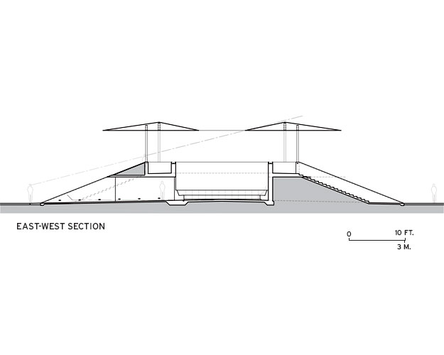
Drawing courtesy Thomas Phifer and Partners, the associated architects
Turrell’s early skyspaces did little more than frame the sky. His 1986 “Meeting,” at MoMA PS1 in Queens, is entered through a door in a hall like every other door. You sit on one of a square of benches under a rectangular opening. Subtle one-color artificial lighting enhances the contrast between sky and room, but in my memory I edited out the visual boost. The sky and the space did it alone. The Rice piece is far more ambitious, in architecture as well as light: two separate 40-minute shows, programmed to start 40 minutes before dawn and to last 40 minutes after dusk, wash the floating plane in colors ranging from fuchsia to violet, cerulean to ice. I thought the effect might be cheesy (the publicity photos, in which the whole thing looks like a space mountain waiting to beam you up, didn’t help), but I was wrong.
Two tall office buildings, part of the neighboring Methodist Hospital system, have exterior light shows as well, and both are visible from the skyspace’s upper deck. Corporate branding or minimalist art? One doesn’t usually think about these two things together. But once you are inside the berm, sitting on one of the Texas-sourced pink granite benches, head tilted up toward the opening, you don’t think about any of that. The LEDs click on just before sunset, a soft yellow glow at the corners by the columns. Around you, everyday life becomes ambient noise. The interior has been designed for music performance—the first official ones will begin this spring—so it simultaneously amplifies and dislocates sound. Whis tles from playing fields. The crunch of stroller wheels on gravel. The man chatting to his date upstairs. Joggers. The slap of ballet flats worn by the music students who treat it as a tunnel.

Photo by Beth Broome for Architectural Record
First there is whiteness, the smooth expanse of white plaster tinged with yellow at the edges. The sky is light blue. Then a rosy pink inside deepens to fuchsia. For one moment, the sky is turquoise, the roof, hot pink. Palm Beach. The strip of visible sky around the top edge between berm and roof adds another color, slightly different from the center square. I begin to see the whole thing as a color theory lecture, an homage to Josef Albers.
A pause, then the roof becomes whiter than white, the sky, ceru- lean blue. I think of Santorini, Greece, where I’ve never been. Vacation postcards keep coming to mind—it must be the punched-up colors. Then the ceiling goes violet, cycling through a series of blues that leach the color from the sky and make it gray, dishwater gray, stormy gray. Sludge. You are in a horror movie, and someone has turned off the sky.
An interlude follows: sherbet colors on the interior, pink mixed into yellow. The lights go back to pink, but you can’t find that turquoise in the sky again. It is literally too late. It is not quite clear when it is all over, but when you stumble out, it is dark. The campus is largely deserted. It is dinnertime.
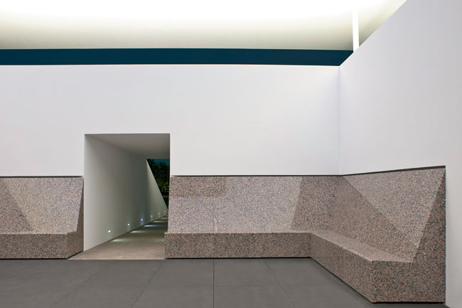
Photo by Paul Hester, courtesy Rice University
The light installation, it turns out, is sublime and slightly unsettling—even more so at dawn, when the sport whistles are replaced by chirping birds, and you can have the place to yourself. But a number of details around those 40 minutes chip away at the experience in ways that are troubling.
To bring the seating capacity to 120, Turrell designed concrete benches that were added to the upper level. Sitting up there, it is hard to focus on the roof and sky. One looks out either at those postmodern professional schools or at the Methodist Hospital skyline, twinkling on its own. You see the LEDs change color a few feet in front of your nose. The lights are protected by acrylic on top, but screened by a piece of white-painted perforated metal on the sides. You could spend your 40 minutes just watching the bulbs. During my visit, a thin line of dirt ran around the square opening, the result of rainwater, dirty from pollution, pooling around the edge and gathering at the corners. Rice has since developed a regular cleaning process and I understand the square has a white edge again.
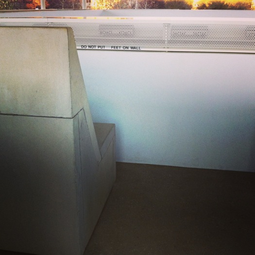
There are other signs that the skyspace wasn’t designed by Turrell to be quite tough enough. On the upper level, the maintenance staff had posted DO NOT PUT FEET ON WALL in several places, in creatively spaced Helvetica capitals. Out front on the sidewalks leading inside, a pair of temporary signs asks visitors to “Please respect the art installation. Food, Drinks, Smoking, Pets, Bicycles and Skateboards are prohibited. Photography and Cell Phone usage during the light sequence is not allowed. [The boldface and caps are theirs.]” Reservations are also required for the sunset show. I was told it has been packed, but on the beautiful February evening I was there, I had five companions.
What is the point of art on campus after all? The skyspace has an urban role to play, attracting people to that end. It serves as a contemplative pendant to the Brochstein Pavilion’s sociability. But it also speaks to a civilizing agenda: students think they are learning from their classes, but the college experience is so much more. Art in the form of university museums has often been part of that “much more,” with study collections, free admission, and all manner of other ways to lower the bar to casual encounters with art. The Turrell seems like the ideal distillation of that impulse. It is impossible to miss, easy to access, hard not to enjoy. It should be the simplest of drop-by art experiences, and that’s clearly what its patron, Suzanne Deal Booth, and the university had in mind. So why have its administrators made it seem so uptight — with the reservations, the docent, the signs, and all that high-maintenance white paint? I wish the architecture had been more minimal, and toughened up, so there didn’t have to be so much metaphorical shushing. Build an experience that can survive an errant soda cup.
Why not make the tunnels, stairs, and upper balcony of unpainted concrete, like the fine-grained benches? Why not let visitors distribute themselves at will? Why not banish the signs, except for a web address, and let people sack out, neck, run the steps, snack, and take selfies at will? If Quaker School taught me anything, it is that respect is earned with actions, not titles. If the point is to have more people — students, faculty, Houston residents, and art pilgrims — experience a Turrell skyspace, how much more wonderful would it be to add the sense of personal discovery? Let people Google it after they have been there, rather than before.
Turrell’s lifetime project is to turn Arizona’s Roden Crater into a monumental skyspace. I think he should have built an artificial crater here, something as tough as if it had been blasted from rock. Leave it there, at the ragged end of campus, to click on and click off on its own. It is programmed for every day of the year. Let it be something that can stand a little rain.
All Blaffer photos by Iwan Baan, courtesy WORKac
BLAFFER ART MUSEUM, University of Houston, WORKac
Call it a tale of two signs. The sign at the recently renovated and added-onto Blaffer Art Museum at the University of Houston takes a different tone. “Blaffer Art Museum invites you to eat, drink, study, muse, stay a while. Come back again.” The sign sits outside a new café area. The museum can’t serve anything yet, not even coffee, but they have carved out a citrus-hued space, just inside the campus entrance to the museum, where anyone can take a table or pull around a pleated white, gray, and chartreuse curtain for a meeting. The museum’s updated logo, now in Cougar Red, has been applied to the window. A plastic sign announces a Valentine’s Day screening of John Waters’s Pink Flamingos, and some dimestore plastic flamingos have been stuck out on the quad, signs around their necks, to attract attention. Everything is screaming: Come on in!
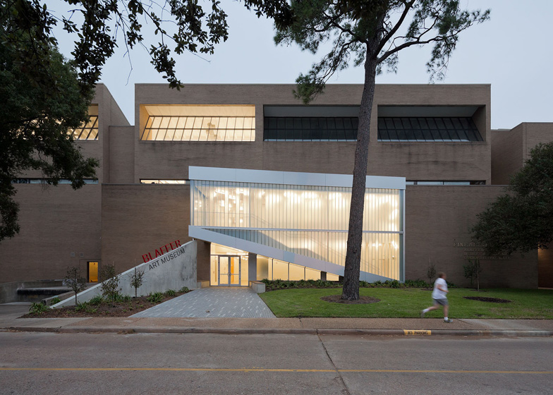
The Blaffer has been on campus since 1973, housed in a beige brick Caudill Rowlett Scott building along with several other fine arts departments. But it was hard for anyone to know it was there. The campus entrance to the museum was located at the back of the open-air Fine Arts Courtyard, shaded by the overhang of a second-story walkway. A public entrance off the vast parking lot did not exist; on that side was only a blank two-story brick wall. In 2011 director and chief curator Claudia Schmuckli announced that New York firm WORKac had been hired to renovate the museum, a $2 million project to improve circulation, visibility, and the museum’s mission to showcase contemporary art. Two million dollars is a small sum for architecture, and the Blaffer renovation was a very small project, as befits a museum of a little less than 14,000 square feet, essentially a sign and a stair and a lot of cleaning up inside. WORKac managed to get the maximum out of that budget by combining the first two functions into one big move.
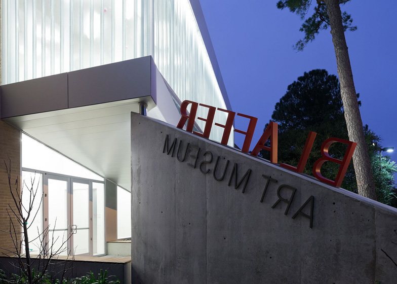
That move is Venturi and Rauch’s “Bill-ding-board” made flesh: where once there was a blank wall, there is now a set of glass doors, announced at the scale of the parking lot by a trapezoidal addition made of translucent and transparent cast channel glass and anodized aluminum. That addition, which contains a new staircase, angles up over the door, following the slant of the underside of the steps. The void underneath creates a covered tri- angle. A triangular concrete wall of exactly the same dimensions looks as if it has been rotated out to form the other side of the entrance portal. The wall cleverly masks the loading dock, contains the support column for the stairs, and serves as a vehicle for the museum’s identity. BLAFFER rides the top, in aluminum letters also painted Cougar Red. ART MUSEUM sits below. On the back, which is visible from a number of angles on campus, the architects and graphic designer Miko McGinty decided to run the words in reverse as a visual joke. Given its disingenuously diaphanous appearance and the way it seems to levitate off the dull façade, the addition reminded me a little bit of early Frank Gehry, straightened up.
The channel glass, which reads as ribs from a distance, solves a number of problems. From inside, it turns the parking lot into a fuzzy, moving abstraction, solving the problem of no view that troubles so many Houston institutions that have hired contemporary architects. From outside, it blurs the art and the akimbo fluorescent tube lighting fixtures that WORKac installed in both upstairs and downstairs halls. (They call it their “Mikado” pattern.) The glass seems to call out for some sort of inside supergraphic, something bold to make people outside curious — from even inside their cars. Matt Johns, the Blaffer’s director of external affairs, says a program of murals by local artists may be in the works, which would likely do the trick. Johns also said that the neon lights were gelled from white to red for the grand re-opening, creating an ombre effect up the stairs.
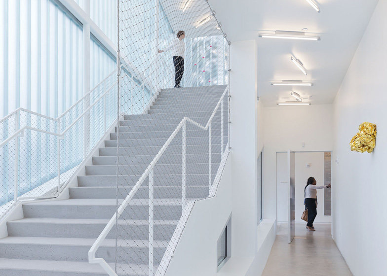
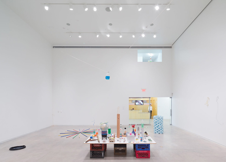
Inside, WORKac created a new, wider front hall with a spruce plywood enclosure for the receptionist, which connects the campus and public sides of the museum. A double-height gallery, almost a cube, sits just off the hall. Behind the white paint, its walls and ceiling are reinforced for contemporary sculpture of any size. Next to that is a lower-ceilinged second gallery, no longer split in two by a staircase to the second floor. Both of these are basic white boxes with new polished concrete floors, nothing fancy, but an improvement over the old divided, brick-floored spaces. I was still bothered by the ceiling of the smaller gallery, which was festooned with vents and tracks for lighting and large movable spots. Given the low ceiling height, this infrastructure attracts attention upward away from the art. It was the same in the third new gallery stacked above this one, its ceiling bisected by a large structural beam. There is not much the architects could do about the beam, but I would have liked a cleaner, shallower canopy.
The curators all seemed thrilled with the new galleries, which also include a black-box media space and a studio space on the second floor. In the previous incarnation, the stairs led from the lower galleries to an upstairs hall, and visitors had to walk by the closed doors of the administrative offices. Now they exit the smaller downstairs gallery and walk up light, bright, new precast concrete steps, with generous treads and thin, white steel pipe handrails. The layout is still confusing when you get to the top, though. The wide hallway on the first floor makes sense as a cut-through to campus and a major route. But the equally wide upstairs hall just leads to two closed doors and the studio around the corner. What you are looking for is the third gallery, which is reached instead down a narrow right-hand walkway. It would be easy to miss the continuation of the exhibit, even with the arrows on the wall.
The Blaffer definitely got its $2 million worth, but for the gallery to become more of an on-campus architectural presence, more needs to happen outside. WORKac’s original proposal included landscape architecture for the Fine Arts Courtyard by SCAPE to give it more shape and specific programming areas. The university is going ahead with a new outdoor plan with the same goals, as part of a larger project, to be designed by SWA Group. Without more of a courtyard statement — including a permanent projection screen — it will always be a struggle for the Blaffer to make connections to the wider UH community (40,000 students use the campus each day). Johns rattled off a number of collaborations the museum has initiated with different arts departments, from the annual MFA exhibition to a wall-mounted museum store stocked with products conceived, made, and packaged by UH design students. That is a perfect use for that wide front hall, making it more like a tiny urban street. Unlocked on one side from its beige brick cocoon, the museum seems to be doing all it can (for now) to meet students where they are, and let them experience the art on their own terms.
Art on campus should be treated differently from art in the real world — even when your campus, like UH, is the size of a small city. Campus art needs to be tougher, punchier, more easily accessible in all senses of the word. Otherwise, experiencing it becomes another adult duty, easily ignored or dismissed. Students are busy when they are in school, but they are also potentially open in ways they won’t be later on. Turrell’s “Twilight Epiphany” at Rice is a perfect catchall for emotion, romance, spirituality, and rest, and as such, it seems suited to those odd moments. That’s why, however transporting I found the light show at sunrise and sunset, the ideal experience would be to stumble upon it without preamble and museum labels. Coffee would not disrupt the view. It would be wiser to eliminate the “No” and maximize wonder.
Related: Notes on my trip to Houston from February 2013, "Patterns of Houston." A review of "Aten Reign," Turrell's summer retrospective at the Guggenheim New York.


Comments [4]
It is true that campuses give a different context for "art." But while your thesis seems to be that architecture is improved with art, the truth is that architecture MAKES the art, by giving it scale and place. A billboard means different things in LA, Tokyo, New York, or Canton.
11.18.13
11:20
11.18.13
11:21
11.20.13
06:24
James Turrell identifies himself as an artist and has to work with an associated architect to make a structure that can be inhabited, as here. I disagree with your statement of my thesis: the art/architecture of Turrell, and the architectural interventions at the Blaffer, allow their respective campus architectures to be experienced in a new way. I don't think that privileges one over the other.
And the Turrell skyspace opened in 2012, before the Guggenheim show, and will remain long after (as long as they can keep their edges white).
11.20.13
07:10