From Little Blue and Little Yellow, by Leo Lionni (1959).
On October 29 Michael Bierut posted his essay “Style: An Inventory,” written for the 2012 SVA Senior Library, a project by Julia Hoffmann and Joe Marianek. Joe Marianek also asked me to write an essay for one of the library books, on the topic “Forming.” This was my brief:
Forming: Shape, Cloud, Mark
Shapes, symbols, forms, silhouettes, and vignettes are used to signify, narrate or decorate. Form can be economical or elaborate. In branding, form is used to disseminate power and recognition. A simple form can be an icon, representing a large, complex idea. The work featured in this booklet is form-driven—celebrating a strong, graphic aesthetic. Some- times the form carries significant meaning; at others it is used as a device; and sometimes it just looks good. Work in this category ranges greatly, including identity systems, packaging, books, textiles, apps, and more.
This is what I wrote.
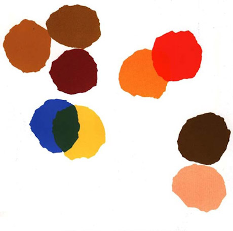
In Leo Lionni’s 1959 children’s book Little Blue and Little Yellow, two dots of color are best friends. In school they sit in neat rows with Little Brown, Orange, Olive and White. After school they run and jump. One day they hug each other … until they are green. As the story goes, Lionni created Little Blue and Little Yellow to amuse his grandchildren on the train from Grand Central to Greenwich. He had an advance copy of LIFE in his briefcase, from which he tore rounds of color to make the story. They were enthralled, and so was the children’s book editor who came to dinner at the Lionnis the next night.
In assembling his tale Lionni was just doing what came naturally, particularly to a graphic designer at mid-century: creating relationships between shapes, creating a cloud of connotations, making an indelible mark by leaving things out. The crudeness of torn paper meant he couldn’t do much more than a dot and the crooked rectangles which stand inelegantly for the grown-ups. But he knew that even a dot, if it is blue, if it is yellow, trails other meanings. Blue is water, is sky, a blueberry and an eye. Yellow is sunshine and flowers, a light and a flame. As even a first grader knows, they complement each other. Of course they should be best friends. When they get mixed up, is it really such a tragedy? Now they can grow up to be grass, frogs, leaves or the logo for international recycling.
I imagine Lionni’s hands moving almost automatically, tearing the magazine to bits and choosing the ones that have character. His mind rejects the almost-squares, the irregular triangles. Maybe he even has to tear some corners off (saving them for the tears) to make it round. A dot says cuddly, like a Dumbo, or Elmo’s head. A dot can grow without changing form. A dot can be read from all directions.
When USA Today unveiled its recent Wolff Olins redesign, all commentary focused on the big blue dot. A mark no longer representing the world, as it had in the old logo, but anything you could make round. A coffee cup, a baseball, a start-up button and (of course) a pie chart. Blue for all, but a green dot for Money, a red dot for Sports, a purple dot for Life (ugh). Little Blue and Little Yellow were all grown up, ready to represent.
The SVA student work in this section creates more meanings for dots. A bowl of soup. A subway token. The anti-Pepsi. The sun and the moon. An ugly duckling. Or even, an anti-fig leaf in the form of an anti-dot. What did that issue of LIFE look like after Lionni was done with it? A peekaboo version of the magazine, where the absence of Little Blue and Little Yellow might inspire a very different kind of design classic.


Comments [2]
Alexandra: I love your beautifully written description of Leo telling a story to his grandchildren on the train from Grand Central. When someone can tell a story with two dots of color torn from a magazine you know they have not forgotten how to play. Leo truly affected a generation’s visual landscape. We all need to have this kind of imagination again when we rebuild New York after Hurricane Sandy. I hope you can inspire many young architects and designers to do so. We need to be able to look at what is in front of us, and form relationships with the materials that we have at hand. As Art Director of Fortune magazine, Leo also created this wonderful cover in 1960 the year after that train ride. Instead of dots he uses type to tell a story that reminds us of the lights of New York.
Do you have a reference to the train story behind Little Blue and Little Yellow?
Thank you.
11.02.12
07:05
I took my creation story from this website, 100 Years of Leo Lionni (http://www.randomhouse.com/kids/lionni/aboutlionni.php). Looking around the web, I see many slightly different versions.
11.04.12
08:22