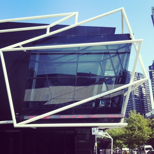
Melbourne Theatre Company, University of Melbourne (2008), ARM Architecture
It's been quite a while since architecture made my jaw drop. But it did, literally, as I walked down Swanston Street in Melbourne ten days ago. There, in the space of a few blocks, is a collection of buildings so bright, so prickly, so merchanical, so textural that they create their own context. RMIT University, a school of design and technology, has spent the last 20 years hiring local architects to design academic buildings of a type hard to imagine on any of the campuses I've studied on. The first on Swanston was Building 8 by Edmond & Corrigan completed in 1993. Its plastic, pastel interiors were described to me as being modeled on an Italian hill town, like the university work of Charles Moore. Its exterior, with tile patterns and palm tree cutouts, part of the diaspora of the ideas of Venturi & Scott Brown, with whom Peter Corrigan studied at Yale in the late 1960s. Edmond is Maggie Edmond, whom Wikipedia says is "probably the nation's foremost female architect." Building 8 was joined in 1996 by Storey Hall by ARM Architecture, then in 2011 by Building 22, also ARM. Across the street, a spiny commercial tower calls to the latest edition, Lyons' Swanston Academic Building, which opened last year and is variously known as the Pineapple, the Porcupine and the Cheese Grater. My own photos of all of these, plus the Cheese, Sean Godsell's willfully monochrome (yet still ornamented) RMIT Design Hub are in the slideshow below.
On Swanston Street, and in a second series of buildings I saw on Melbourne's South Bank, it became clear that postmodernism never died. It flourished later in Melbourne than it did in the United States, and those who practiced it in the 1990s are still advancing its referential ideas, now with less symmetry, more geometry, more brights, less pastels. It is self-referential to modernism, and to its neighbors old and new: Melbourne has quite a collection of brightly patterned, orange-and-buff Victorian architecture.
The interior of Lyons' building is a fragmented, darkish place, one which seems to apply the ideas about open work spaces and chance encounters so popular in Silicon Valley to the academic environment. But so did Building 8, 20 years ago. I'm not quite sure what to make of any of these buildings yet, but seeing this work felt like an important puzzle piece for some not-too-distant-future reconsideration of postmodernism. It seems to be back in the work of architects like England's FAT (who recently spoke in Melbourne), so seeing it age, and grow, and energize the streets in Melbourne made me think on it anew. My favorite building in this loose collection was probably ARM's Melbourne Theatre Company, in black and white. I'm told the neon tubes reference painter Al Held; I thought of Peter Halley. The white armatures read crisply even on a sunny day, and seemed to move as I walked around the building. I liked the idea of abstracted bright lights. I liked that it read strongly even on a car-dominated corner.

Godsell, architect of the Design Hub, is clearly of another school, and one gathers there's some rivalry between the "light and space" architects and their more colorful neighbors down the block. Godsell was mentioned on several of the "Who Will Win the Pritzker?" lists, but judging by the Design Hub alone I wouldn't give him the prize yet. The exterior is exquisite, made of rotating glass panels, like beads on a string, that form a sunshade and reminded me a bit of Edward Durell Stone's screens. The interior was penitential: open offices and classrooms down one side of the bar, a wide hallway down the other, split by a deep, narrow stair. The walls are covered in metal grating, so pin-up is by magnet. People seemed to be rather awkwardly occupying the various spaces, as if unsure how to arrange the furniture.
In Melbourne I spoke on a panel sponsored by the Faculty of Architecture, University of Melbourne and moderated by Justine Clark, and titled "More Than One Way to Skin a Building." That's the title of the last chapter of my book, and seemed extra-appropriate in retrospect. Video here, summaries here and here. Then it was on to Sydney for a workshop and panel sponsored by the Faculty of Architecture, University of Sydney and hosted by Lee Stickells, titled "Words and Buildings." Thankfully, they were quite different, and Tania Davidge bravely attended both.
I only had one free day in Sydney, and like everyone else, I wanted to see the Opera House. If Santa Monica Pier is the most Instagrammed site in LA, the Opera House is the most Instagrammed site in all of Australia. So I did that too, probably to excess, as you can see in the slideshow above. The Opera House's architecture is indeed spectacular. I mostly took pictures of details I hadn't seen before: the matte v. shiny finish on the tiles, which are actually off-white; the molded concrete anchorages for the cable-reinforcing at the base of the shells; the thin, undulating wooden slats that line the interior walls. I even liked the echt-70s wayfinding graphics, Helvetica on chunks of green, red, blue vinyl. The Opera House Project is an impressive documentary about the structure that can be watched online, bit by bit.
What was most surprising to me on the ground was how prominent the podium below the shells is, and how packed with program. The Opera House is actually five different-sized theaters, the Concert Hall being the largest, which allows the building to show an incredibly wide range of performances. On the day I toured, the place was packed with strollers for the "Babies Proms": Sunday morning with Mozart for toddlers, most performances held in the recently completed Utzon Room (those are Nanna Ditzel chairs). The box office, a half-dozen restaurants, plus a coffee bar, a wine bar and a sad gift shop (no Opera House piggy banks left) are also accessible on different levels. The Opera House seemed like what Lincoln Center is now trying harder to be, minus the rock concerts and incredible setting. That is a place worth visiting whether or not you have tickets, with restaurants and cafes at different price points, a setting for culture that's also part of the life of the city. I don't think it is entirely working in New York, but it was intriguing to see the idea built out. Opera House CEO Louise Herron, who very kindly gave me my tour, seemed to have a lot more ideas about programming and insertions to create a more welcoming (and more sticky) visitor experience.
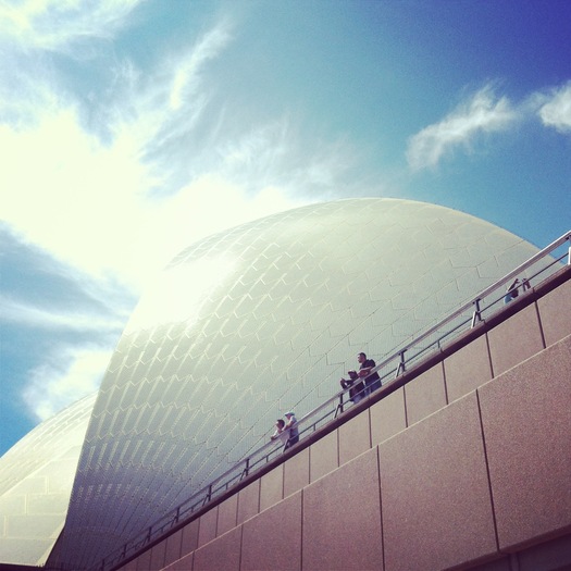
Sydney Opera House (1973), Jorn Utzon, Sydney
My last stop was Brisbane, where I did a book talk at the University of Queensland invited by Naomi Stead. In Brisbane I had what I consider to be the ideal exerience for the urban traveler. I arrived late at my hotel, and woke up very early the next morning. After breakfast, I had three hours before I was scheduled to meet Naomi. So I walked out the door in search of some intriguing fragments I'd seen from the taxi the night before. My hotel was on South Bank, a stretch of riverfront across from the business district that was buzzing at 7:30 a.m. Bikers and pedestrians commuting to work over a series of dramatic bridges. A tentacle-like trellis sputtering bougainvillea. Public pools, shallow, deep, rocky, stepped, shaded by trees and pavilions. A lawn with pop-print lounge chairs. Coffee everywhere (true in every Australian city). I started working my way down the river, noting the university buildings and the student housing, luxury apartments and the headquarters of the ABC.
Later, with Naomi, I walked in the other direction through a string of public cultural buildings, ranging in stype from art barn to classic modern. Many are in the slidehow. Most impressive was the State Library of Queensland, remodeled and expanded in 2006 by Donovan Hill and Peddle Thorp. A concrete structure patchily painted light green, the library feels light and airy, connected to its neighbors and to the river inside and out. An open balcony has wifi and a permanent installation of Queensland china. The cafe bleeds into the public walkway. The reading rooms are stacked along the water, but you can see through them from the interior, open court. Seeing it reminded me of my experience, now many years ago, in Will Bruder's Phoenix Central Library. That also felt like a library at the center of contemporary life, pitched at many audiences, and connected to recreation, food, culture, beauty. South Bank is only a small slice of Brisbane, but it seemed like there were lessons for other waterfronts here too.
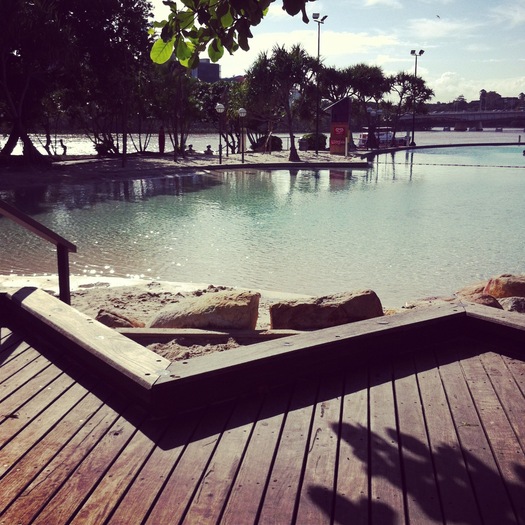
Streets Beach, South Bank Parklands (1992), Desmond Brooks International
Last but not least: you'll notice many of the photos have the distinctive square shape and golden filter that marks them as having been taken with Instagram (you can follow me @langealexandra). I joined the photo sharing service some time ago, but this trip was the first time I really saw its possibilities. (Which may have led me to some excessive posting, but consider that lesson learned.) I was invited to Australia originally by Chris Brisbin at the University of South Australia, funded by the Hawke Research Institute, to discuss the future of architecture criticism. Most of what I had to say on that topic concerned social media, and how Twitter, for example, has connected communities of common interest alongside old institutions like city newspapers. I argued that Twitter was terrific as a part of a critic's arsenal, a beginning but not the end of argument. In Australia, I began to see how Instagram could be part of that too, showing what critics look at, what makes their jaws drop, what's across the street from to the heroic commissioned building portrait, which signs represent design failure. I would not call myself a photographer, but Instagramming my way through those cities certainly made the trip a lot more fun.


Comments [4]
Some of them are fun and irreverent, more so than most po-mo. However, they still look second-rate against the craft, strength and sincerity of the Opera House. Color should be used carefully.
03.19.13
01:22
03.19.13
01:29
hopefully someone will direct you some of the good architecture that does exist, and away from the kindergarten playtime of ARM and Lyons et al
03.19.13
11:46
03.24.13
03:24