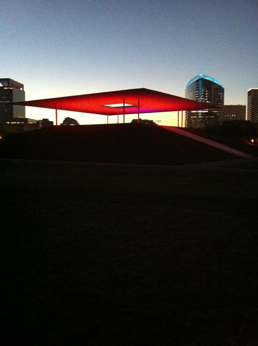
James Turrell, Skyspace, Rice University, Houston, 2012
I just spent two and a half days in Houston preparing to write about two new university art spaces, the James Turrell Skyspace at Rice and WORKac's addition to the Blaffer Art Museum at the University of Houston. My review will appear in an upcoming issue of Cite, so I will say more about those experiences when that comes out. I did manage to capture the Skyspace's glorious dawn pink on Instagram. Too bad about the competing light shows on the flanking hospital towers.
I also had time to look at a variety of other new architecture in Houston and to talk about a variety of urban initiatives underway there — open streets, bayous as greenways, water detention areas as a new kind of Emerald Necklace — with Cite's editor Raj Mankad. He used my book in a class at UH last year, and found himself frustrated that it didn't talk more about cities like Houston. I had no budget for travel, and didn't want to write about cities I don't know well, but it is a fair critique. Who is the best architecture critic of suburbia? Of no zoning? Do we have to patch together a new kind of criticism out of typologies of parking lots, Mike Davis on surveillance and a close reading of neighborhood covenants?
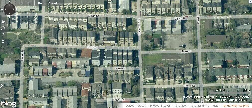
Rice Military from above, 2009
Yes and no. I pointed out that Frederick Law Olmsted's ideas about the park as urban lungs and social mixer applied just as well in Houston. Houston now has a number of successful parks, many of which have been aggressively programmed. I asked whether that programming was necessary to draw people out of their own backyards, and open space alone not enough. And there's also Charles Moore, talking about Los Angeles and paying for the public life. I have rarely seen less regard for the public life than in a neighborhood like Rice Military. Once an area of 800- to 1200-square-foot cottages for miltiary personnel, the blocks have now been filled, shoulder to shoulder, with the highest density of architectural styles I have ever seen, applied to townhomes that fill the lots from side to side and sometimes front to back. Most meet the street with a garage door, or sit one car length back. Houston requires every house to have room to park two cars.

Cameron Armstrong Architects, 5423 Gibson, Houston, 1993 (via CAA)
Every house, it seems, must agressively proclaim its uniqueness (in sets of two to five). Brick fronts, cast columns, stucco, stone tile. One sees the same mix in single-family developments, but having the houses attached makes the century-hopping more intense. The native contemporary version of these houses is in Galvalume, and the area is known as the tin house district dating from the 1990s. More recent galvanized metal versions are developer built, codifying yet another decade but getting the details slightly wrong. It struck me that these townhomes, which you see everywhere in the city, but nowhere else so thickly deployed, are a pattern specific to Houston. A pattern in the Christopher Alexander sense. So maybe he, too, could provide guidance for a Houston critic.
I saw a few other patterns in both senses of the word, that seemed worth sharing.

Brave Architecture, Sicardi Gallery, Houston, 2012 (via CultureMap Houston)
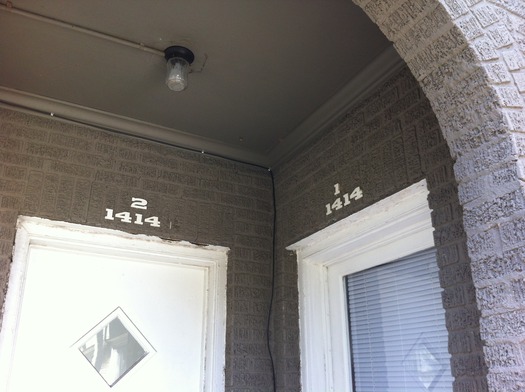
The use of galvanized aluminum. Architect Fernando Brave took me on the tour of Rice Military, where he lives in an early tin house with an indigo garage. Brave recently finished the Sicardi Gallery near the Menil Collection which is sheathed in a sort of hyper-Galvalume, with a broad, aggressive tooth. It was nice to see what has become a vernacular tradition played with in this manner, giving it some particularity. The silvery sheen of the metal also relates nicely to the gray paint on the Menil museum and the many houses the foundation owns in the surrounding neighborhood. The paint is a most recessive form of branding, as are the standardized Western house numbers.

Thomas Glassford, 39 Steps, 2008, anodized aluminum with aniline dye, 47-1/4 x 63-5/8 inches (via Quint Contemporary Art)
Inside the Sicardi Gallery, I saw the work of Thomas Glassford, an American artist who lives in Mexico City and who has, for many years, been making paintings out of custom colors of anodized aluminum siding. I loved them on sight (as a fan of architecture and Op Art, how could I not?) and they also seemed like commentary on the way we limit our palette, even in off-the-shelf building materials.
Next door to the gallery, a green-stained wood panel routed with a low-relief pattern of overlapping leaves stood alone on a cleared lot. Architect Dillon Kyle is planning to build his new office there, and plans are far enough along that the architects co-ordinated the design of their parking lots. The panel was interesting, crude despite the impressive technology. A building covered in leaves would make a great contrast to the metal lines next door, and relate to the beautiful old trees in and around the Montrose neighborhood. The view of the parking lot is an occupational hazard for architects in Houston. The Menil lot across Alabama Street from the gallery is one of the few with enough trees to make it pretty from the second floor. Yoshio Taniguchi's Asia Society Texas Center has a surprising second-story pool that mists in the heat. But across its contemplative surface one sees only asphalt, cars and some scrubby bushes.
 Dillion Kyle and Cedar Baldridge, carport, Meredith Long Gallery, Houston, 2009 (via DK A)
It turns out Kyle is also responsible for the best shade I saw in Houston: this verdant carport for the Meredith Long Gallery. This is especially witty in situ: this gallery is on a busy road alonside the exclusive River Oaks neighborhood. Many River Oaks homes can barely be seen behind brick walls covered in small-leafed ivy. The shape and size of your wall becomes a sort of landmark. This version actually serves a purpose beyond privacy.

Philip Johnson, Menil House, Houston, 1951
The Menil House by Philip Johnson, interiors by Charles James, doesn't have a wall. It is a wall. (The windows weren't even supposed to be there; Mrs. de Menil thought those who worked in the kitchen deserved a view. Johnson had provided only a couple of bubble skylights.) I was lucky enough to get a private tour of the house, which is only open for museum parties a few times a year. The Menil House has only been published a handful of times, and Johnson didn't like to talk about it. Dominique de Menil didn't want him to do the interiors, and he wasn't comfortable with the result. Which is strange, since his own private interiors had some of the same decadence.

Menil House, front hall (via Texas Architect)
When you walk through the glass front door of the Menil House, the first thing you feel is green. The interior courtyard, now covered with tenting, has grown out of its square, so fronds press against the windows and seem to fill the glass box to bursting. The Venetian sofa, which has been standing there for decades, absorbs the living flora and seems to glow. For years Houstonians would have been confronted with the Yves Klein body painting seen in these photographs. When I was there it had been replaced with a church interior by seventeenth-century French painter Desiderio, a detailed, almost trompe l'oeil work that drew you deeper into the space of the hall.
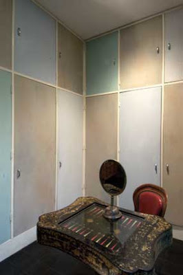
Dominique de Menil's dressing room (via Texas Architect)
To the right is the Calvinisht kitchen, all gray linoleum and enameled metal cabinets. To the left is the sitting room, with its famous ottoman and lip-shaped sofas by James. A bronze Giacometti lamp with a woman's helmeted head stood in one corner by an insect-like chaise. The floor is black Mexican tile, and the colors throughout slightly queasy. Mustard felt in the entrance vestibule, red velvet and pink felt in the children's bedroom hall. Mrs. de Menil's dressing room had the classics in French and closets painted Jordan almond colors. The combination of Surrealism, Venetian antiques and landscape works surprisingly well, giving the house the feel of a tiny palace swept clean by time and filled up again.
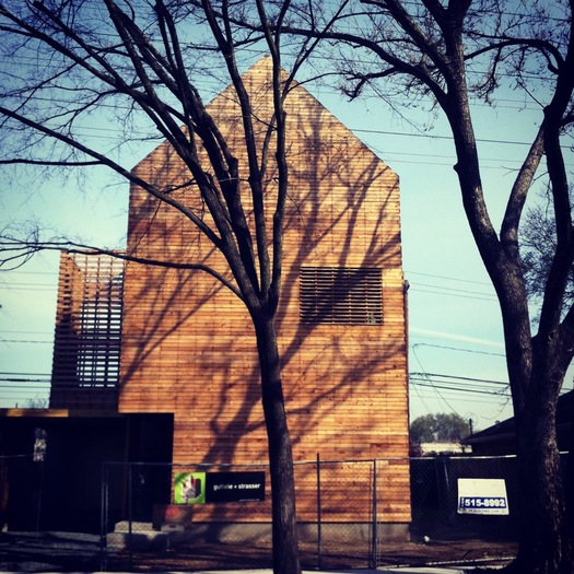
On my last day, I visited an under-construction house by Guthrie + Strasser on Vassar Street which proposes a kinder, gentler modern vernacular style, both by virtue of its siding — cedar, not aluminum — and its shape — peaked, not flat. The Menil House, and the many other modern houses built since, have been controversial. Despite the implied freedom of "no zoning," many neighborhoods have building rules that try to select out the white box, by restricting roof shape, exterior materials, setbacks, and so on. This house looks like a drawing of a house, tall and thin, with a peaked roof and horizontal wood siding. But that siding, which will weather gray, wraps up and over the roof. And the roof, rather than holding down the fort of tradition, is peeled away on one side: the top story is a roof deck, shaded on the west with uninsulated slats, and open to the east. The interior is painted shocking orange, and can be seen clearly from a number of highway bridges. It is its own billboard. And yet, most of the neighbors are apparently happy, despite the fact that this house is a story or two taller than their ranches and bungalows. A gable changes the conversation.
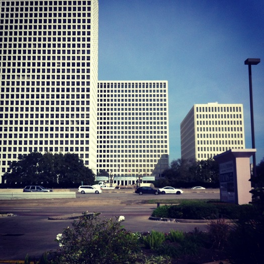
But not everything is so cosy. This is what most New Yorkers think Houston looks like, and it does. When I took this picture I was standing in a parking lot, waiting for a taqueria to open. But this is just one of the patterns.


Comments [12]
02.17.13
06:02
02.17.13
09:00
From their web page:
Few cities have their own architecture and design magazine. When Cite was launched, Houston was the landing pad of the world’s star architects, the Dubai of the time. Houston had bucked the trends of the national economy and anything seemed possible, until the savings and loans failed and the price of oil collapsed. Cite persisted. It cataloged the lost opportunities, lamented speculation unaccompanied by considered urban planning, and pointed to the troubling patterns underlying a rapidly changing environment. It was there for each new loop road; there for struggles over light rail, condo towers, and changing neighborhoods; there to bear witness to the oddities and unexpected joys of the city.
Another good source is
Ephemeral City: Cite Looks at Houston by Barrie Scardino, William F. Stern, Bruce C. Webb and Peter G. Rowe (Dec 1, 2003)
02.17.13
10:08
It's a pity you didn't drive the Westpark Tollway to its terminus.
02.18.13
02:00
I agree that we limit our palate in architecture... but a paint job or pattern is usually only a surface treatment--like the galvanized aluminum. It seems to lack meaning if done indiscriminately or to attract attention for the sake of it. Or worse, it can be used just to hide a shoddy architectural product. I'd like to explore how to add color or patterns in ways that are meaningful. Usually surface treatments are associated with styles that rapidly go in and out, probably why architects fear them (nobody wants a house that lasts for 3 years). But if they can connect with the architecture in new ways, who's to say?
I'd also like to hear more about the Taniguchi Museum. Can I call out an architectural review please? Ha. Despite being surrounded by depressing parking lots and strip malls we need those places to take us away from the drudgery of urban sludge and inspire us to build better--assuming you think its 'good. How can you go wrong with a steaming pool would be beyond me.
02.19.13
02:57
02.20.13
04:18
Through these towns they built to change
And then you said "The emotions are dead"
It's no wonder that you feel so estranged
- Arcade Fire, Sprawl I (Flatland)
02.20.13
10:18
Anyway, when I think of suburbs, I think of large developments, all the same style and color. Homogeneous houses and people.
Any neighborhood or city with variety adds spice to existence. If Houston has variety all the better. Building houses individually always leads to better architecture--buildings that respond better to its owners personalities, taste, different trends and so on. It works for New York.
02.21.13
12:50
I was only in Houston for two days, so I intended this as a kind of outsider's travelogue. A real critique of Houston's shape needs to come (and has come) from people and publications that are more embedded. I will say that the tin houses of the 1990s were inspired by vernacular tin-roof cottages, and have become themselves a new vernacular as other architects and builders have adapted the material. Aluminum is actually great for Houston's climate, as it deflects heat and holds up to the sun in ways paint can't. I also thought it looked great in the flat light.
Cite published a review of Taniguchi's Asia Society building last year. I was only inside for about 15 minutes, so I don't have that much more to say. The misty second-story pool is indeed wonderful (when you walk in the front door you hear running water, but have to pass through most of the building to find the source), but I thought what you saw across it mattered. Taniguchi designed a very Taniguchi building, and there it is in Houston. I did not see that much inflection to its surroundings. And in fact the list of exotic materials imported from other countries to achieve his desired effect started to sound a little ridiculous -- one of the ways discussions of sustainability in architecture has changed the way I think about building.
http://offcite.org/2012/08/14/cite-89-houstons-place-in-a-larger-world
02.21.13
09:20
Huxtable did write some great pieces about Houston, including this still relevant piece in the May 1976 issue Texas Monthly called "If You Don't Live in Houston Your City May Be Obsolete." Here's a link from Google Books:
http://books.google.com/books?id=ZCsEAAAAMBAJ&pg=PA34&dq=ada+louise+huxtable+texas+monthly&hl=en&sa=X&ei=GZsnUdapMMeg2AWgnoDYCQ&ved=0CDAQ6AEwAA#v=onepage&q=ada%20louise%20huxtable%20texas%20monthly&f=false
As John Kaliski noted, Ephemeral City is a great source.
Lars Lerup and Albert Pope at Rice University have long tried to develop a vocabulary to describe "conurbations" like Houston. Lerup's essay on "Stim and Dross" is lyrical, fun, and incisive. And Pope's essay, "From Form to Space," in Dana Cuff's book Fast-Forward Urbanism is a provocative argument about suspending judgement of "sprawl" and "suburbia" so we can look for solutions rather than turn away.
Susan Rogers, the current editorial chair of Cite, has steadfastly focused on the area "between the belts" of Houston, our most urban spaces that are paradoxically located well outside the center. Here's an example of her work:
http://citemag.org/wp-content/uploads/2011/09/Cite_86_Street_Of_Dreams_Rogers.pdf
I think there's a whole lot more work to be done! What I still haven't seen is great embodied writing---on the ground, in the body, out of the car experience---that gets across what is at stake and what is possible in spaces like Houston.
02.22.13
11:30
I don't like articles where a writer just flies in and starts making demands, generalizations and condescending statements as if every city is on a NY scale. Exhibit A:
http://www.nytimes.com/2012/09/27/arts/design/louisville-wrestles-with-freeway-dilemma.html?_r=0
02.25.13
02:52
Honestly, so much of the best critique and study of suburbia comes from incidental sources outside of architectural writing. Richard Yates on picture windows, Rick Moody + Ang Lee on gated communities, Bill Owens on the rich street life of lower middle class tract housing developments...
03.07.13
04:45