
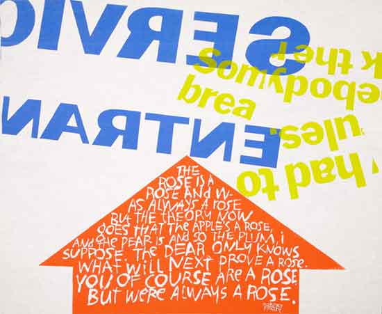
Sister Corita, somebody had to break the rules, serigraph, 1967
Thanks to Sally Field, off-off Broadway satires and countless drag queens, the image of nuns as silly celibates functions as a sort of harmless anti-Catholicism, detached from any real encounter with, or understanding of the women who actually have committed themselves to the life of a spiritual community. Personally, this always grates a bit, since I was lucky to have attended a Catholic grade school in the 1960s, during the height of the (brief) liberalization of the Church, and many of the nuns I encountered in grade school were extraordinarily talented and compassionate teachers. True, they made us kneel down to make sure that the hems of our uniforms touched the floor: but to me this was seriously outweighed by the good stuff, which included energetic teaching, moral lessons delivered with talk of social and political justice, and great, great passion for music and art. And the nuns were huge fans of a series of silkscreened posters, which were hanging in all of the classrooms.
The designer of those posters, Corita Kent, had been a nun. And although she could not fly, her story is almost as improbable.

A member of Los Angeles' Immaculate Heart Community, and long-time art educator and artist/printmaker, Corita Kent attained a position as close to that of a celebrity as any female artist, much less a nun, could expect to have achieved in the mid-60s. Her work tapped into that particular moment when the Catholic Church was invigorated by the challenge, set by Pope John XXIII in his Vatican II decree of 1962, to renew and rethink its traditions. Corita's work, fusing text and image, provided a visual narrative for this re-energized spirituality, particularly as it strove to engage people in their everyday lives. It also embraced social activism, independent of the strictures of the institutionalized (and, of course, male-dominated) Church. The silkscreen prints that surrounded me in grade school were joyful explosions of appropriated advertising slogans and logos in grocery-store colors — Pop Art reconfigured into messages centered on faith and spiritual joy. They were also aesthetic declarations of religious independence.
Corita Kent's story is convincingly told by Julie Ault in the first monograph on her work, Come Alive: The Spirited Art of Sister Corita. Ault has written about Corita Kent before, and has benefitted from the cooperation of the Immaculate Heart order, which still possesses the archive of this remarkable artist (she entered the convent in 1936 and left in 1968, but continued to work and write until her death in 1986).
Readers of Come Alive may be surprised at the amount of Church history included in Ault's narrative, but the work of Sister Corita that is most admired dates from a specific set of years — between 1963 and 1967 — when the nuns of the Immaculate Heart order were resisting the authoritarian rule of the Cardinal of Los Angeles, James Francis MacIntyre, who was himself ignoring the reforms encouraged by Vatican II.
Conflict between the order and the Cardinal centered on issues of self-governance, ranging from the nuns' desire to wear street clothes instead of habits, to their educational philosophy and participation in social action and protest. Corita's work itself was deemed symptomatic of the insolence of the Immaculate Heart order, and, though she clearly stayed away from the politics of the ongoing fight, her work embodied the spirit of this most heartfelt, genuine and positive rebellion. Corita's poster of 1964, the juiciest tomato of them all, (repurposing a slogan from Del Monte canned tomatoes into praise for the Virgin Mary) was actually declared sacreligious and banned from public display by the Cardinal.
Sister Corita, the juiciest tomato of all, serigraph, 1964
Corita's commitment to the cheap and ordinary medium of the silkscreen print reflected values inherent to her vows of humility and poverty; but the intense visuality of her work, particularly its catholic (small c) use of the vernacular, was both a reaction to her immediate environment, the Pop Art paradise of 1960s Los Angeles street scenes (the same streets that inspired Ed Ruscha, who worked in the same neighborhood) and a uniquely creative invention for addressing the Vatican's turn to the vernacular without succumbing to banality or kitsch. The joy, humor and surprise in Corita's work is a result of her intense compositional skill and the deftness with which she manipulated the visual junk around her. Like the Eameses (with whom she was close), she used a 35mm camera to create a visual archive for reference, inspiration and use, and while her work is two-dimensional and typographic, it is entirely dependent upon a design process driven by camera cropping, framing, and photomechanical manipulation — a process as creatively responsive to contemporary art and design thinking as any of the many more celebrated Pop artists working during those same years.
Corita's "appropriation" (years before the term had critical currency) of the language and images of 1960s advertising in her silkscreens of 1963-67 is particularly interesting. In The Conquest of Cool, Thomas Frank's study of 1960s business culture in the United States, Frank proposes that American advertisers successfully co-opted the language of hippies and social rebellion to suit the needs of the corporations they served, but that it was not simply, as often believed, a new strategy directed at the youth market. Instead, Frank suggests that business culture saw itself as an agent of change, and identified itself with the language of rebellion and liberation (though for an entirely different set of reasons than, say, anti-war or civil rights protesters) and therefore had no problem speaking the same language as their alleged opposition. This makes Corita's co-co-option even more contrarian: she would take the phrases of advertisings' bad boys (and girls) such as "get with the action" or "power up" — distortions of the language of resistance for a superficial celebration of consumerism — and transform those phrases into sales pitches for radically independent modes of spiritual and social engagement. In Daniel Berrigan's coda to Ault's text, he refers to Corita as a "witch of invention" and there is no doubt that at least in those tumultuous years of the 1960s, her powers of invention seemed supernatural, if not divine. Always, though, they were characterized by a nun's modesty and light touch, her criticisms delivered with bouquets of grace and laughter.
Ault brings up many aspects of Corita's work that even those who have already been stalking eBay and Bookfinder for her publications may not know about: Corita's design and orchestration of temporary exhibitions and celebrations with her students at Immaculate Heart College (and the corporate commissions that they also produced for clients such as IBM); the challenges that came to Sister Corita due to her growing fame, and the inability of the contemporary press to realistically describe the collaborative and democratic nature of her teaching and production. Come Alive draws a vivid picture of the brutal workload imposed on this art-designer as a nun who had pledged her life to service: Corita would not claim to be anything other than a teacher, and her brilliant work was produced in small interstices between obligation and sacrament. Even after she left the order and retreated from her public image as the nun-artist, she continued some work on design commissions, and collected and published thoughts on her (extremely unpretentious) educational philosophy. Her list of 10 art department rules is an all-purpose educator's tool, including the laugh at the end: "there should be new rules next week."
Her slogan (attributed to the Balinese) for the Art Department at Immaculate Heart College was, "We have no art, we do everything as well as we can." Corita's work stands for its sheer graphic invention, the riot of letterforms and color, and the immediacy of its connection to her time and place. One can certainly choose to ignore the specifics of her religious messsages, especially since in her methodology, the forms came first, and the content next. But it all emerged out of the deepest of Corita Kent's spiritual convictions that work was a living meditation, with consciousness and devotion to the soul of the here and now; and if you are searching for "Heroes and Sheroes" (as she called them) here, at this turn of a grim old year toward the dawning of a new one, there may be no better place to start than with this book.


Comments [25]
Her work is a constant reminder to me of the how humility can manifest itself in a beautiful way. Such a breath of fresh air among todays towering design egos!
01.09.07
10:58
01.09.07
11:09
Talk about the most unlikely of graphic designers... it's nice to have an inside perspective on someone most of us probably don't know anything about.
The Fogg Museum is great! If you live nearby, it's definitely worth the trip. They have archives of prints and other materials that you can look at close up. You just pick it out of their catalog and they will bring it out of the archives for you.
01.09.07
12:16
01.09.07
12:44
It's ironic that this post starts with the author complaining that "harmless anti-Catholicism . . . grates a bit." But then she goes on to toss around uncritical cliches about the past and present of Christians and Christianity.
For example, she calls the 1960s "the height of the (brief) liberalization of the Church." Tell that to the Jesuits in Central America in the 1970s and '80s, or to gay Catholics in certain dioceses in the 1990s, or to opponents of the death penalty and war today. "Liberalization" is a poor word to describe the Church as a whole or at times or even in parts. It fails to capture the diversity of movements and the unique character of local churches. It also suggests that the Church's commitment to peace and social justice was a shining moment, not an ongoing doctrine that stretches back to the second century and is lived out today in myriad ways, both banal and dramatic.
One comment above this one asks, "Christianity has such a rich history of art and design, why has it been lost?" One possibility is the crushing homogeneity of today's urban art scene, in which a "cool" rejection of spirituality, of any tinge of religion, of "humor, joy, and surprise" is de rigeur.
Casual dismissals of religion abound in this post: the Second Vatican Council is summarized as a papal declaration (far from it), social activism is described as outside the "institutional Church" rather than vitalized by Catholic tradition and worship. This is the kind of laziness that causes Sister Corita's genius--and the genius of countless other creators--to be ignored.
It is a shame that Sister Corita cannot be praised without all these qualifications to suggest she was but a marginal Catholic and to reassure the reader we are all "in the know" and share a common contempt for the Church. It would have required real boldness to frame Corita's career in less apologetic terms.
01.09.07
01:01
01.09.07
01:40
01.09.07
02:06
01.09.07
02:32
Emerson, I think you take your criticism a bit too far. And reveal the chip on your shoulder. The "crushing homogeneity of today's urban art scene" is simply that, homogeneity--not exactly a rejection of religion, or "humor, joy and surprise." In fact, the art world seems to be welcoming of personal earnestness, be it about spirituality, politics or even kittens (see: Miranda July/Harrell Fletcher, Sufjan Stevens, Andrea Bowers).
And again, I think you're far too critical of Lorraine. She has hardly framed this post about Sister Corita in apologetic terms. You say, "It is a shame that Sister Corita cannot be praised without all these qualifications to suggest she was but a marginal Catholic." Perhaps she was a marginal Catholic, marginal to the Vatican and others in the Catholic Church's governing body. What evidence do you have to say otherwise?
I do not think that Lorraine, by placing her on the outskirts of the Church, has tried to make it acceptable, or easier, to love her. Lorraine would be unable to make the argument that Sister Corita was 'apart' from the Church, even if she wanted to. Sister Corita's spirituality speaks for itself. If she wasn't so engaged with the Catholic Church, why would she go so far as becoming a nun and dedicating her life and work to the Church? The fact that she was an important voice of dissent within the Church's internal dialogue speaks for her dedication. It's all there for anyone to see.
And that is why we admire her.
01.09.07
02:45
I applaud her experimentation with typography, but was taken aback by the grandiose General Mills logo on For Eleanor. Such is the folly of reviewing such work out of context. Since it was noted that she frequently borrowed the slogans and ad-speak of the time, it would be interesting to explore the concept behind this poster.
As for the state of design in religion, I would have to agree that, generally speaking, it has become rather bland. Most of the design is so generalized; it isn't distinguishable from any other direct mail or marketing piece one would find in their mailbox. It would be quite interesting if someone took their passion for God, expressed it via their passion for design, and picked up where Sister Corita left off.
I would start by looking at the book cover design for The Death of Satan by Andrew Delblanco. The cover, designed by Farrar, Straus & Giroux in New York, is a pleasant mix of rough illustration and mechanical typography. It's not a poster from a church, but it certainly grabs my attention.
01.09.07
03:13
Sister Corita gives me hope that one day I will be able to find my own path of expression.
01.09.07
03:49
01.09.07
04:57
Why don't you all visit her rule # 8 ? (Corita Kent's Rules)
" Don't try to create and analyze at the same time. They're different processes. "
Nothing kills the enjoyment of art more than endless commentary of what the artist meant to say through someone elses eyes. It seems her messages are more direct and upfront. There is nothing wrong with that simple staement. Give it a rest.
01.10.07
10:30
01.10.07
10:56
01.10.07
12:07
01.10.07
12:55
01.10.07
04:15
When I see this work, I'm often reminded of the work of Ben Shahn — a Jewish artist also known for his political and anti-war positions. This there anything interesting about the overlap of these two artists, one Catholic and one Jewish, one LA and one NY, both of whom incorporated typography into their work?
Ben Shahn seems to be another artist, inspired as as designer and typographer, who has fallen by the wayside of modern art.
01.10.07
06:27
01.10.07
08:12
01.10.07
08:15
Sasha Carrera is right, a visit to the Corita Art Center in Los Angeles is a must. Notice on the walls the uncanny similarity between Corita's late 60s silkscreen prints and the computerized graphic distortion of type that we take for granted thirty years hence.
William Drenttel picks up on something real. Corita once said that she admired Shahn "for his line drawing, his use of words, and for making his own social and political stand in his pictures." In return, Ben Shahn referred to Corita as "the artist who joyously revolutionized type design"-- a phrase that stuck, at least in part, since Corita was referred to after that as a "joyous revolutionary." (Loste, 2000, p.119)
Corita's work engendered strong opposition from the Catholic hierarchy, as did her community of scholarly sisters, yet they were Corita's greatest allies, her anchor, as she increasingly took on quasi rock-star status among her students and fans during the late 60s.
01.10.07
08:30
01.11.07
11:24
01.16.07
01:23
Also, a completely irrelevant aside:
These days, it seems high-end design firms spend tons of money on snazzy office decor and photographing their impressive interiors for glitzy publication features, press kits, etc. The atmosphere of these places (at least judging from the photos) generally tends to be uniformly trendy, spotless, and artificially hip -- seemingly lacking in soul, character or anything resembling evidence of real work.
But thankfully, I've now witnessed the true antithesis of those glossily contrived environments: that photo in the slideshow of the nuns working in the silkscreen shop (i.e., "Serigraphy workshop at Immaculate Heart College").
That is, without question, THE COOLEST studio interior shot I've ever seen.
They're working hard. They're making stuff. They're sporting kick-ass artwork in the background. And they're nuns in black habits.
Truly awesome. I love it.
01.31.07
08:31
I remember Father Geroge Wuellner. He was an artist and once or twice a month he would come into the classroom and draw stories on the board. And then his art would be erased.
After so many years. he must be close to eighty, I looked him up on the internet. Nothing of his art. Just chalk dust, like so many years ago...and then go outside and clean the erasers so that the process may not be copied but instead blow in the wind.
Ahhh wait... Check again
I would recognize that typography anywhere and everywhere.
http://www.stpatsurbana.org/infocus/Dec2006.pdf
02.15.07
10:46