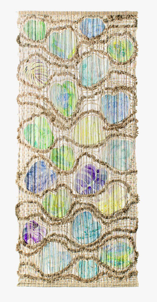
Ted Hallman, "Water Lily Pads," 1964 (MAD/Ted Hallman)
Just before Thanksgiving, I had the opportunity to tour the Museum of Arts and Design (MAD) exhibition, Crafting Modernism: Midcentury American Art and Design, with curators Jeannine Falino and Jennifer Scanlan. The moment I walked in, I was a little bit embarrassed I hadn't been before, as the opening vignette features a large, pristine piece of Irving Harper's "China Shop" fabric, designed while he was working for George Nelson. Given my obsession with midcentury and architectural textiles, what took me so long? The argument of the show is that modernism wasn't a one-way industrial street, and that, during the 1950s and 1960s, there was a great deal of back-and-forth between craft and design, the rough and the smooth, and there is a tremendous amount of eye candy, including Betty Cooke and Art Smith jewelry). DCrit graduate Chappell Ellison has written an excellent summary of the show over on the Etsy blog, so I won't do that. Collapsing the boundaries between craft and machine, and versing designers in multiple disciplines is part of the legacy of the Bauhaus. And indeed, Dorothy Liebes's experiments with Lurex and natural fibers and close cousins of Anni Albers's earlier experiments in wool and cellophane.

Dorothy Liebes, Textile Samples, 1948 - 1968 (MAD/Ed Watkins)
What interested me the most was a series of pieces that played with scale, pattern and architecture. "China Shop" illustrates a point I've made before, about the textiles of Alexander Girard: when three-dimensional designers move to fabric, they tend to bring all their 3D techniques. What's the difference, really, between the motif-strewn rugs and the rosewood storage wall he designed for the Miller family, or the "Eden" drapes in the kitchen? All take an object and place it on a grid, embellished with color, texture or material. "China Shop" works the same way: it could be an illustration of a Girard-designed shop, with folk art vessels populating the white, gridded space. You need something quirky, something handmade, something crafty to pop from the woven field, and it is precisely that contrast that this exhibition intends to point out.
A number of other pieces made a virtue of the same contrast at a larger scale. I was very taken with Ted Hallman's "Water Lily Pads," which used some very funky macrame techniques to make flattened discs of acrylic look like precious gems. In this case, the woven frame was, the natural element, and the pads the industrial product, but it could easily have gone the other way. And this wall hanging was itself intended to bring a touch of the landscape into a home that might have been all terrazzo and glass. Midcentury architects were acutely aware of the need for texture (an element the photographs of Ezra Stoller tend to leave out), but they never wanted their clients to go too far against the modernist grain. Artists and craftspeople like Hallman split the difference.
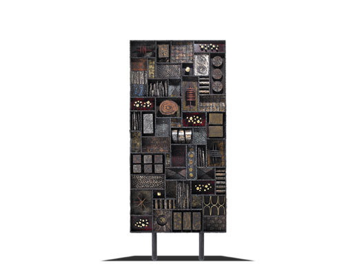
Paul Evans, Screen, 1969 (MAD/Rago Arts)
The Paul Evans screen, which faces the Hallman, would have performed the same service. It actually looks like a storage wall, but is much shallower and the objects are fixed in place. It is halfway to being a textile, as well as halfway to being a Louise Nevelson. It also reminded me strongly of the interior design Girard did on the Scoren House in Woodside, CA, which included magnificent enameled doors and a backlit armature to hold sculptural pots and objects. If you go, also consider jewelry designer Ruth Radakovich's sensuous door in this context, which manages to be radical in its use of fiberglass and suggestive of Mackintoch.
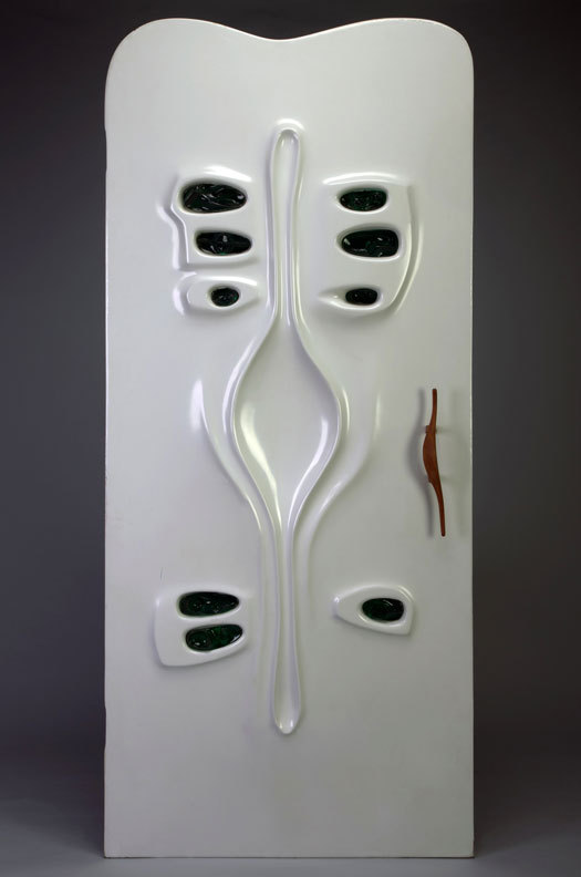
Ruth Radakovich, Door, 1969 (MAD/Jon C. Bolton)
And finally, since he's one of my pet causes, pause for a moment at the small, brass Harry Bertoia screen. It's the baby sister of the stunning bronze screen that used to grace the back wall of Manufacturers Hanover Trust. Chase says it is in a safe place but really, we need to know where it is. Bertoia's screen performed the same function for the bank as the macrame and the door, the screen and the printed vases. It warmed it up. Lewis Mumford saw this right from the start, as he wrote in his New Yorker review, "Crystal Lantern."
Though [Bertoia’s screen] is purely abstract, making no effort at symbolic significance, it humanizes these quarters even more effectively than living plants, mainly because it suggests something frail, incomplete, yet unexpected and defiant of rational statement, and thus lovable, a note that is not audible in most of the representative architectural expressions of our time.The exhibition even include a pocked-size piece of humanity, this Bertoia comb.
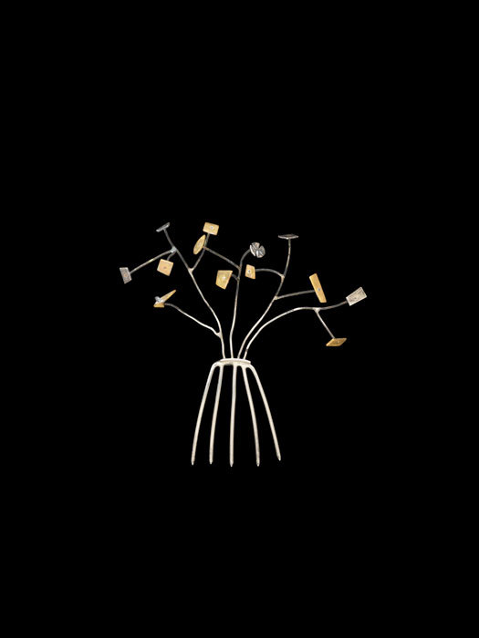
Harry Bertoia, "Tree" Hair Ornament, 1950 (MAD/John Bigelow Taylor)
While I loved the premise and the objects, I can't offer the exhibition untempered praise. The first floor of the show (fifth floor of the museum) is nicely done, installing suites of objects in room-like settings that suggest daily use. Unfortunately, those rooms are at MAD, and four years after the opening, I have yet to warm up to Allied Works' renovation. In a show that's all about texture, the galleries are as bland as can be, the skinny windows blocked up (likely for conservation reasons), the walls gray. Couldn't we even get a rug on the floor? The second part of the exhibition, which showcases less domestic and more artistic products, has the look of a showroom with a gray stepped podium running around the edge. I actually wished the Sheila Hicks tapestry was hanging on one of the wood-paneled walls at the Cooper Hewitt. The attempt not to upstage the objects actually sapped them of some of their crunchy vitality, and seemed counter to the curatorial emphasis on contrast.


